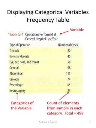
Download
1 / 12
130 likes | 270 Views
Displaying Quantitative Variables. Dotplots and Stemplots. So… What exactly is a quantitative variable?. It simply Takes numerical values! Values that are added or averaged! It makes them make sense! I SIMPLER WAY TO COMPARE!!. Dotplots.

E N D
Displaying Quantitative Variables Dotplots and Stemplots
So… What exactly is a quantitative variable? • It simply Takes numerical values! • Values that are added or averaged! • It makes them make sense! • I SIMPLER WAY TO COMPARE!!
Dotplots • One of the simplest forms of displaying quantitative data is using a dotplot. • 1.) draw a horizontal axis and ALWAYS label your axis and title your chart!! • 2.) scale the axis based on the values!! • 3.) mark a dot above the horizontal axis that matches each data value!!
Dotplot example!! Here’s the scenario!! Little susie attends DeSoto high school but works part time at the local record store. Her boss asked her about the record sales and on four records that were just released; Jay z-Magna Carta, Wale-The Gifted, YMCMB-Rich Gang, and Kanye West-Yezzus. So Little susie decides to take a survey in one of her biggest classes!
The Data If this is all the information that susie gets while surveying, how should she organize in a way where others will be able to interpret it? -DUH!!! A Dotplot graph!!!
18 15 12 9 6 3 Ms. Jones Class Survey Who’s record had the most hits? Rich Gang Magna Carta Yeezus The Gifted
Stemplots • They can also be called Stem-leaf-plot • They are used to show the frequency of a set of numbers • A tad bit harder than a dotplot, but still very easy
Stem-and-leaf plots • Sometimes, values can be very wide and spread out to display on a dotplot graph. This is where stemplot graphs come into play. • 1.) Make a “T-Chart” with the left side smaller than the right. • 2.) label the left side “stem” and the right side “leaf.” • 3.) Plug in your data to the chart and compare the frequencies between numbers.
Stem-and-leaf plot example!!! Here’s the scenario!! Four radio stations are giving away tickets to the John Legend concert that is coming up. Each radio station has to give more than 25 tickets away each hour of their morning show!! After the give away has been done, Little Bobby has been given the data from all four radio stations, but its just numbers!! How can Little Bobby organize this data and graph it?
The Data With all of this scattered information, if Little Bobby just want edto compare the frequencies within the numbers, what would Little Bobby use? -Of Course!! A Stem-and-leaf plot
John Legend Radio Give-away Ticket Give-away totals stem leaf 2 3 4 5 7 9 7 8 9 9 6 7 8 9 0 3
Hopefully, we have taught you the easy way to chart a stemplot and a dotplot!!