Download
1 / 10
100 likes | 251 Views
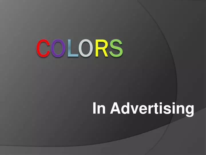
In Advertising. C o l o r s. Red is an extremely powerful color. It is the bang that hits your eyes, and as a result, it symbolizes energy, power, vitality and vigor. .

E N D
In Advertising Colors
Red is an extremely powerful color. It is the bang that hits your eyes, and as a result, it symbolizes energy, power, vitality and vigor.
Blue is probably the universal favorite. As a cool shade, it not only promotes serenity and clarity, it also denotes intellect and precision. Blue has a lot of significance in formality and elegance, especially in its deeper shades.
Yellow is a two-faced advertising color. Although it is the most eye-catching color, yellow can be fatiguing to the eye and overbearing to the mind. The use of yellow for important things, though, can be a good property as well. Yellow is a happy, energetic color, that sometimes symbolizes rejuvenation; hence the use of the color yellow in beauty products. But somehow, the color remains distasteful to men, maybe because of its conventional “cheap” connotation.
Purple is the luxury color. High quality in its elegance, it’s often used to attract women, who find the color irresistible. Because of its costly appearance, it can affect perception of bargain hunters, while at the same time giving quality to cheaper products
Orange is a more neutral shade of red. It has all the energetic warmth of the warmer half of the color wheel, but it doesn’t have red’s association with negative emotions. It is used as an adrenaline power shot, with a lot of use in energy drinks, orange-flavorings and children-associated products. On the negative side, though, orange can give a very strong impression of shoddy cheapness
Pink is the number one feminine color in the world. Known for its attractive quality, pink is used all over as the “in” advertising color for all things girl-related. Also used as a pastel color, pale pink is a baby-color as well.
Black is the smooth shade of exclusivity. Shiny black is a mark of excellence, while black on the whole is a very formal color in advertising, hinting of corporate touches. Although black tends to be a more traditional color, it can be used to give class to advertisement as well.
White, on the other hand, is the cool airy shade of purity. Used a lot to depict cleaning substances, it’s also often used to give a calm look to a room shown in an advertisement.