Download
1 / 24
250 likes | 745 Views
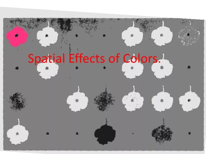
Spatial Effects of Colors. Does Donald Sultan create an illusion that some flowers are larger and some are smaller? Which colors seem close, and which seem to recede? . Donald Sultan, 28 Flowers. Colors that are warmer seem to be closer

E N D
Does Donald Sultan create an illusion that some flowers are larger and some are smaller? Which colors seem close, and which seem to recede? Donald Sultan, 28 Flowers
Colors that are warmer seem to be closer • Colors that are higher in value at full saturation (yellows) seem to be closer • Warmer, more saturated colors seem larger • Cooler colors seem smaller • Desaturated colors (especially dark desaturated colors) seem farther • Darker colors seem farther
Notice how some sections of bands seem closer and some seem farther from the viewer. Tony Bavington
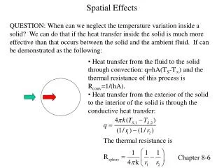
Earlier, we discussed how lighter, brighter, more saturated colors tend to push toward the viewer while darker, less saturated colors recede. Based on this idea, would you paint a small room that you want to seem more spacious YELLOW or BLUE?
Alfred Bierstadt, Merced River Atmospheric perspective: A technique where shifts in value and color create an illusion of space. Forms in the foreground are larger, darker, and higher in contrast. In the distance the value gets lighter and has less contrast.
Foreground: brighter, darker, more saturated. Background: lighter less saturated.
Rules for atmospheric perspective: Closer objects are larger and more detailed Nearer objects are darker and higher in contrast (dark and light are often paired together) Nearer objects are more saturated Objects become smaller and lose detail towards the distance Farther objects are lower in value, lower in saturation, and lower in contrast (mountains may resemble the sky in value an color)
Chiaroscuro is created by contrasting areas of light and dark. In this image, there are several distinct lighting areas: a highlight, quartertone, midtone, form shadow, reflected light, and cast shadow. By contrasting the light areas with dark, we see an illusion of a sphere curving in space, and light moving across the sphere.
A similar three dimensional effect can be achieved using chromatic value, where variations of tonal color create an illusion of objects turning in space. Smooth forms like these spherical objects will display subtle gradations of color as the object turns away from the light source.
Consider how similar forms, without tonal/color variations seem flat rather than spatial.
More textured objects may display sharper tonal and color contrasts as light and shadow hit the form
And very planar forms will have distinct, hard-edged shifts in color and tone.
Color/tone contrasts create an illusion of three-dimensionality within two-dimensional forms
How does Al Held use the principles of atmospheric perspective and chiaroscuro to create an illusion of space with his abstract forms? Al Held