Download
1 / 14
150 likes | 286 Views
GRAPHING BASICS. Data Management & Graphing. Data Management. When performing an experiment, you will always collect data REVIEW Quantitative data – Data gathered by making observations using your senses and includes numbers

E N D
GRAPHING BASICS Data Management & Graphing
Data Management • When performing an experiment, you will always collect data • REVIEW • Quantitative data – Data gathered by making observations using your senses and includes numbers • Qualitative data – Data gathered by making observations using your senses and does NOT include numbers • Regardless of the type of data that you collect, it should be properly organized in a data table.
Data Table Format • The proper format for a data table is: • Place your independent variable and unit in the left-most column • Place your dependent variable and unit in the right-most column • REVIEW: • Independent Variable • The thing that is changed by the experimenter • Dependent Variable • The thing that is measured in the experiment INDEPENDENT VARIABLE Label (unit) DEPENDENT VARIABLE Label (unit) Data
Practice Scenario For the following scenario, pull out the parts indicated: Laura was watching a special on HGTV (Home and Garden TV) that was on the effects of different amounts of fertilizer on plant growth. It said that the more fertilizer that could be added, the more the plants would grow. She decided to experiment to see if it was true. She went to her garden and removed 6 tulip bulbs. She placed them in 6 identical pots, watered them with the same amount of water. She decided to add the following amounts of fertilizer to the plants: Plant A (0g); Plant B (3g); Plant C (6g); Plant D (9g). She went back after 10 days and measured the height of each plant. She measured the plants as follows: Plant A (5cm), Plant B (7cm), Plant C (9cm), Plant D (11cm). What is the hypothesis? What is the Control? What are the Constants? What is the Independent Variable? What is the Dependent Variable? If I add more fertilizer, then the plants will grow more. Plant A Pots, tulips, water, measured after same amt. of time Amount of fertilizer Plant growth
Now, using your answers from the previous slide, correctly fill in the data table below. Consult the scenario to find the proper numbers to put in the table as well. A B C D Practice Scenario (continued) Dependent Variable Independent Variable Amount of Fertilizer (grams) Plant growth (cm) 0 5 3 7 9 6 9 11
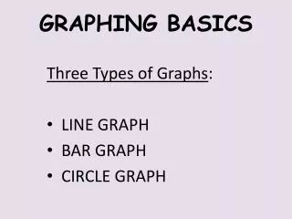
Types of Graphs • After collecting your data, you will need to organize it into a graph. • There are three types of graphs: • Pie/Circle Graph • Bar Graph • Line Graph
Why Graph? • Graphs are an effective way to visually display the information or data collected in an experiment. • Graphs can clearly illustrate a trend in information or data collected. This is one way that data can be analyzed. It is important to use the correct type of graph for the type of information or data presented.
Pie/Circle Graph • These graphs are usually used when data is comparing parts to a whole (percentage) or when a quantity is broken down • Example: • How the Milton’s family budget is broken down in a month
Bar Graph • Most often used when comparing groups (words) and numbers or numbers that cannot be ordered • Example: • Comparing the resistance of current passing through different types of metal
Line Graph • Most often used to show changes over time or rates of change in something. It is used when you can make a sequential scale with the data being collected. • Example: • Change in average speed compared to the distance traveled.
Titling a Graph • A title for a graph should describe what the experiment was comparing • For pie graphs: • Titles should name the quantity or thing being divided • Student Hair Color • For line and bar graphs: • Titles should list the dependent variable vs. the independent variable • Temperature vs. Time • All titles are placed at the TOP of the graph
Y-axis X-axis Bar & Line Graphs • Bar and line graphs are constructed on a set of axes • X axis runs horizontal ( →) • Y axis runs vertical (↑) • These axes must be labeled properly • The x-axis should be labeled with the independent variable and unit • The y-axis should be labeled with the dependent variable and unit Dependent Variable vs. Independent Variable DEPENDENT VARIABLE Label (unit) INDEPENDENT VARIABLE Label (unit)
Amount of Fertilizer (grams) Plant growth (cm) 5 0 A 7 3 B 9 6 C 11 9 D Practice Scenario (continued) Now, using your answers from the earlier scenario, correctly title and label the axes below: Plant Growth Depend on Amount of Fertilizer Plant Growth (cm) Amount of Fertilizer (grams)
Amount of Fertilizer (grams) Plant growth (cm) 5 0 A 7 3 B 9 6 C 11 9 D Line Graph