Download
1 / 12
120 likes | 325 Views
1.2 - Displaying quantitative data with graphs. (Histograms). Histograms. The most common graph of quantitative data. (not the most convenient) Classes: the intervals along the bottom axis. These need to be of equal width Frequency: the count of individuals of a class occurring

E N D
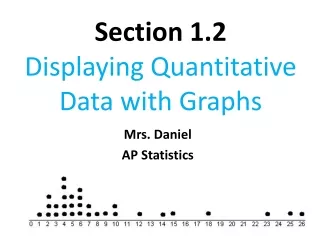
1.2 - Displaying quantitative data with graphs (Histograms)
Histograms The most common graph of quantitative data. (not the most convenient) Classes: the intervals along the bottom axis. These need to be of equal width Frequency: the count of individuals of a class occurring Relative frequency: the percent of the individuals in a class (this is more useful, especially when you are comparing two sets of data with an unequal total of individuals)
The following table represents the battings averages for the 25 Cincinnati Reds who have an at bat this time in the 2013 season. Door Side
The following table represents the battings averages for the 29 Cincinnati Reds who have an at bat this time in the 2014 season. Wall Side
Steps for constructing a histogram 1st - divide the range of data into class of equal width. 2nd - find the count and percent of individuals in each class. 3rd - label and scale your axes 4th - draw your histogram
1st step What is the range of our data? What would be a good class size to choose? What are the classes?
2nd Step Fill in a frequency table and a relative frequency table.
2013 • 2014 • Relative Frequency • Relative Frequency 3rd step • Batting Average • Batting Average
Don’t forget your “SOCS!” • The histogram shows that the batting ranged from __________ • The data appears to be _______ with a peak of _____ . • The center of the data occurs around ______ Describe the data of the batting average for YOUR year only! • The _____ appear to be any outliers.
www.whfreeman.com/tps4e How does class size effect the shape of the histogram?
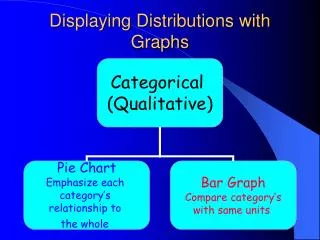
2. Don’t use the counts or percents as the data. Use the data to find the counts and percents for your graph. • 3. Use percents instead of counts when comparing distributions with different numbers of observations. Last Pieces of advice about histograms • 4. Just because a graph looks nice, doesn’t mean it’s necessarily a meaningful display of data. • (Excel is a terrible tool to use for statistical graphs) 1. Don’t confuse histograms and bar graphs Histograms are for quantitative data Bar graphs are for categorical data