Download
1 / 57
590 likes | 849 Views
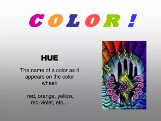
Introduction to C o l o r. CS123 – Introduction to Computer Graphics. Introduction. G raphics displays became common in the mid-60’s. The field of graphics concentrated first on interaction, and later on “photorealism” (which was generally based on performance-centered hacks)

E N D
Introduction to Color CS123 – Introduction to Computer Graphics Color
Introduction • Graphics displays became common in the mid-60’s. The field of graphics concentrated first on interaction, and later on “photorealism” (which was generally based on performance-centered hacks) • Now both are important, as well as is non-photorealistic rendering (e.g., painterly or sketchy rendering) • Photorealistic rendering increasingly physically-based (such as using physically realistic values for light sources or surface reflectance) and perception-based • An understanding of the human visual and proprioceptive systems are essential to creating realistic user experiences Color
All You Need to Know About Color in CS123 (Courtesy of Barb Meier, former HeadTA) Physics: E&M, optics, materials… Electronics (display devices) Psychophysics/Human Visual System Graphical design Color
Lecture Roadmap • Motivation • Achromatic light • Chromatic color • Color models for raster graphics • Reproducing color • Using color in computer graphics Color (rendered with Maxwell)
Why Study Color in Computer Graphics? • Measurement for realism - what does coding an RGB triple mean? • Aesthetics for selecting appropriate user interface colors • how to put on matching pants and shirt in the morning • what are the perceptual/physical forces driving one’s “taste” in color? • Understanding color models for providing users with easy color selection • systems for naming and describing colors • Color models, measurement and color gamuts for converting colors between media • why colors on your screen may not be printable, and vice-versa • managing color in systems that interface computers, screens, scanners, and printers together • Useful background for physically-based rendering and shares ideas with signal processing – photoreceptors process signals • Graphics group has worked on color tools for Adobe Color
Why is Color Difficult? • Color is an immensely complex subject drawing from physics, physiology, perceptual psychology, art, and graphic design • There are many theories, measurement techniques, and standards for colors, yet no single theory of human color perception is universally accepted • Color of an object depends not only on the object itself, but also on the light sources illuminating it, the color of surrounding area, and on the human visual system (the eye/brain mechanism) • Some objects reflect light (wall, desk, paper), while others also transmitlight (cellophane, glass) • surface that reflects only pure blue light illuminated with pure red light appears black • pure green light viewed through glass that transmits only pure red also appears black Color
What is color? • Color is a property of objects that our minds create – an interpretation of the world around us • Color is apparently unique to humans and higher primates • Color perception stems from two main components: • Physical properties of the world around us • electromagnetic waves interact with materials in world and eventually reach eyes • visible light comprises the portion of the electromagnetic spectrum that our eyes can detect (380nm/violet – 740nm/red) • photoreceptors in the eye (rods and cones) convert light (photons) into electro-chemical signals which are then processed by our brains • Physiological interpretation of signals (“raw data”) output by receptors • less well-understood and incredibly complex higher level processing • very dependent on past experience and object associations • Both are important to understanding our sensation of color Color
Our Visual System Constructs our Reality (1/3) • Still not completely understood • Understanding our visual system and brain’s “wiring” is insufficient • New tools (e.g., fMRI) greatly increase our understanding, but also introduce new questions • Some viewing capabilities are hardwired, others are learned • We acquire a visual vocabulary • What looked real on the screen a few years ago no longer does – bar keeps rising • We have huge innate pattern recognition ability • Visual processing generally faster than higher-level cognitive processing • Roads use symbols instead of words for signs (but “dual coding” is always better) • And may have more emotional impact Color
Our Visual System Constructs our Reality (2/3) • Perceptual invariants are crucial for sense-making • Size, rotation and position constancy of objects despite varying projections on the eye (but not always!) • Color constancy despite changing wavelength distributions of illumination • Person recognition despite everything else changing and very poor viewing conditions • Optical illusions • Completing incomplete features, such as seeing “false” size differences due to context • Seeing differences in brightness due to context, negative afterimages, seeing “false” patterns and even motion • Seeing 3d (perspective, camera obscura, sidewalk art) • But also artifacts: misjudgments, vection (apparent motion) • Examples • Miscellaneous1, Miscellaneous2, Afterimages, Vection, Forced Perspective Color
Our Visual System Constructs our Reality (3/3) • Seeing is bidirectional • Visual process is semantically driven • Based on context, we expect to see (or not to see) certain things • Example • http://www.youtube.com/watch?v=Ahg6qcgoay4 Color
Achromatic Light (1/2) • Achromatic Light: “without color,” quantity of light only • Called intensity, luminance, or measure of light’s energy/brightness • The psychophysical sense of perceived intensity • Gray levels (e.g., from 0.0 to 1.0) • We can distinguish approximately 128 gray levels • Seen on black and white displays • Note Mach banding/edge enhancement – stay tuned Color
Achromatic Light (2/2) • Eye is much more sensitive to slight changes in luminance (intensity) of light than slight changes in color (hue) • "Colors are only symbols. Reality is to be found in luminance alone… When I run out of blue, I use red." (Pablo Picasso) • “Picasso's Poor People on the Seashore uses various shades of blue that differ from each other in luminance but hardly at all in color (hue). The melancholy blue color serves an emotional role, but does not affect our recognition of the scene.” Also, consider how realistic black and white images/movies look! • “The biological basis for the fact that color and luminance can play distinct roles in our perception of art, or of real life, is that color and luminance are analyzed by different subdivisions of our visual system, and these two subdivisions are responsible for different aspects of visual perception. The parts of our brain that process information about color are located several inches away from the parts that analyze luminance -- as anatomically distinct as vision is from hearing. ” (source below) • Source: • Includes in-depth explanations of many interesting natural phenomena relating to color (including several interactive applications) http://www.webexhibits.org/causesofcolor/ Color
Chromatic Light • Factors of visual color sensations • Brightness / intensity(this circular color picker shows single brightness) • Chromaticity / color: • Hue / position in spectrum(red, green, …)- angle in polar coordinates (circular color picker) • Saturation / vividness – radius in polar coordinates (circular color picker) Example of an HSV color picker Ingredients of a Rainbow Color
Dynamic Range • Dynamic Range:ratio of maximum to minimum discernible intensity; our range: photons/sec • Extraordinary precision achieved via adaptation, where the eye acclimates to changes in light over time by adjusting pupil size. At any one moment, human eye has much lower dynamic range, about 10,000:1 • Dynamic range of a display gives idea of how many distinct intensities display can depict • Note: dynamic range (ratio of max:min intensities) not at all the same as gamut (number of displayable colors) • Dynamic range also applies to audio, printers, cameras, etc. • Display Examples: • ink bleeding and random noise considerably decreases DR in practice Source: http://www.cambridgeincolour.com/tutorials/cameras-vs-human-eye.htm Color
Non-linearity of Visual System (1/4) • What is the relationship between perceived brightness and intensity/luminance? • If linear, equal steps in would yield equal steps in • However, human visual system is roughly based on ratios (non-linear) • e.g., difference between = 0.10 and 0.11 is perceived the same as between 0.50 and 0.55 • note the difference in relative brightness in a 3-level bulb between 50100 watts vs. 100150 watts • Thus to produce equal steps in brightness. Calculate ratio of adjacent levels for specified number of values (e.g., 255) – next slide Color
Non-linearity of Visual System (2/4) • To achieve equal steps in brightness, space logarithmically rather than linearly, so that • Use the following relations: • Therefore: Color
Non-linearity of Visual System (3/4) • In general for n+1 intensities: • Thus for: (4 intensities) and =1/8, r=2, intensity values of 1/8, 1/4, 1/2, and 1 Color
Non-linearity of Visual System (4/4) • But log function is based on subjective human judgments about relative brightness of various light sources in the human dynamic range • Stevens’ power law approximates the subjective curve well in this range: (or .42, for better imagery in a dark room, or .33, the value used in the CIE standard) • Instead of encoding uniform steps in in an image, better to encode roughly equal perceptual steps in (using the power law) - called compression • Idea behind encoding analog TV signals and JPEG images Color
Non-linearity in Screens: Gamma • The intensity emitted by a CRT is proportional to 5/2 power of the applied voltage V, roughly • This exponent is often called gamma (γ), and the process of raising values to this power is known as gamma correction • Gamma is a measure of the nonlinearity of a display • The output is not directly proportional to the input. • It is typically used to compensate for different viewing environments and to convert between media and screens. • Many LCDs have a built-in ability to “fake” a certain gamma level, a black box does a lookup that simulates the CRT power law. Color
Gamma • Example: PC monitors have a gamma of roughly 2.5, while Mac monitors have a gamma of 2.2, so Mac images appear dark on PC’s • Problems in graphics: • Need to maintain color consistency across different platforms and hardware devices (monitor, printer, etc.) • Even the same type/brand of monitors change gamma values over time PC user gives image back; it’s now too bright Mac user generates image PC user changes image to make it bright Color
High Dynamic Range (1/3) • High Dynamic Range (HDR): describes images and display media that compress the visible spectrum to allow for greater contrast between extreme intensities • Takes advantage of nonlinearities inherent in perception and display devices to compress intensities in an intelligent fashion • Allows a display to artificially depict an exaggerated contrast between the very dark and very bright http://en.wikipedia.org/wiki/High_dynamic_range_imaging Color
High Dynamic Range (2/3) • Can combine photos taken at different exposure levels into an aggregate HDR image with more overall contrast (higher dynamic range) • Generally 32-bit image format (e.g., OpenEXR or RGBE) • HDR and tone mapping are hot topics in rendering! (source: www.hdrsoft.com) Color
High Dynamic Range (3/3) • To avoid the inevitable, lossy compression that occurs when squeezing a huge DR taken by a camera into, typically, 255 discrete intensity bins, cut the DR into sub-intervals and encode each into its own separate image. • Then use a function to emphasize the most representative sub-interval and either clamp the values to a min and max I value or allow a little discrimination of values outside the chosen sub-interval. This function is called the tone map. • Expensive displays with many more intensity levels specially designed for HDR images produce incredibly rich images. For example, LG has developed LCD monitors claiming contrast ratios of 5,000,000:1! • (http://www.lgsolutions.com/__downloads/pdf/eb2242t041232pr.pdf) • Individually modulated LED pixels allow for true blacks, “infinite” contrast ratios Color
Inside a CRT Phosphor's light output decays exponentially; thus refresh at >= 60Hz Cool pictures: http://www.pctechguide.com/06crtmon.htm Block diagram : http://www.tpub.com/neets/book18/ Color
Inside an LCD Picture source http://www.teac.com.au/pages/howdoesanlcdwork Color Backlightmade by LEDs and diffuser layer provides (whitish) flood lighting of entire screen Polarizer filters light, allows only certain light with desired direction to pass TFT matrix: transistors and capacitors at each pixel to change the voltage that bends the light Liquid Crystal controls direction of light, allow between 0 and 100% through second polarizer Color Filter gives each subpixel in (R,G,B) triad its color. Subpixel addressing used in anti-aliasing Video: http://www.youtube.com/watch?v=jiejNAUwcQ8
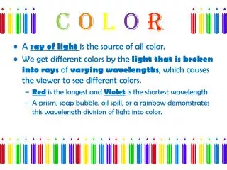
Color Terms • Hue distinguishes among colors (e.g., red, green, purple, and yellow) • Saturation refers to how pure the color is, how much white/gray is mixed with it • red saturated; pink unsaturated • royal blue saturated; sky blue unsaturated • Pastels are less vivid and less intense • Lightness: perceived achromatic intensity of reflecting object • Brightness: perceived intensity of a self-luminous object, such as a light bulb, the sun, or an LCD screen • Can distinguish ~7 million colors when samples placed side-by-side (JNDs – Just Noticeable Differences) • With differences only in hue, differences of JND colors are 2nm in the central part of visible spectrum and10 nm at extremes – non-uniformity! • About 128 fully saturated hues are distinct • Eye are less discriminating for less saturated light and less sensitive for less bright light Color
Color Mixture • The effect of (A) passing light through several filters (subtractive mixture), and (B) throwing different lights upon the same spot (additive mixture) • Color Mixing Applets Additive Mixing Applet: http://www.cs.brown.edu/exploratories/freeSoftware/repository/edu/brown/cs/exploratories/applets/colorMixing/additive_color_mixing_guide.html Combined Mixing Applet: http://www.cs.brown.edu/exploratories/freeSoftware/repository/edu/brown/cs/exploratories/applets/combinedColorMixing/combined_color_mixing_guide.html A B Color
Subtractive Mixture • Subtractive mixture occurs when mixing paints, dyes, inks, etc. that act as a filters between the viewer and the light source / reflective surface. • In subtractive mixing, the light passed by two filters (or reflected by two mixed pigments) are wavelengths that are passed by the two filters • On left: first filter passes 420 - 520 nanometers (broad-band blue filter), while second passes 480 - 660 nanometers (broad-band yellow filter). Light that can pass through both is in 480 - 520 nanometers, which appears green. blue greenyellowred green Color
Additive Mixture • Additive mixture occurs when color is created by mixing visible light emitted from light sources • Used for computer monitors, televisions, etc. • Light passed by two filters (or reflected by two pigments) impinges upon same region of retina. • On left: pure blue and yellow filtered light on same portion of the screen, reflected upon same retinal region. Color
Additive Mixture in Pointillist Art The Channel at Gravelines (1890) by Georges Seurat • Discrete color daubs (left image) are said to mix additively at a distance. • Pointillist technique • Creates bright colors where mixing(overlaying) daubs darkens (subtractive) • Sondheim’s “Sunday in the Park with George” is a fantastic modern musical exploring Seurat’s color use and theories about light, color, composition. Color
Complementary Hues – Additive Mixture • These “unique” hues play a role in opponent color perception discussed later • Note that only for perfect red and green do you get gray – CRT red and green both have yellow components and therefore sum to yellowish gray Complementary hues:Any hue will yield gray if additively mixed in correct proportion with it’s opposite hue on the color circle. Such hue pairs are complementary. Of particular importance are the pairs that contain four unique hues: red-green, blue-yellow “complementary hues” Color
Color Contrast • The gray patches on the blue and yellow backgrounds are physically identical, yet look different • Difference in perceived brightness: patch on blue background looks brighter than one on yellow. Result of brightness contrast. • Also a difference in perceived hue. Patch on blue looks yellowish, while patch on yellow looks bluish. This is color contrast: hues tend to induce their complementary colors in neighboring areas. • To explore, click any Albers Plate link on:http://www.cs.brown.edu/courses/cs092/VA10/HTML/start.html Color
Negative Afterimage • Stare at center of figure for about a minute or two, then look at a blank white screen or a white piece of paper • Blink once or twice; negative afterimage will appear within a few seconds showing the rose in its “correct” colors (red petals and green leaves) Color
Decrease saturation Tints White “Pure” color Tones Decrease lightness Grays Shades Black Specifying (Naming) Color • How to refer to or name a particular color? • Compare unknown and sample from a collection • Colors must be viewed under a standard light source • Depends on human judgment • PANTONE® Matching System in printing industry • Munsellcolor system • Set of samples in 3D space • Dimensions are for: hue, lightness, and saturation • Equal perceived distances between neighboring samples • Artists specify color as tint, shade, tone using pure white and black pigments • Ostwald system is similar • Later, we’ll look at computer-based models Color
Psychophysics • Tint, shade, and tone: subjective and depend on observer’s judgment, lighting, sample size, context, etc • Colorimetry: quantitative with measurements made via spectroradiometer(measures reflected/radiated light), colorimeter (measures primary colors), etc. Perceptual termColorimetry term Hue Dominant wavelength Saturation Excitation purity Lightness (reflecting objects) Luminance Brightness (self-luminous objects) Luminance • Physiology of vision, theories of perception still active research areas • Note: our auditory and visual processing are very different! • both are forms of signal processing • visual processing integrates/much more affected by context • more than half of our cortex devoted to vision • vision probably dominant sense, though it is apparently harder to be deaf than blind Color
Response to Stimuli (1/3) • We draw a frequency response curve like this: to indicate how much a photoreceptor responds to light of uniform intensity for each wavelength • To compute response to incoming band (frequency distribution) of light, like this: • We multiply the curves, wavelength by wavelength, to compute receptor response to each amount of stimulus across spectrum ¦(l) l I (l) Color l
f ( ) l l I ( ) l l R ( ) l l Response to Stimuli (2/3) • Gray area under product curve represents how much receptor “sees,” i.e., total response to incoming light • Let’s call this receptor red. Then: Response Cell Applet: http://www.cs.brown.edu/exploratories/freeSoftware/repository/edu/brown/cs/exploratories/applets/spectrum/single_cell_response_guide.html Response Curve Incoming Light Distribution Product of functions red perception = òR(l)d(l) = òI(l)f(l)dl Color
Response to Stimuli(3/3) • Response curve also called filter because it determines amplitude of response (i.e., perceived intensity) for each wavelength • Where filter’s amplitude is large, filter lets through most of incoming signal → strong response • Where filter’s amplitude is low, filters out much or all of signal → weak response • Analogous to filtering that you saw in the Image Processing Unit Color
Metamers (1/3) Different light distributions that produce the same response • Imagine a creature with one receptor type (“red”) with response curve like this: • How would it respond to each of these two light sources? • Both signals will generate same amount of “red” perception. They are metamers • one receptor type cannot give more than one color sensation (albeit with varying brightness) ¦(l) l ¦(l) l Color
Metamers (2/3) • Consider a creature with two receptors (R1, R2) • Both and are processed by (convolved with) the receptors and to form the same product • Note that in principle, an infinite number of frequency distributions can simulate the effect of , e.g., • in practice, near tails of response curves, amount of light required becomes impractically large I2 R1 R2 I1 I1 Color
Metamers (3/3) • Whenever you have at least two receptors, there are potentially infinite color distributions that will generate identical sensations (metamers) • Conversely, no two monochromatic lights can generate identical receptor responses - they all look unique • Observations: • If two people have different response curves, they will have different metamers • Different people can distinguish between different colors • Metamers are purely conceptual • Scientific instruments can detect difference between two metameric lights • Metamer Applet: • http://www.cs.brown.edu/exploratories/freeSoftware/repository/edu/brown/cs/exploratories/applets/spectrum/metamers_guide.html Color
Energy Distribution and Metamers • Spectral color: color evoked from single wavelength; “ROYGBIV” spectrum • Non-spectral color: combination of spectral colors; can be shown as continuous spectral distribution or as discrete sum of n primaries (e.g., R, G, B); most colors are non-spectral mixtures. N.B. No finite number of primaries can produce • Metamers are spectral energy distributions perceived as same “color” • Each color sensation can be produced by arbitrarily large number of metamers White light spectrum where height of curve is spectral energy distribution Cannot predict average observer’s color sensation from a distribution!
Dominant Wavelength e2 Energy Density Idealized uniform distribution except for e2 e1 700 Wavelength,nm 400 Colorimetry Terms • Can characterize visual effect of any spectral distribution by triple (dominant wavelength, excitation purity, luminance): • Dominant wavelength: hue we see; the spike of energy e2 • Excitation purity: “saturation,” ratio of monochromatic light of dominant wavelengthto white light • Luminance: relates to total energy, proportional to depends on both e1 and e2. • Note: • dominant wavelength of real distribution may not be one with largest amplitude! • some colors (purple) have no dominant wavelength Color
Three Layers of Human Color Perception - Overview • Receptors in retina (for color matching) • Rods, three types of cones (tristimulus theory) • Primary colors (only three used for screen images: approximately (non-spectral) red, green, blue (RGB)) • Note: receptors each respond to wide range of frequencies, not just spectral primaries • Opponent channels (for perception) • Other cells in retina and neural connections in visual cortex • Blue-yellow, red-green, black-white • 4 psychological color primaries*: red, green, blue, and yellow • Opponent cells (also for perception) • Spatial (context) effects, e.g., simultaneous contrast, lateral inhibition * These colors are called “psychological primaries” because each contains no perceived element of others regardless of intensity. Color
Receptors in Retina • Receptors contain photopigments that produce electro-chemical response • Rods (scotopic): only see grays, work in low-light/night conditions, mostly in periphery • Cones (photopic): respond to different wavelengths to produce color sensations, work in bright light, densely packed near center of retina (fovea), fewer in periphery • Young-Helmholtz tristimulus theory1: 3 cone types in the eye, each of which is most sensitive to a particular range of visible light, with roughly a normal distribution • Three receptor types can produce a gamut of colors that are contained in a 3-space of hue, saturation and value (lightness/brightness) • To avoid overly literal interpretation of R,G, B, perceptual psychologists often use S (short), I (intermediate), L (long) as a measure of wavelength instead 1Thomas Young proposed idea of three receptors in 1801. Hermann von Helmholtz looked at theory from a quantitative basis in 1866. Although they did not work together, the theory is called the Young-Helmholtz theory since they arrived at same conclusions. Color
TristimulusTheory Spectral response functions • Tristimulus theory does not explain subjective color perception, e.g., not many colors look like predictable mixtures of RGB (violet looks like red and blue, but what about yellow?) • The luminous efficiency function on right is the sum of the three spectral response functions on the left and gives the total response of the eye to each wavelength Luminous efficiency function Triple Cell Response Applet http://www.cs.brown.edu/exploratories/freeSoftware/repository/edu/brown/cs/exploratories/applets/spectrum/triple_cell_response_guide.html Color
S I L - + + + - + + + + BK-W Y-B R-G Hering’s Chromatic Opponent Channels • Additional neural processing • Three receptor elements have excitatory and inhibitory connections with neurons higher up that correspond to opponent processes • One pole is activated by excitation, the other by inhibition • All colors can be described in terms of 4 “psychological color primaries” R, G, B, and Y • However, a color is never reddish-greenish or bluish-yellowish: idea of two “antagonistic” opponent color channels, red-green and yellow-blue Light of 450 nm Each channel is a weighted sum of receptor outputs – linear mapping Hue: Blue + Red = Violet Color
Spatially Opponent Cells • Some cells in opponent channels are also spatially opponent, a type of lateral inhibition (called double-opponent cells) • Responsible for effects of simultaneous contrast and after images • green stimulus in cell surround causes some red excitement in cell center, making gray square in field of green appear reddish • Plus… • color perception strongly influenced by context, training, etc., abnormalities such as color blindness (affects about 8% of males, 0.4% of females) Color
Mach Bands and Lateral Inhibition • Mach bands: illusion in which stripes are perceived next to the boundary between two regions of an image having different lightness gradients • Nature provides for contrast enhancement at boundaries between regions: edge detection. This is caused by lateral inhibition. A B Color
Lateral Inhibition and Contrast excite inhibit Color • Lateral Inhibition: Excited cell can reduce activity of its neighbors • Receptor cells, A and B, stimulated by neighboring regions of stimulus. • A receives moderate light. A’s excitation stimulates next neuron on visual chain, cell D, which transmits message toward brain. • Transmission impeded by cell B, whose intense excitation inhibits cell D. Cell D fires at reduced rate. • Intensity of cell is function of ’s excitation e() inhibited by its neighbors with attenuation coefficients that decrease with distance. Thus, • At boundary more excited cells inhibit their less excited neighbors even more and vice versa. Thus, at boundary dark areas even darker than interior dark ones, light areas are lighter than interior light ones. • Nature’s edge detection