Download
1 / 22
270 likes | 761 Views
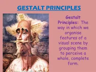
Gestalt . Principles of Perception. Jennifer Brooks. Figure and Background.

E N D
Gestalt Principles of Perception Jennifer Brooks
Figure and Background Figure and background are not seen simultaneously, so when we look at this image our eyes have to switch their focus between black fish and white fish, never able to focus on both at any time. In this case, figure and ground are interchangeable.
Figure and Background 2 In this image, the eye will first focus on the dogs, as they are initially seen as the figure. When you change your focus to the ground, or seemingly negative space of the image, the eye adapts and uncovers the image of the Seattle space needle.
Grouping When we look at an image with repeated elements, like the circles and squares in this example, our brain will try to organize the information. We create a visual pattern, of four groups of circles and a plus sign of squares instead of just a mass of shapes.
Grouping 2 This example is similar to the last frame in that we are still visually organizing the information into a more simple pattern. The interesting thing to me is that although it is a simple group of circles of the same size, because of their black and white values we put them into different visual categories.
Proximity When we look at this image, instead of seeing black spots and yellow circles we group the black dots together because of their proximity and similarity and see them as the figure of a Dalmatian.
Proximity 2 In this image, if the flying black person figures were more spread out that’s all we would gather from the image, little flying people. Instead, they are close in proximity, in our eyes forming the shape of a tree.
Similarity If this image only contained the rounded crowns, our brain would group them as two different sets, black and white crowns. But there’s another element- the one pointed crown. That one is not like the others, so the similarity of the black and white rounded ones is strengthened. The pointed crown is the outcast.
Similarity 2 This image also exemplifies similarity in that the little black people are seen as one group, and the yellow is another. Although all the same shape, our brain organizes then into two groups. One of these things is not like the other.
Continuity Lines that move smoothly and continuously are of visual preference. These lines, although separate, form a cohesive and relaxing image because of their visual flow.
Continuity 2 The lighter blue line of dots are visually preferred because they move in one direction, the curved line giving it a relaxed feeling even though they are separate shapes.
Closure Thought to be a survival adaptation, our brain takes incomplete information and makes it whole. Although the white space between the black animal figures is not outlined or finished, our mind reads them as animals.
Closure 2 Although this is seemingly just a group of curved dashed lines, we perceive this as an image of a circle. We close the space between the lines to make sense of the given and absent information.
Leveling and Sharpening The position of the centered black square gives us a visually level feeling. A centered shape eliminates visual tension. The other square is also a simple shape yet its position creates a sharpening feel, makes it seem more important and creates tension.
Leveling and Sharpening 2 This tranquil image of a sailboat is an example of sharpening. The off center position of the sailboat in the frame creates visual tension and gives the sailboat visual importance. If it had been a centered photo, more of a leveling effect would be observed.
Surrounding Although the points are the only positive space, their position in the image cause us to see a sphere because of the way they surround the negative space.
Surrounding 2 Instead of seeing the black strokes and blob-like figures as a random smattering, we make sense of them visually. These black marks surround the negative space to create the image of an old man.
Third Dimension The use of perspective in design is very popular in Western culture. Narrowing and shrinking the lines that would be farther away in reality creates the feeling of a third dimension, of depth in an image.
Third Dimension 2 At first, we see this as a tangible image of a 3-D cube. In actuality its physically impossible, but we still look at it in disbelief because the concept of a third dimension seems to be conveyed in this design.
EscherBond of Union Leveling, in this image, is provided by the symmetrical feel of the two almost identical heads. The curved lines that make up the “peels” of the faces have a serene feeling of continuity for their lack of abrupt direction change and fluid motion. We interpret the two heads as whole because of the closure concept. We finish filling in the spaces intuitively to create a sense of order. Also, a third dimension is created by shading, especially prevalent in the spheres.
EscherEncounter We see figure and ground separately so in this image we see the dark figures and the light figures at different times. We also group each value of figures together separately. Because the dark figures in the foreground are similar to the ones in the background, although simplified, we see them as the same but in a different perspective (shapes are simplified as you move further away creating a third dimension.) The entirety of the image is centered creating a leveling effect. The figures themselves move in a circular motion without abrupt change in direction which exemplifies the concept of continuity. In the background we see surroundedness- the black and white figures create each other in a sense.
DaliGalatea of the Spheres In this image by Dali we get the feeling of continuity from the spheres’ apparent non-abrupt movement. Leveling is also prevalent here thanks to the centering of the image in the frame. The third dimension is created by the shading of elements. The similarity of the spheres makes them feel unified, which creates the visual feel of closure. This is why we see the image of a woman instead of just a bunch of random colored spheres.