Download
1 / 28
280 likes | 437 Views
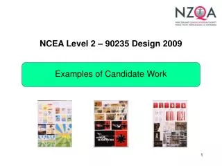
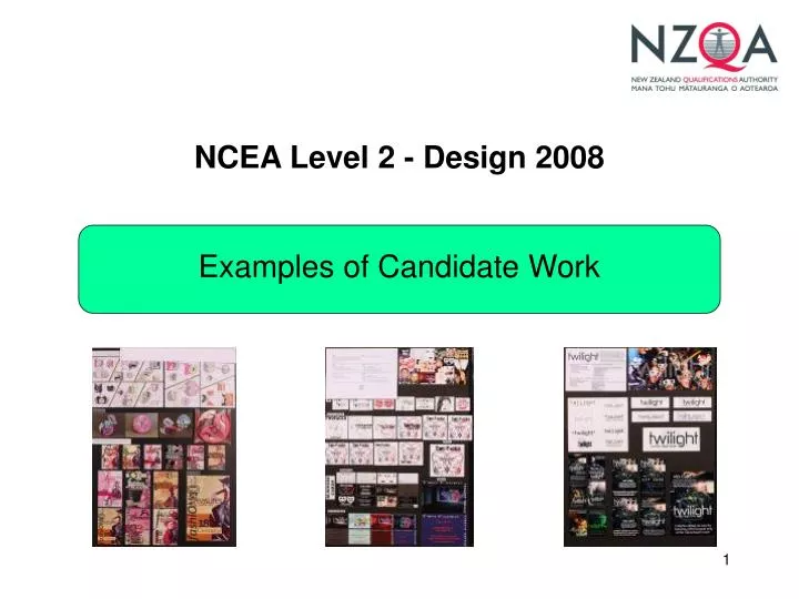
NCEA Level 2 - Design 2008. Examples of Candidate Work. Achieved. This submission is placed in the middle of the achieved grade range.

E N D
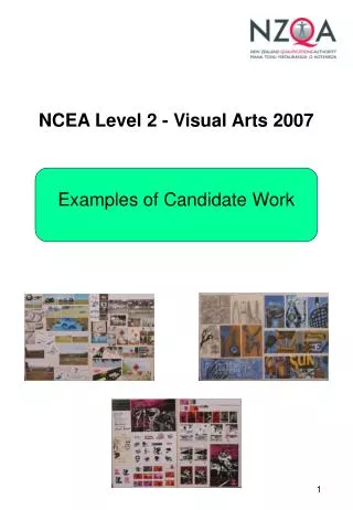
NCEA Level 2 - Design 2008 Examples of Candidate Work
This submission is placed in the middle of the achieved grade range. The submission employs a fashion theme to generate design solutions for Logo, Ticket, CD Case and Poster briefs. While the thematic context is potentially more engaging for female candidates, the design conditions are founded in conventional typographic and layout problems. Materials and techniques from established design practice have clearly been used to inform the development of ideas. However the solutions themselves are relatively conventional and do not demonstrate a breadth and/or depth of investigation. This is characterised by a reliance on a single pictorial device (the headless torso with dress) that has been identified early in the developmental process. Strategies that may have helped this submission move to the next grade range include (but are not limited to) incorporating additional more contemporary design models, and/or gathering a wider range of resource materials before commencing the developmental sequences. This later strategy often enhances candidates’ ability to extend ideas by providing a greater range of alternative resource options to draw from. The inter-changeability of designs between panels one and two (ticket and poster solutions) indicates that there is not sufficient extension of ideas to fulfil the requirements of bullet point one for merit. While the solutions themselves demonstrate an appropriate control of materials and techniques from established practice, the developmental sequences are limited in their scope of investigation. This narrow investigation is often a characteristic feature of submissions in this grade range. It is defined by the small variation in colour and placement of a group of preselected elements (see preparatory sequence for poster in the bottom half of panel two) rather than a genuine inquiry process that explores a significant range of alternative visual concepts.
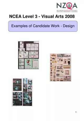
This sample is placed in the middle of the achieved grade range. This submission constitutes a promotional package for a Performing Art School that includes a Logo, Calendar, Business Card and Poster. Promotional and/or Corporate Identify programmes make up the majority of design submissions at level two. In this case the four briefs represent an appropriate investigative journey that provides ample opportunity for the candidate to fulfil the requirements of the achievement criteria. The submission demonstrates a coherent but limited developmental journey. The solutions tend towards conventional rather than innovative and may have benefitted from the investigation and integration of a wider range of more contemporary design models. The typographic elements reveal a lack of nuance that characterises control, but not understanding, of this area of design practice. While the concept developments for each brief reveal a range of alternative options that have been generated, the final solutions do not always build upon the most successful ideas from the initial sequence(s). Some developmental sequences (logo and calendar) present prolonging refinement sequences that tend to repeat the design with minor variations rather than systematically advance towards a resolved solution. The submission relies (in some parts) on appropriated resources that have not been generated by the candidate. This is a potentially problematic practice that often limits candidate’s opportunity to extend ideas due to the limited pool of resources. It is recommended that candidates develop their own resources through drawing and/or photography. This ensures that a range of appropriate imagery (composition, content, resolution) is available to sustain pictorial development throughout a wide range of design contexts.
This submission is placed in the middle of the merit grade range. The submission employs a fashion theme to generate design solutions for Logo, Ticket, CD Case and Poster briefs. This folio begins with the collection of a wide range of appropriate patterns, textures and drawing resources. This forms a broad foundation for the generation of alternative ideas and provides opportunity for the candidate to show the extension of ideas required of bullet point one of the criteria for merit. The body of work is characterised by an innovative integration of hand drawn elements with textural surfaces. This strategy has resulted in a degree of personal style that acknowledges particular recent practice, is appropriate to the genre of the fashion theme, and allows the candidate to develop a range of related design solutions. The understanding of the systematic approach to generating and developing ideas is clearly demonstrated. The poster concept and development sequence at the bottom of panel two shows conceptually consistent, but genuinely alternative ideas, that build towards a solution that shows an appropriate understanding of contemporary design practice. The notations for the CD planning drawings convey a sense of evaluative intent. The work demonstrates an understanding of, but not facility with, typographic conventions. While the choice of font type, colour, and placement is usually appropriate, the inconsistent font selections between briefs undermine the consistent corporate identity of the submission as a whole.
This submission is placed at the higher end of the merit grade range. This submission constitutes a promotional package for an Under Age Rage that includes a Logo, Ticket, VIP Card and Poster. As with other high merit candidates, the submission is characterised by an accomplished starting point (logo) that then maintains a consistently highly technical facility throughout both panels. However, it is a reliance on this narrow range of highly successful pictorial devices that prevents the submission from showing the regeneration of ideas required of bullet point one of the criteria for excellence. The typographic decisions made throughout this submission demonstrate a degree of facility and purpose that approaches the requirements for excellence. The candidate has sustained a sufficient investigation to develop an elegant and appropriate typographic logo. Considered developments in size, placement, kerning, leading, style, complexity, and justification have been applied to sustain the development of a consistent corporate identity across a number of design contexts. The reliance on appropriated photographic resources places the submission at risk of not being able to extend ideas or show understanding of appropriate image generation techniques. Fortunately the candidate has taken a degree of ownership of these resources through a process of modification, adaption and integration with other pictorial and typographic elements. This strategy, combined with the facility with text elements, has led to the strong sense of personal style that is often found at the higher end of the merit grade range. Understanding of systematic approach is demonstrated by coherent and methodical developmental sequences. Although small shifts in layout labour the final four refinements for each brief, the diversity of the initial eight concepts (six for the VIP Card) show a clear range of alternative options for development.
This submission is placed in the middle of the excellence grade range. The submission employs a fashion theme to generate design solutions for Logo, Ticket, CD Case and Poster briefs. This submission begins with a clearly defined pictorial purpose and direction. A wide range of appropriately selected and documented historical motifs have been gathered to provide a broad foundation for subsequent development. Textures and historical patterns have not just been sourced, but appropriately adapted and modified to fit the intended contemporary design context. A high degree of consistent technical facility has been maintained throughout a range of different design modes include typographic logo, pictorial layout and three dimensional construction. In each case a clear sense of corporate consistency is sustained while the unique properties of each design mode are adhered to with knowledge and understanding. Critical approach in the developing of ideas is clearly demonstrated in the final refinements sequence of each project where every developmental work is a significant variation and/or advance on the previous concept. These sequences do not present the minor refinements (baby steps), or variations without purpose (random changes), or repetition with subtle changes (wallpaper) that characterise developmental sequences in the achieved and even merit grade ranges. The comprehensively annotated CD Case developments also attest to a critical purpose. The evidence has been critically edited and appropriately presented to support the reading of the developmental journey. Smaller concepts, are followed by larger developments, which lead to a final large (often printed on higher grade stock) solutions.
This submission is placed in the middle of the excellence grade range. This submission constitutes a promotional package for a Car Design Company that includes a Logo, Magazine Cover, Business Card and Calendar. This submission commences the design journey with a highly successful logo solution with an elegant restraint that shows a deep understanding of the particular constraints of the logo genre. The subsequent solutions demonstrate equal facility in radically different design contexts. This versatility of performance is often present in excellence level submissions. Although the resources are largely a collation of appropriated imagery, the success of the solutions is in no way reliant on the quality of the resources. In each case (Cover, Card and Calendar) the original resources have been extensively modified and adapted. The tree that is central to the cover design demonstrates a high level of technical skill as well as a refined critical and aesthetic sense. These qualities are secondary to the sophisticated and creative use of typographic elements to create an environmental context in the calendar solution. The strength of the submission lies in the clearly differentiated solutions for each brief that retains a strongly consistent corporate identity and personal style. The sophistication and restraint of the final solutions, typified by the elegant use white negative spaces, clearly demonstrates the purposeful clarification of ideas required for excellence level submissions. The depth of ideas required of bullet point one in the criteria for excellence is evident in the wide range of alternative concepts generated for each brief. This consistent success in parallel approaches leads to a “wow” factor that is frequently found in excellence level submissions.