Download
1 / 8
80 likes | 319 Views
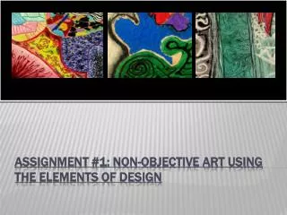
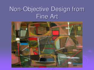
Non-Objective Design from Fine Art. Objectives:.

E N D
Objectives: • The student will be able to create a nonobjective design from a section of selected fine art image. The composition will use the Principles of Design and will be enlarged to 9" x 12" composition - altering as desired and exploring color relationships. • Develop skills in composition - develop focal point • Develop skills in using a variety of drawing media
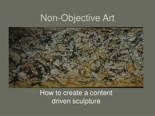
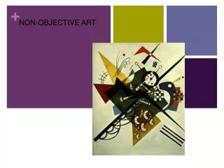
What is nonobjective art? • Art that is not representational, containing no recognizable figures or objects. Sometimes it is called abstract art.
Steps • 1.Select a favorite artist’s work. • 2. Using a viewfinder, travel around The piece and frame a composition. The composition should be complex with some detailed and some ambiguous areas. Using a 9 x 12 piece of drawing paper, draw a rectangle (in same proportion as viewfinder) that is no larger than half the paper. The rectangle can be placed anywhere on the paper. • 3. Draw a line drawing of the framed composition inside the rectangle. • 4. Draw an enlarged version of the composition in the background. Do not draw through the rectangle. Add to background shapes -making composition more interesting.
5. Establishing lights and darks: Using a black marker create darks, this can be accomplished by filling in areas with textures like cross hatching, hatching, stippling or solid lines. Sections can be outlined and/or lines can be enhanced with thin to thick weighted lines. • 6. Color: You may use 4 colors plus black and white. • 7. Begin color in the rectangle. Techniques used can be realistically smooth or they can be textured like the Impressionists. Include shading using a darker analogous color or its complement. • 8. When the rectangle is complete, begin work on the background. YOUR GOAL IS THE CREATE THE BACKGROUND AS IF THE RECTANGLE WAS FLOATING ABOVE IT. Think carefully how you will do this. Will it be because of color, shadows, textures, or contrast?
How will I be graded? • Criteria 1 – Selected interesting segment for composition • Criteria 2 – Developed interesting background composition utilizing elements and principles of design • Criteria 3 – Color plan and rendering of shapes - developed contrasts • Criteria 4 – Effort: took time to develop idea & complete project? (Didn’t rush.) Good use of class time? • Criteria 5 – Craftsmanship – Neat, clean & complete? Skillful use of the art tools & media?