Download
1 / 38
380 likes | 522 Views
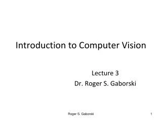
After Image, our 3 rd Alber’s Principle & Overtones…. continued exploration with Complementary Colors. AFTER IMAGE. After Image : occurs when eye grows tired of a given hue and spontaneously creates the complementary hue as a result. -------- AKA successive contrasts.

E N D
After Image, our 3rd Alber’s Principle & Overtones… continued exploration with Complementary Colors
After Image: occurs when eye grows tired of a given hue and spontaneously creates the complementary hue as a result. --------AKA successive contrasts
ALBERS’ COLOR RELATIVITY: The 3 Principles of Color Interaction 1. Light/Dark Value Contrast 2. Subtraction 3. Complementary Reaction or Effect
ALBERS’ COLOR RELATIVITY: The 3 Principles of Color Interaction 3. Complementary Reaction or Effect
Principle 3:COMPLEMENTARY REACTION OR EFFECTOur eye “seeks” the complement of any given color. For example, you’re staring at a red stop sign for a long period of time…your RGB photoreceptors grow tired, namely the R-receptor. Therefore, G-receptor comes to the rescue and “appears” to give the R-receptor a break.
Revisit #2 SUBTRACTION 1st then add Complementary Reaction….
How is subtraction at work in the previous slide? the small YO on a large Orange ground seems less orange, because the Orange (within YO) subtracts itself from YO (it’s absorbed by larger Orange color field) making it appear more Yellow.
What about SUBTRACTION here? And COMPLEMENTARY REACTION?
Describe the color interaction you see at work here: (name the principle (s)
Exercise: • Practice: Complementary Reaction/Effect: • Make 1 Color look like 2 • (TIP: begin by playing with complementary colors as grounds) • & • Make 2 Colors look like 1 • (TIP: begin by choosing 2 colors that look very similar, but have • Different amounts of one color type. For example, 2 pinkish-violets, but • one has more BLUE overtones, while the other has more RED overtones ) • When you have a match, then get creative. • The next 2 slides are high school student work, • So up the ante with your cut-outs . . .
The 2 colors being studied below are both a pinkish-violet(see upper centered rectangles)…but the LAVENDER rectangle at center right has more BLUE in it, while the MAUVE rectangle at center left has more RED in it. Therefore, the LAVENDER-Pink must go on a more BLUE background, while the MAUVE-Pink must go on a more REDDISH background.
Another example of MAKE 2 LOOK LIKE 1 . . . The blue-green tint at center left has more blue than the one at center right which has more yellow and less blue.
Color Temperature Color Overtones
Olafur Eliasson The weather project 2003
Take Your Time One-way colour tunnel 2007
Alexander Calder Flamingo Eagle
Picasso’s Blue & Red Periods La Vie (1903)
Exercise: • In-Class Neutralized Painting Hans Hofman
Exercise: • Go over Color Overtone Chart • Quiz Review! • DUE NEXT WEEK: • -Color-Aid project: MAKE 2 LOOK LIKE 1 • -Color Overtone Chart in paint
If time….. Andy Goldsworthy: Rivers and Tides