Download
1 / 12
120 likes | 236 Views
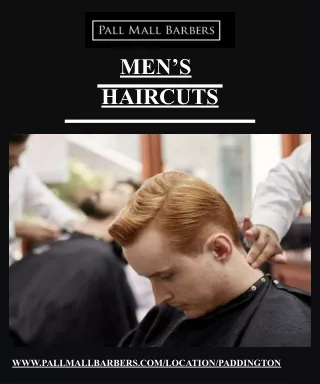
SLIQ RIQS HAIRCUT SALOON WEBSITE. Blake Bassett Alex Kotsores M.Obaid Khan. Purpose. The website serves as basic info about ‘Slick Riq’s hair cut saloon’. The owner wants picture galleries, appointments, and information about the saloon on the website. Original Web Site Design. Home Page >.

E N D
SLIQ RIQS HAIRCUTSALOON WEBSITE Blake Bassett Alex Kotsores M.Obaid Khan
Purpose • The website serves as basic info about ‘Slick Riq’s hair cut saloon’. • The owner wants picture galleries, appointments, and information about the saloon on the website.
Original Web Site Design Home Page >
Screen Shots Cont.. Image Gallery >
Users • Users of this website are Riq’s existing clients: • Who want to make appointments for different Hair related Services. • Browse around the picture galleries etc.
Findings from our Usability Testing • Original Website • Paper Prototype
Original Website • Existing navigation was confusing at times • Did not know where to go next • The navigational button seemed to be… • over-dominant • Distracted users from the main focus of the site • Had a Random Color Scheme • (e.g. felt the site resembled a rainbow)
Findings from our Usability Testing • Original Website • Paper Prototype
Paper Prototype • Existing navigation was confusing at times • Did not know where to go next • From paper prototype users saw that to many different columns confused • They did not know where to look next • Seemed to crunch in content
The Re-designed Website • A redesigned Vertical Navigation instead of the old Horizontal one. • Categorized and more Simplified Image Galleries • Current Navigation was found to be less confusing • According to past user tests
Usability Issues • We used CSS to create and make contrasting colors to separate the sub galleries from the normal main and most common links