Download

1 / 44
440 likes | 891 Views
Web Design Principles Joan Naturale NTID Reference Librarian Web Design Principles

E N D
Web Design Principles Joan Naturale NTID Reference Librarian
Web Design Principles • Set design for home page at 640 x 460 pixel rectangular area (standard browser window size). Think about designing all important elements within this rectangular space area. The page is wider than it is tall which is different from a book page design. • Keep design simple, clear and clean • Make good use of graphic elements to break up large text areas
Web Design Principles • Put credits, dates and unimportant details at the bottom of your page • No scrolling sideways or down to get to the navigation area • You want folks to visit your site. Put links on a separate page or at the bottom of your page • Avoid cluttering up the page with too much text or too many graphics • Align all elements properly
Web Design Principles • If there are a lot of graphics, create an alternative text only page • Every page looks like it belongs there with the use of repetitive elements • Avoid the use of a “splash” page. Visitors do not want to waste time • Page should look good on most browsers. Preview pages using different browsers
Web Design Principles • Include contact info, especially an e.mail address. You may also include your institution’s address, phone and/or fax number(s) and/or a feedback form • If there is a lot of content, break it up into separate pages. You can also use headings and anchors • Do not use more than 2 or 3 graphics on a page • Do not insert too many horizontal rules or bars across your page
Web Page Examples http://trfn.clpgh.org/About/bad/badexample4.htmlhttp://trfn.clpgh.org/About/trfnfaq.shtmlhttp://www.ocf.berkeley.edu/~chenj/brucelee/brucelee.html
Focal Point On Web Pages • You need something that draws your eye in and pulls you to the page • Focal point is usually a logo or image and it’s the dominating design. Helps to create a hierarchy of information • Logo text size is usually the biggest so make other text headings smaller in size. If it’s an image, reduce all other images in size. • Do not use large navigation buttons as the only source of interest • Create contrast in logo design by using different type (bold, size, style, color)
Navigation Design • Buttons and bars are easy to understand and use. The visitor knows what page they are visiting and where they are going • Consistent navigation design on all pages • Avoid navigation images where you have to roll your mouse over it to read the links • If your site is large, consider a site or index map
Navigation Web Page Examples http://www.sarahmclachlan.com/index2.htmlhttp://www.potlatchpaper.com/http://www.michaeldouglas.com/html/html/michael_douglas.html
Frames Design • Avoid using frames until you become more skilled at web design • If you use them, keep them unobtrusive. Don’t use borders • Do not use multiple frames or multiple scrolling bars • Do not use complicated frames • Avoid frames that make you scroll sideways
Frames Design • Frames are used as navigational aids • Use tables instead of frames • Can use frames for thumbnail images-portfolios
Frame Web Page Examples http://www.signenhancers.com/http://www.joelnakamura.com/http://wally.rit.edu/javawally/
Background Design • Use a background color that contrasts with the text and graphics • Use browser safe colors • Do not use busy, distracting, or weird backgrounds. Backgrounds are supposed to enhance your text and graphics. Backgrounds are unobtrusive and are not focal points • Do not use the default gray color • Avoid black backgrounds. Black backgrounds are suitable for remembrance sites or for skilled web designers
Background Web Page Examples http://www.users.nac.net/falken/annoying/backgrounds.html http://www.users.nac.net/falken/annoying/static_bg.htmhttp://members.tripod.com/~jamwired/bwd2.htm
Text Design Principles • Text size should not be smaller than 10 point. Do not ITALICIZE small text • Text size should not be bigger than 14 point. It’s hard to read whole phrases at a time and it looks unsophisticated • Use text color that contrasts with the background • Do not write text across the screen. Break up your text into columns. No more than 8-10 words • Sans-serif text is easier to read on the screen but serif text is easier to read in print. Arial and Verdana are good sans serif fonts
Text Design Principles • Avoid using a different color for each letter • Limit text colors to 2 or 3. • Do not use more than 2 type font styles • Align text on the left, not right. It’s hard to read right aligned text • Avoid centered text as each line starts in a different place and makes it hard to read
Text Design Principles • Avoid text crowding against the left edge of the page • If you need to change text design, change the type font, not size. • Avoid all CAPS, BOLD or ITALIC text. Use these to emphasize words. Don’t’ use these in paragraphs • Do not underline text if it’s not a link • Use the spell-checker for spelling errors
Text Web Page Examples http://trfn.clpgh.org/About/bad/badexample2.htmlhttp://www.infovillage.com/PatronSaints/McLuhan.html
Links Design • Underline links unless the links are an obvious contrasting color • Avoid “click here” links. Links should be clear where they will take the visitor • Avoid links that distract readers and take them to useless pages • Check links frequently
Links Design • Links should coordinate with the text and background color. • Avoid the blue default color • Use not use form buttons as links
Links Web Page Examples http://www.users.nac.net/falken/annoying/links.htmlhttp://wally.rit.edu/instruction/tree.html
Table Design Principles • Graphics, text and links can be put in tables for a neater effect • If you have many links, consider using a table • Tables can be used as sidebars • Tables are better than frames especially if you are a beginning web designer • Put different colors in cells for borders
Table and Column Web Page Examples http://wally.rit.edu/information/information.htmlhttp://wally.rit.edu/depts/ref/instruction/tutorial/engines.html
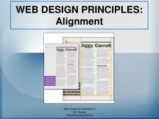
Alignment Design Principles • All items should be aligned with each other, especially headlines and text • Choose one alignment and stick with it (all left, all right, centered). Do not mix alignments • Left or right alignment looks more sophisticated • Links inside buttons or tables should be on same baseline for a neater and more organized appearance
Spacing and Proximity Principles • Cluster related items together. Grouped items are easier to read • Headlines or subheads should be close to the text it belongs with. Keep spacing consistent between elements. Use bold or different font style for headings • Paragraphs. Use either a space between them or indents. Do not use both • Good use of spacing creates a unified, organized layout with clear relationships between elements • Keep columns short. Do not force readers to scroll up and down to the next column.
Repetition Design Principles • Repeat elements that tie all of your web pages to unify your site • Use consistent navigation, buttons, colors, text, layout, format and typography throughout your pages • Use colors from sidebar and logo for headings or important words
Web Page Examples http://www.puebloharvest.com/http://www.sarahlovett.com/
Graphic Design Principles • Buttons are small and used for links, not decoration • Have ALT tags for blind and text based browser users • Keep graphic size small and use height/width pixel tags for faster downloading • Graphics relate to your pages. Don’t use meaningless graphics
Graphic Design Principles • If you use graphics as links, create text links • Avoid using boxes around graphics • Consider using thumbnail images and a Javascript link to view the whole image • Save JPEG (photo images) to lowest quality/highest compression
Graphics Design Principles • Right or left aligned graphics are not wider than 400 pixels • Avoid use of Flash • Avoid “missing” graphics • Avoid using graphics as text. Takes up space and search engines can’t search graphics for text
Graphic Web Page Examples http://trfn.clpgh.org/About/bad/badexample6.htmlhttp://trfn.clpgh.org/About/bad/goodexample6.html
Flash Web Example http://www.users.nac.net/falken/annoying/flash.htm
Junk On Web Pages • Spinning logos • 3D logo graphics • Blinking text or images • Rainbow, animated or blinking rules • Scrolling text
Junk on Web Pages • E.mail animation • Running animation that never stops • “Under Construction” signs • Counters • Advertising (separate page) • Awards (separate page)
Junk On Web Pages • Cute pictures like smiley faces • Guestbooks • Pop - Up window ads • Plug-Ins. If you web page requires plug-ins, create alternative pages for those who don’t have the plug-ins and don’t want to download them • Specifying browser, pixel width, font size and type default in order to view pages
Animated GIFs Web Page Example http://www.users.nac.net/falken/annoying/ani_gif.html
Bars Web Page Example http://www.users.nac.net/falken/annoying/bars.html
Java Web Page Examples Fade In http://www.users.nac.net/falken/annoying/java/fade.html Java Cube http://www.montcopa.org/da/cube.htm
Counter Web Example http://www.users.nac.net/falken/annoying/counters.htm
Browser Specifications Example http://www.users.nac.net/falken/annoying/browspec.htm
Bad Web Pages Examples http://www.artcenter.edu/http://trfn.clpgh.org/About/bad/badquiz.html
Good Web Pages Examples http://wally.rit.edu/http://www.rit.edu/~624www/fipse/http://ntidweb.rit.edu/
Educational Resources Examples of Web Courses • Ideas in English • Making a Difference • NetS@vvy Career Exploration Tutorial • Information Literacy Tutorial-Virgil • Search Engines Practice Module
Deaf Resources • Deaf Subject Page at RIT Library • Deaf Internet Resources • Education Subject Page • Education Internet Resources