Download
1 / 9
90 likes | 273 Views
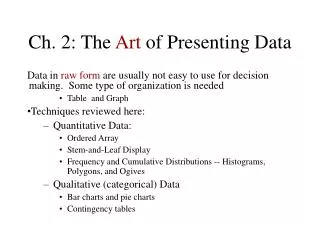
Ch. 2: The Art of Presenting Data. Data in raw form are usually not easy to use for decision making. Some type of organization is needed Table and Graph Techniques reviewed here: Quantitative Data: Ordered Array Stem-and-Leaf Display

E N D
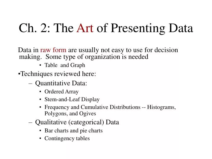
Ch. 2: The Art of Presenting Data Data in raw form are usually not easy to use for decision making. Some type oforganizationis needed • Table and Graph • Techniques reviewed here: • Quantitative Data: • Ordered Array • Stem-and-Leaf Display • Frequency and Cumulative Distributions -- Histograms, Polygons, and Ogives • Qualitative (categorical) Data • Bar charts and pie charts • Contingency tables
The Art of Presentation, Con’t • The Ordered Array – Sort data from min. to max. • Provides some signals about variability within the range • May help identify outliers (unusual observations) • If the data set is large, the ordered array is less useful. • Then, we need a simple way to see the distribution details of the data set.
Stem-and-Leaf Diagram • METHOD: Separate the sorted data series into leading digits (the stem) and the trailing digits (theleaves) • Example: • What are the values of the 1st and the 8th observations? • What the Minimum, maximum values? • Are values concentrated? • What is the range? • What if the data set is too large even for stem-and- leaf display?
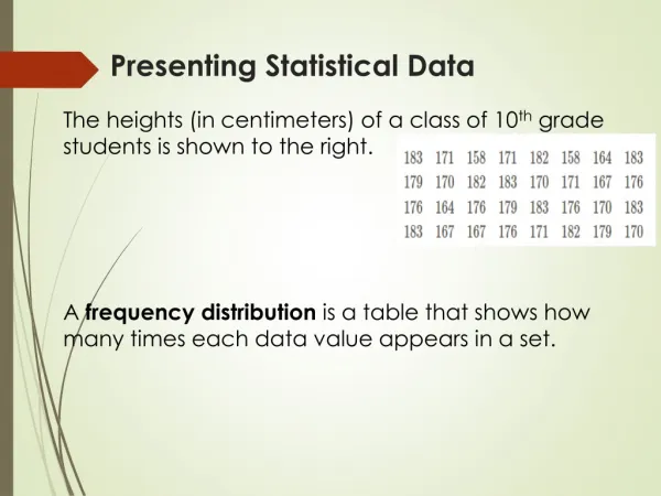
Frequency Distributions What is a Frequency Distribution? • A frequency distribution is a way to condense data into a more useful form. It allows for for a quick visual interpretation of the data. • A frequency distribution is a a table or graph containing nonoverlapping class groupings (categories or ranges within which the data fall) and the corresponding frequencies with which data fall within each grouping or category
How to Built a Frequency Distribution, Table • Sort raw data in ascending order • Find the range • Select number of desired classes • Create class grouping (intervals) of the same width • Determine the width of each interval by • Use at least 5 but no more than 15 groupings • Round up the interval width to get desirable boundaries • Compute class midpoints • Count observations and assign to classes
How to Built a Frequency Distribution, Graphs • A graph of the data in a frequency distribution is called a histogram • The class boundaries, Bins, (or class midpoints) are shown on the horizontal axis • the vertical axis is eitherfrequency, relative frequency, or percentage • Bars of the appropriate heights are used to represent the number of observations within each class • A graph of the height of frequencies at midpoint values is calledPolygon– good for comparing two or more distributions • A graph of Cumulative Frequencies is called Ogive
Presentation of Qualitative Data • One variable: • Bar charts and Pie charts -- are often used for qualitative (category) data. Height of bar or size of pie slice shows the frequency or percentage for each category • Pareto Diagram – are used to portray categorical data – See page 71. • It is a bar chart, where categories are shown in descending order of frequency • A cumulative polygon is often shown in the same graph • Used to separate the “vital few” from the “trivial many”
Presentation of Qualitative Data • Two or More Variables: Multivariate Categorical Data can be presented by a Contingency Table. • Individual values could be expressed as absolute values, percentages of the overall total, percentages of the row totals, or percentages of the column totals
Scatter Diagram Scatter Diagrams are used for bivariate numerical (quantitative) data • Bivariate data consists of paired observations taken from two numerical variables • one variable is measured on the vertical axis and the other variable is measured on the horizontal axis • This is a graph of the relationship between two variables and does not necessarily means causality