Download
1 / 14
140 likes | 452 Views
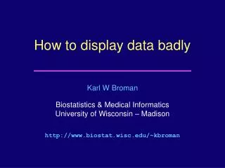
How to display data badly. Karl W Broman Department of Biostatistics http://www.biostat.jhsph.edu/~kbroman. Using Microsoft Excel to obscure your data and annoy your readers. Karl W Broman Department of Biostatistics http://www.biostat.jhsph.edu/~kbroman. Inspiration.

E N D
How to display data badly Karl W Broman Department of Biostatistics http://www.biostat.jhsph.edu/~kbroman
Using Microsoft Excel to obscure your data and annoy your readers Karl W Broman Department of Biostatistics http://www.biostat.jhsph.edu/~kbroman
Inspiration This lecture was inspired by H Wainer (1984) How to display data badly. American Statistician 38(2):137-147 Dr. Wainer was the first to elucidate the principles of the bad display of data. The now widespread use of Microsoft Excel has resulted in remarkable advances in the field.
General principles The aim of good data graphics: Display data accurately and clearly. Some rules for displaying data badly: • Display as little information as possible. • Obscure what you do show (with chart junk). • Use pseudo-3d and color gratuitously. • Make a pie chart (preferably in color and 3d). • Use a poorly chosen scale. • Ignore sig figs.
Example 2 Distribution of genotypes AA 21% AB 48% BB 22% missing 9%
Displaying data well • Be accurate and clear. • Let the data speak. • Show as much information as possible, taking care not to obscure the message. • Science not sales. • Avoid unnecessary frills — esp. gratuitous 3d. • In tables, every digit should be meaningful. Don’t drop ending 0’s.
Further reading • ER Tufte (1983) The visual display of quantitative information. Graphics Press. • ER Tufte (1990) Envisioning information. Graphics Press. • ER Tufte (1997) Visual explanations. Graphics Press. • WS Cleveland (1993) Visualizing data. Hobart Press. • WS Cleveland (1994) The elements of graphing data. CRC Press.