Download
1 / 1
20 likes | 174 Views
What : Data Explain what large means using the Agilent high through-put instrument data, and Google keynote study clickstream data Explain that the data sets are not only large, but growing due to the relative ease in data collection

E N D
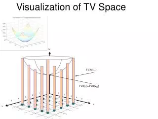
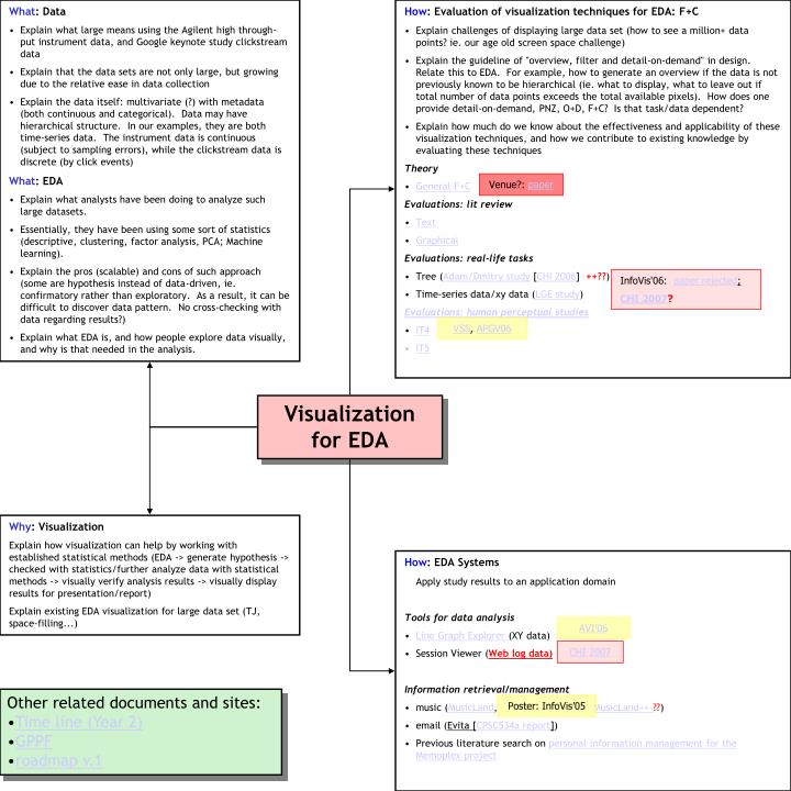
What: Data • Explain what large means using the Agilent high through-put instrument data, and Google keynote study clickstream data • Explain that the data sets are not only large, but growing due to the relative ease in data collection • Explain the data itself: multivariate (?) with metadata (both continuous and categorical). Data may have hierarchical structure. In our examples, they are both time-series data. The instrument data is continuous (subject to sampling errors), while the clickstream data is discrete (by click events) • What: EDA • Explain what analysts have been doing to analyze such large datasets. • Essentially, they have been using some sort of statistics (descriptive, clustering, factor analysis, PCA; Machine learning). • Explain the pros (scalable) and cons of such approach (some are hypothesis instead of data-driven, ie. confirmatory rather than exploratory. As a result, it can be difficult to discover data pattern. No cross-checking with data regarding results?) • Explain what EDA is, and how people explore data visually, and why is that needed in the analysis. • How: Evaluation of visualization techniques for EDA: F+C • Explain challenges of displaying large data set (how to see a million+ data points? ie. our age old screen space challenge) • Explain the guideline of "overview, filter and detail-on-demand" in design. Relate this to EDA. For example, how to generate an overview if the data is not previously known to be hierarchical (ie. what to display, what to leave out if total number of data points exceeds the total available pixels). How does one provide detail-on-demand, PNZ, O+D, F+C? Is that task/data dependent? • Explain how much do we know about the effectiveness and applicability of these visualization techniques, and how we contribute to existing knowledge by evaluating these techniques • Theory • General F+C • Evaluations: lit review • Text • Graphical • Evaluations: real-life tasks • Tree (Adam/Dmitry study [CHI 2006] ++??) • Time-series data/xy data (LGE study) • Evaluations: human perceptual studies • IT4 • IT5 Venue?: paper InfoVis'06: paper rejected; CHI 2007? VSS, APGV06 Visualization for EDA Why: Visualization Explain how visualization can help by working with established statistical methods (EDA -> generate hypothesis -> checked with statistics/further analyze data with statistical methods -> visually verify analysis results -> visually display results for presentation/report) Explain existing EDA visualization for large data set (TJ, space-filling...) • How: EDA Systems • Apply study results to an application domain • Tools for data analysis • Line Graph Explorer (XY data) • Session Viewer (Web log data) • Information retrieval/management • music (MusicLand, MusicLand++ ??) • email (Evita [CPSC534a report]) • Previous literature search on personal information management for the Memoplex project AVI’06 CHI 2007 • Other related documents and sites: • Time line (Year 2) • GPPF • roadmap v.1 Poster: InfoVis’05