Download

1 / 6
70 likes | 181 Views
Poster Conventions, analysis and research . T itles.

E N D
Poster Conventions,analysis and research
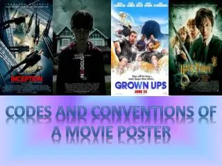
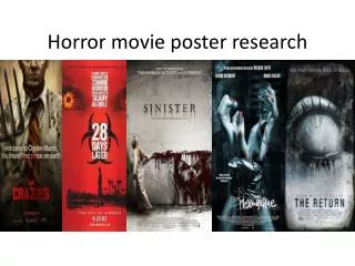
Titles When looking at titles on a poster you have to make sure that you pick a title that catches the attention of the viewer over the image you have decided to pick. When someone looks at a film poster the title is the most important thing you want them to see, so you have to make sure you pick a title that is easily readable but yet stands out so that even if they only take a quick look at the poster they come away with the name of the film. As you can see from these of these examples of film posters they use very bright coloured Fonts which grab your attention when you first look at them, which is effective because you come away mainly with the name of the film.
Image Another important convention of a film poster is picking the right image to place on the poster, picking the right image is important because if you pick an interesting image its going to make the viewer want to see the film. But you need to me careful that the image does not give away to much of the film but gives them enough so they feel like they want to see it. Also like the font it has to be something that will draw people to it, for example using bright colours or something bold. As you can see from these three examples they all have very eye catching images which get your attention very well, all there have many things going on which I believe makes an effective poster because it makes me want to see what is going on.
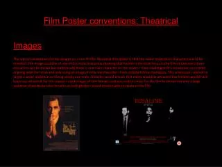
Fonts When picking the font to use on your poster you have to make sure that firstly it is easily readable so that the viewer can take information away from it easily. Also you have to think about sizing because you don't want it to be to big otherwise it could overpower the image or the title of the film. And the information you want them to take away from the posters you would usually make either a bigger size or bolder so that it stands out. As you can see from This example they Have made the font White so that it stand Out well from the Background colour Which means that it is a lot easier to read, also making the important information in capitals to makes it easier to read, which is important. As you can see in this example above, even though there is very minimal text, you can see that they have used the same sort of font for the release date as the title which I think is effective to keep the whole theme of the film together.
Information Given Another important convention is the information you decided to give on away on the poster the obvious ones are things such as: • Release date – So they know exactly when they will be able to see the film • Where its being released – So they know where they can go and see it • Producers – which can bring in more potential viewers because they may be interested in this certain producers work. • Actors – Which can also bring in more viewers due to fans of the actors. They will usually give you the release date somewhere on the poster, usually in either a bright colour or a bold font so that it is eye catching. dark_knight_ver5.html : as you can see on this link they give you a lot of information about the film such as actors and producers etc, but they have done it a very effective way by firstly using a white font which contrasts with the greyish black background and also if you look at the names of the actors they have put their second names in capitals so that you concentrate on the second names so you can easily see who is in the film.
Where to advertise? Once you have produced your poster, it is just as important to find out the most effective place to advertise your poster so that you can bring in the most viewers. It is very important to advertise your film poster in places in which your target audience will see it. Lets say our target audience were teenagers, we would most probably advertise our posters in places such as: • Town centres – outside certain shops • Bus stops • Near schools and colleges • In public places which are popular with teens – beach, parks and sport facilities