Download
1 / 17
190 likes | 250 Views
Organizing and Summarizing Data. Chapter 2.1, 2.2. Frequency Table Frequency Distribution:. List of each category of data and the number of occurrences for each category Frequency – number of occurrences Usually contains a column with running tally of occurrences as the are counted

E N D
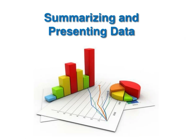
Organizing and Summarizing Data Chapter 2.1, 2.2
Frequency Table Frequency Distribution: • List of each category of data and the number of occurrences for each category • Frequency – number of occurrences • Usually contains a column with running tally of occurrences as the are counted • Interval – is used when grouping quantitative data (also called classes)
Bar graphs; side by side graphs • Used to compare more than one type of data at the same time.
Histogram • A bar graph of a set of data, constructed from a frequency table. • The bars are touching (no gap). • If the interval (x-axis) does not start at zero, leave a break before you make the first bar. • The frequencies (y-axis) are depicted by the height of a rectangular bars located above the corresponding interval.
(1) Let’s Make a Freq. Histogram: Using the following list of test scores with 5 classes: 91,87,89,76,84,92,87,88,78,81,89,92,93,86,97 • Find the range: 97-76 = 21 • Divide the range by 5; 21/5 = 4.2 round up to 5, thus each interval will go up by 5. • Create your table with intervals, starting at the first data value of 76. Add 5 to 76 making your next interval. • Tally the occurrences of each interval
Cumulative Histogram • Cumulative frequency is the running total of the frequencies. (Add frequencies) • Rectangular bars getting bigger as you move to the right.
Pie Chart or Circle Graph • Circle graph: A graph representing parts of a whole as sectors (pie pieces) of a circle. • Circle totals 360 degrees of measure. • Proportions can be created to determine values of the pie pieces or percentages.
(2) Create a Pie Chart: Using the following amounts spent on books this semester: Statistics: $138 English 101: $94 Bowling: $32 Psychology: $72 Greek Mythology: $48 • Find the total amount spent. • Determine the percent spent on each (percent must equal 100) 3) Find the angle measure associated with each.
Stem and Leaf Plots • The leaf is the digit in the place farthest to the right in the number, and the stem is the digit, or digits, in the number that remain when the leaf is dropped. • To show a one-digit number (such as 9) using a stem-and-leaf plot, use a stem of 0 and a leaf of 9. • To find the median in a stem-and-leaf plot, count off half the total number of leaves.
(3) Construct a stem and leaf plot: - From the following list of data: 10, 18, 12, 22, 43, 23, 11, 51, 16, 27, 11, 44, 32, 29, 30, 26, 14, 46, 11, 19, 24, 36, 40, 31, 25 - See board…
Construct a stem and leaf plot: • College students spent the following amounts of money on textbooks for one semester.$101, $107, $121, $90, $89, $101, $98, $110, $115, $85, $95, $109, $109, $110, $109, $114 • Find the median from the plot.