Download
1 / 12
120 likes | 136 Views
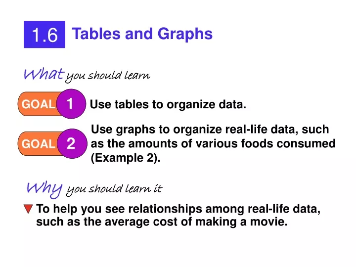
1.6. Tables and Graphs. 1. 2. GOAL. GOAL. Use tables to organize data. Use graphs to organize real-life data, such as the amounts of various foods consumed (Example 2). To help you see relationships among real-life data, such as the average cost of making a movie. What you should learn.

E N D
1.6 Tables and Graphs 1 2 GOAL GOAL Use tables to organize data. Use graphs to organize real-life data, such as the amounts of various foods consumed (Example 2). To help you see relationships among real-life data, such as the average cost of making a movie. Whatyou should learn Why you should learn it
1.6 Tables and Graphs USING TABLES TO ORGANIZE DATA 1 GOAL EXAMPLE 1 Remember: A table is just one way to organize data. We need to organize it to make it easier to understand.
Extra Example 1 The data in the table represents the number of worldwide shipments of personal computers, in millions. During which 2-year period did the number of shipments increase the most? Solution: Find the difference in each 2-year period. The greatest increase in shipments occurred from 1996-1998.
1.6 Tables and Graphs 2 USING GRAPHS TO ORGANIZE DATA GOAL EXAMPLE 2 BAR GRAPHS—The bars may be either vertical or horizontal. LINE GRAPHS—Connect the data points with straight lines; do not draw curves.
Extra Example 2 A graph for the data in Extra Example 1 is shown. Is the graph misleading? Explain. The bar graph is not misleading since the vertical scale is consistent.
Drawing Graphs All graphs need: 1. Title 2. Axis labels 3. Appropriate scale Does it go beyond the largest number? Does it show the differences in data? 4. Consistent scale 5. Neatness
Checkpoint The data in the table represents the number of households in the U.S. in millions. • During which 10-year period did the number of households increase the most? 1970 to 1980 b. Draw a bar graph to represent the data.
TITLE SCALE SCALE LABELS EXAMPLE 3 Checkpoint (cont.)
Extra Example 3 The data in the table represents the number of people over age 65 in the U.S. in millions. • Draw a line graph.
Extra Example 3 (cont.) b. During which 10-yr period was there the least increase? Answer: from 1960 – 1970. Think: How does the bar graph show the answer to this question? The steeper the line, the greater the difference between the points.
Checkpoint a. Draw a line graph for the data in Extra Example 1. b. During which two-year period did the number of shipments increase the least? 1990-1992