Download
1 / 32
320 likes | 426 Views
Explore the analysis functionality of Phenom-Networks with a dataset from Dani Zamir’s lab. Learn to conduct statistical analysis, study comparison, correlations, and pedigree analysis on the "Tomatoes" database.

E N D
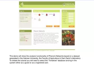
This demo will show the analysis functionality of Phenom-Networks based on a dataset generated in the Hebrew University, the Faculty of Agriculture in Dani Zamir’s laboratory. To initiate the tutorial you will need to select the “Tomatoes”database and log in the system either as a guest or as a registered user.
Phenotype -> analysis After you log in, go to “Phenotype -> analysis”. This is the main analysis page of the system which allows the user to perform statistical analysis of the data. The analysis options appear on the left side, organized into categories like “univariate”, “multivariate” and so on. In the middle, there is a table that lists all traits and on the right there are fields (which depend on the selected analysis) that will contain the traits that will be analyzed. The toolbar includes filtering possibilities to subset the data as well as other options.
1) Studies filter button 2) Select folder 3) OK Click on “studies filter” will open the study window from which I select the “M82-pennellii ILs” folder.
1) Factors filter button 2) Select the factor “linkage group”. 3) Select “in” operator 4) Select one of the chromosomes 5) Add condition In this example I’ll compare genotype’s among studies. First I’ll subset the dataset using the “factors filter” button (this is not mandatory for the analysis – I’m doing it so I wont get so big figure). I’ll select only genotypes that have introgression on chromosome 8 (linkage group factor is 8).
2) Enter “yield” and press “search trait” 3) Put “total yield” into the “Y Variables”, and “germplasm identification” in “X Variables”. 1) Study comparison -> bars 4) OK Now I select the “bars” analysis under the “study comparison” category. Next I put the trait “total yield” in the “Y Variables” field.
This is a genotype that shows reduced yield in all studies This is a genotype that shows reduced yield in all studies This one has increased yield in most of the studies The figure shows the average yield of the selected genotypes in all available studies. Each study is represented in different bar color. Units are normalized per study’s mean.
Group by: Y Here I repeat this analysis, but this time check the “Y” option in the “Group by” category (on the right side).
The figure now is grouped by studies (see X axis), and each colored bar represents different genotype.
1) Disable factors filter 2) Split by factor 4) Gropp by X 3) Add “linkage group” to the “By” field. Here I invoke this analysis again, but this time I disable the factors filter (so the analysis is done on the entire data). In addition, I split the results by the “linkage group” factor.
Genotypes of linkage group 1 Genotypes of linkage group 10 Now we’ll get a figure for each level of “linkage group” factor (12 levels according to 12 linkage groups in tomato).
2) “total yield” is the trait we want to correlate 3) We want to color the data point according the “il homozygosity” factor (homozygous / heterozygous) 1) Study comparison->correlations This example will show how to correlate a trait among all studies (only in cases were this trait was measured in more than a single study on the same set of genotypes). First I select the “Correlation” option under “study comparison” category. Next I put “total yield” in the “Y Variables” and “IL homozigosity” factor to the “color by” field. Then press OK.
In the diagonal we can see all studies where “total yield” was measured. And for each pair of studies, the correlation plot and correlation parameters appear on the corresponding squares. The coloring of the points (red/blue) represents the homozygosity of the genotype (in some studies only homozygous genotypes included and thus only blue points appear).
1) Split by: factor 2) Put “IL homozygosity” in “By” field. Here I redo the analysis, but this time I put the “IL homozygosity” in the “By” field (first I need to choose: split by = factor).
This will yield two figures: one for homozygous and another for heterozygous genotypes.
1) Click on “studies filter” button 2) Select folder In this example I will show pedigree analysis. First lets select the “Neorickii BILs” directory from the “studies filter” popup window.
I’ll select the “phenotype overlay” analysis under the “pedigree” category. Lets put the trait Brix in the “Y Variables”, and press OK.
For example, let click on this circle This is the pedigree figure where each circle represents a genotype and its color indicate its Brix measurement red is high, green is low and black is average. Orange line represents one generation progress where orange line indicates self fertilization and green is cross (so it needs to have two parents). You can point the mouse on each circle to view its name and you click on it to zoom in.
This is the genotype that we clicked on in the previous figure. This gives a subset of the pedigree.
Here I’ll do analysis of nominal traits. Let’s select the “akko 200 NEO” study under “Neorickii BILs”.
Here I’ll do analysis of nominal traits. Let’s select the “akko 2000 NEO” study under “Neorickii BILs”. Now choose the “Moasic” analysis under “nominal variates”, and put (for example) “Evaluation” as “Y” and “fruit cover” as “X”. Note that you can only put nominal (red icon) or ordinal (green icon) variates into the X and Y fields. Now press OK.
There 13 instances that got score of “3” for fruit cover and “1” for evaluation. Let’s click on this square Squares without a number indicate that there are less than 6 instances in that category The figure shows a contingency plot of the two traits. Each square shows the number of genotypes that scored the corresponding values of both traits. For example, there were 13 genotypes that scored 3 for “fruit cover” trait and “1” for evaluation. The fact that its colored pink indicate that this category is less than what you would expect by chance. Green squares indicate that its more that what you would get by chance alone. you can click on each square to see the actual instances in it. Let click on the pink square, for example.
We get a list of all genotypes that have fruit cover: “3” and evaluation: “1”. You can click on each genotype’s name to go to its details page.
Download as Excel Create and save germplam set for further manipulation At the bottom of the page, you can download results as an Excel table, or create a germplasm set, that is based on this list.
Here I select “association” analysis , which is equivalent to the “Mosaic”, except that the figure is a little bit different.
This is the results of association analysis. This is analysis is equivalent to mosaic, except that the figure looks a little bit different.
The “frequencies” analysis is similar to the distribution, only that it analyzes only nominal (red icon) and ordinal (grenn icon) traits and not continuous (blue icon).
A click on each of the categories will give an output that depends on the radio button (pedigree or search results). Here is the result of the “frequencies” analysis. You can click on each bar to view the pedigree or a search results (depending on the radio button at the top).
This is the list results output if you click on category 3 (and check the “search results” radio option).
Phenotype->Search This is the search page. It is used to search germplasm based on their measured traits. The first step here is to select study or studies that you want to work with from the left panel.
Here I selected the study “akko 2000 NEO” and then clicked on “evaluation” and “brix” traits. For evaluation, I get a list of possible scores because it is an ordinal trait. For brix, I get a range search option. This current query can be interpreted as: search for germplasm that their evaluation score was 3, 4 or 5 and their brix is between 5 to 10.8.