Download
1 / 88
880 likes | 902 Views
R 的版面配置與繪圖. 1. R 附加圖形應用與 3D 繪圖. 2. 3. ggplot2 套組的繪圖功能. 4. R 的版面配置與繪圖功能. 程式迴圈繪圖. R 的版面配置與繪圖功能. 圖形的版面配置 、 圖形 設定參數 、 散佈圖 、 函數曲線 、 矩陣圖 、 條件散佈圖 、 常態機率圖 、 直方圖 、 長條圖 、 盒狀圖 、 圓餅圖 、 3D 繪圖 、 附加圖形應用 、 進階 3 D 繪圖 、 程式迴圈 繪圖 、 ggplot2. 圖形區域的版面配置.

E N D
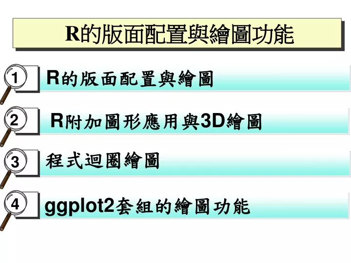
R的版面配置與繪圖 1 R附加圖形應用與3D繪圖 2 3 ggplot2套組的繪圖功能 4 R的版面配置與繪圖功能 程式迴圈繪圖
R的版面配置與繪圖功能 圖形的版面配置、圖形設定參數、散佈圖、函數曲線、矩陣圖、條件散佈圖、常態機率圖、直方圖、長條圖、盒狀圖、圓餅圖、3D繪圖、附加圖形應用、進階3D繪圖、程式迴圈繪圖 、ggplot2
圖形區域的版面配置 • R最具特色的功能之一就是繪圖功能,一般是一張紙畫一個圖形,但R可以將多張圖形放在同一張紙,但事先最好先儲存一張圖的原始設定,如oldpar=par(),之後再以指令par(oldpar)恢復原設定一張紙一個圖,方式包括以下三種: • par函數搭配mfrow或參數mfcol參數: 適合規則形狀的多張圖形分布 • layout函數:適合不規則的多張圖形分布 • par函數搭配fig參數: 適合不規則的多張圖形分布
par()函數搭配mfrow參數 • 適合規則形狀的多張圖形分布,例如 par(mai=c(0.5,0.5,0.5,0.5),mfrow=c(3,2)) • mai設定紙張邊緣(英吋) 依序是底部、左邊、頂端、右邊,mfcol是逐欄,mfrow是逐列排列 • 將babies.txt依年齡分為6組(~20、20-25、25-30、30-35、35-40、40~)畫6個height和weight的散佈圖
多張規則圖形的程式碼 • babies=read.table(“d:/R/babies.txt”,header=T) • grp1=subset(babies,age<20) • grp2=subset(babies,age>=20 & age<25) • grp3=subset(babies,age>=25 & age<30) • grp4=subset(babies,age>=30 & age<35) • grp5=subset(babies,age>=35 & age<40) • grp6=subset(babies,age>=40) • #oldpar=par() • par(mai=c(0.5,0.5,0.5,0.5),mfrow=c(3,2)) #by rows • plot(grp1[,"height"],grp1[,"weight"]) #plot(x,y) x y are vectors • plot(grp2[,"height"],grp2[,"weight"]) • plot(grp3[,"height"],grp3[,"weight"]) • plot(grp4[,"height"],grp4[,"weight"]) • plot(grp5[,5],grp5[,6]) • plot(grp6$height,grp6$weight) • #par(oldpar)
layout函數:不規則的多個圖形 • layout(M,widths,heights) • M是圖形分佈的矩陣,widths、heights各是設定M矩陣長、寬的比例,其基準點是左下角 • 上圖的指令為2x2矩陣layout(matrix(c(1,1,2,3),2,2, byrow=T)) • 下圖的指令為2x2矩陣 • layout(matrix(c(2,0,1,3),2,2, byrow=T), widths=c(3,1), heights=c(1,3))
layout函數的程式碼 • attach(iris) • layout(matrix(c(2,0,1,3),2,2, byrow=T), widths=c(2,1), heights=c(1,2)) • plot(Sepal.Length,Sepal.Width,main="Sepal Length-Width Scatter Graph") • hist(Sepal.Length,main="Sepal Length Histogram Graph") • hist(Sepal.Width,main="Sepal Width Histogram Graph")
par函數搭配fig參數 • par(fig=c(x1,x2,y1,y2)) • par(fig=c(0,0.8,0.7,1)) 大約是圖2的版面位置, 左下角座標(x1,y1)是(0,0.7) ,右上角座標(x2,y2)則是(0.8,1) (0,1) (1,1) (1,0) (0,0)
par函數搭配fig參數程式碼 • attach(iris) • par(fig=c(0,0.6,0,0.6),new=TRUE) • plot(Sepal.Length,Sepal.Width,main="Sepal Length-Width Scatter Graph") • par(fig=c(0,0.6,0.6,1),new=TRUE) • hist(Sepal.Length,main="Sepal Length Histogram Graph") • par(fig=c(0.6,1,0,0.6),new=TRUE) • hist(Sepal.Width,main="Sepal Width Histogram Graph")
圖形基本設定參數 • col=k : 設定color,可用在col.axis、col.lab、col.main、col.sub,設定座標軸、X與Y軸、主標題、附標題的顏色,可以colors()查到顏色名稱 • lty=k : line type , k=1為實線 • lwd=k : line width , k為標準線寬的倍數 • pch=k或”圖點符號”,預設為圓點, k=0~20 • font=k :設定字體,1一般字體、2粗體、3斜體、4粗斜體,可用在font.axis、font.lab、font.main、font.sub • cex=k : 設定字型的倍數(可為小數),可用在cex.axis、cex.lab、cex.main、cex.sub
plot散佈圖、長條圖、盒狀圖 >plot(Species) >plot(Sepal.Length,Sepal.Width) >plot(Species,Sepal.Length) >plot(iris)或 pairs(iris) >plot(~Sepal.Length+ Petal.Length+Petal.Width) >plot(Sepal.Length)
curve 函數曲線 curve(x^2-4*x+3,-4,4,lty=2,add=T) curve(sin(x),-4,4)
pair矩陣圖 >pair(iris)
coplot條件散佈圖(加 ,rows=1) > coplot(Sepal.Length~Petal.Length | Species)
常態機率圖qqnorm qqline、qqplot qqplot(Sepal.Length,Sepal.Width) qqnorm(Sepal.Length)+ qqline(Sepal.Length)最佳線
直方圖hist hist(Sepal.Length,breaks=4:8) hist(Sepal.Length,nclass=8)
bar plot長條圖 • cancers=c(11,16,17,6,12) • labels=c("乳癌","支氣管癌","結腸癌","卵巢癌","胃癌") • barplot(cancers) • barplot(cancers,names=labels) • barplot(cancers,names=labels,horiz=T) • barplot(cancers,names=labels,col=c(1,2,3,4,5)) • barplot(cancers,names=labels,col=c(1,2,3,4,5),density=10) • barplot(cancers,names=labels,col=c(1,2,3,4,5),density=40)
boxplot盒狀圖 • boxplot(iris[,1],xlab="SLen",main="(F1)") • boxplot(iris[,1:4],main="(F2)") • boxplot(iris[,1:4],main="(F3)",names=c("Slen","Swid","Plen","Pwid")) • boxplot(iris[,1:4],main="(F4)",horizontal=T) • boxplot(iris[,4]~iris[,5],main="(F5)",xlab="flower class",ylab="Slen") • boxplot(Sepal.Length~Species,data=iris,main="(F6)",xlab="flower class",ylab="Slen“ ,col=c(2,3,4))
sales=c(0.12,0.3,0.26,0.16,0.04, 0.12) snames=c("電腦","廚具","家電","傢俱","其他","服飾") pie(sales, label= snames) Pie圓餅圖
3D繪圖contour 、image 、persp • contour(x,y,z):畫出地圖效果的等高線圖 • image(x,y,z):類似於contour,但可畫出色彩 • persp(x,y,z,theta,phi,box=TRUE):畫出真正的三度空間透視圖,theta控制圖形上下旋轉角度,phi控制圖形左右旋轉角度,box=TRUE則不畫出框線 • >demo(graphics) #展示繪圖功能 • 等高線圖>filled.contour(volcano,color=terrain.colors,plot.axes=contour(volcano,add=TRUE))
3D繪圖contour 、image 、persp • x=seq(-3,3,0.1) • y=x • f=function(x,y){(1/(2*pi))*exp(-0.5*(x^2+y^2))} • z=outer(x,y,f) #外積函數outer • par(mfcol=c(2,2)) • contour(x,y,z) • image(x,y,z) • persp(x,y,z) • persp(x,y,z,theta=30,phi=30,box=F, main= "persp theta=30 phi=30")
繪圖函數的共用輔助參數 • main=“” 、 sub=“” 、xlab=“” 、ylab=“” • xlim=c(xmin,xmax) 、 ylim=c(0,30) • add=TRUE #覆蓋前一張圖 • axes=FALSE #不畫出座標軸 • xaxt=“n” yaxt=“n” #不畫出座標軸格線 • right=FALSE #即右邊為開放區間 < • log=“x”、 log=“y”、 log=“xy” • type=“p”:points only 、type=“l”:lines only • type=“b”:points and lines、 type=“o”:overlap • type=“s”:steps 、type=“h”:height
plot圖點樣式 x=rnorm(10,0,1) >plot(x,type=“p”) >plot(x,type=“l”) >plot(x,type=“b”) >plot(x,type=“o”) >plot(x,type=“h”) >plot(x,type=“s”)
height=sample(150:190, 30,replace=TRUE) score=sample(c(60:100), 30,replace=TRUE) xp=c(160,165,170,175) yp=c(80,90,80,90) plot(height,score) points(xp,yp,col=2, pch=19) lines(xp,yp,col=3) text(xp,yp+5,col=4, label=c("P1","P2","P3","P4")) 附加圖形:points、lines、text
age=sample(20:60,100, replace=TRUE) sex=sample(c("M","F"),100,replace=TRUE) race=sample(c("WHITE","YELLOW","BLACK"),100,replace=TRUE) data=data.frame(age,sex,race) barplot(table(race),col= 4:6) table(race) 28 31 41 附加圖形:legend、title、axis
table(sex,race) F 8 17 21 M 20 14 20 barplot(table(sex,race), col=c(“pink”,“blue”), axes=FALSE,beside=TRUE) legend(0.5,40,c("Female","Male"),col=c("pink","blue"),pch=15) title(main="Race and Sex Bar Chart",sub="in1988") axis(2,las=2) 1底部 2左邊 las=2水平數字 附加圖形:legend、title、axis
boxplot(age~race, main="Age by Race", col="yellow",boxwex=0.3) boxplot(age[sex== "M"]~race[sex=="M"],col="blue",boxwex=0.1,at= c(1.3,2.3,3.3), add=TRUE, axes=F) 也可在既有圖形加入add=T
attach(iris) plot(Sepal.Length,Petal.Length,xaxt="n",yaxt="n",xlim=c(4,8)) axis(side=1,at=seq(4,8,by=0.5)) axis(side=2,las=2) abline(v=7,col="red") identify(Sepal.Length,Petal.Length) 按右鍵的停止功能結束 自訂座標軸及互動式圖形
附加圖形應用:points、 legend • plot(Sepal.Length[Species=="setosa"],Petal.Length[Species=="setosa"], pch=1 ,col="black", xlim=c(4,8), ylim= c(0,8), main="classified scatter plot", xlab= "SLen", ylab= "PLen") • points(Sepal.Length[Species=="virginica"],Petal.Length[Species=="virginica"],pch=3,col="green") • points(Sepal.Length[Species=="versicolor"],Petal.Length[Species=="versicolor"],pch=2,col="red") • legend(4,8,legend=c("setosa","versicolor","virginica"),col=c(1,2,3),pch=c(1,2,3))
Taiwan map library(maps) x=world.cities taiwan=x[x$country.etc=="Taiwan", ] taiwan map("world",xlim=c(120,122),ylim=c(21.2,25.5),mar=c(1,1,1,1)) taiwan.city=taiwan[taiwan$name %in% c("Taipei", "Taoyuan","Taichung","Tainan","Kaohsiung"), ] map.cities(taiwan.city,capital=1) map.cities(taiwan.city,label=TRUE) mpop=taiwan[taiwan$pop >1000000,] symbols(mpop$long,mpop$lat,circle=mpop$pop,inches=0.2,fg=2,lwd=2,add=TRUE)
Scatterplot3d之一 library("scatterplot3d") scatterplot3d(iris[,1:3]) scatterplot3d(iris[,1:3],angle=55, main="3D Scatter Plot", xlab = "Sepal Length (cm)", ylab = "Sepal Width (cm)", zlab = "Petal Length (cm)") scatterplot3d(iris[,1:3], pch = 16, color="steelblue")
Scatterplot3d之二 #Change point shapes and colors by groups shapes = c(16, 17, 18) shapes <- shapes[as.numeric(iris$Species)] scatterplot3d(iris[,1:3], pch = shapes) colors <- c("#999999", "#E69F00", "#56B4E9") colors <- colors[as.numeric(iris$Species)] scatterplot3d(iris[,1:3], pch = 16, color=colors)
Scatterplot3d之三 #Remove box and add bars scatterplot3d(iris[,1:3], pch = 16, color = colors, grid=TRUE, box=FALSE) scatterplot3d(iris[,1:3], pch = 16, type="h", color=colors)
Scatterplot3d之四 # Custom shapes/colors legends or points label s3d <- scatterplot3d(iris[,1:3], pch = shapes, color=colors) legend("bottom", legend = levels(iris$Species), col = c("#999999", "#E69F00", "#56B4E9"), pch = c(16, 17, 18), inset = -0.25, xpd = TRUE, horiz = TRUE, cex=0.5) # inset:distance between plot and legend # xpd:enable legend outside plot scatterplot3d(iris[,1:3], pch = 16, color=colors) text(s3d$xyz.convert(iris[, 1:3]), labels = rownames(iris), cex= 0.7, col = "steelblue")
Scatterplot3d之五 oldpar=par() par(mfcol=c(1,2)) s3d=scatterplot3d(Nuts, Eggs, Milk, col.axis="blue", col.grid="lightblue", main="scatterplot3d - 1", pch=16,color=as.numeric(Country)) text(s3d$xyz.convert(data[,c(9,4,5)]), labels = Country, cex= 0.6, col = "steelblue") t3d=scatterplot3d(RedMeat, WhiteMeat, Fish,col.axis="blue", col.grid="lightblue", main="scatterplot3d - 2", pch=16,color=as.numeric(Country)) text(t3d$xyz.convert(data[,c(2, 3,6)]), labels = Country, cex= 0.6, col = "steelblue") par(oldpar)
plot3D套組說明 • scatter3D(x, y, z, ..., colvar = z, col = NULL, add = FALSE) • text3D(x, y, z, labels, colvar = NULL, add = FALSE) • points3D(x, y, z, ...) #scatter3D(…, type =“p”) • lines3D(x, y, z, ...) #scatter3D(…, type =“l”) • scatter2D(x, y, colvar = NULL, col = NULL, add = FALSE) • text2D(x, y, labels, colvar = NULL, col = NULL, add = FALSE)
plot3D套組說明 • x, y, z: vectors of point coordinates • colvar: a variable used for coloring by z ,unless colvar = NULL • col: color palette used for coloring colvar variable • labels: the text to be written • add: logical. If TRUE, then the points will be added to the current plot. If FALSE a new plot is started • …: additional persp arguments including xlim, ylim, zlim, xlab, ylab, zlab, main, sub, r, d, scale, expand, box, axes, nticks, tictype.