Download
1 / 37
380 likes | 676 Views
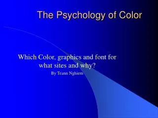
Color Psychology and Informational Color. Luscher Color Test.

E N D
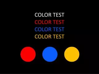
Luscher Color Test Dr. Max Luscher developed a color test to determine personality traits and disorders. This test is considered one of the most reliable color personality insight tools. It made results even for color-impaired individuals, and tends to work across cultures. Participants rank these colors in order of preference, with the order of the ranking determining personality traits. http://colorquiz.com/
More psychological Colors… School Interiors: Based on the idea that neutrals are tasteful and non-threatening, and that greens are calming.
But if pinks are stimulating, maybe we should paint schools like this, waking students’ brains
The Notre Dame Football team painted their locker room this red, to amp up their players. The visiting teams locker room was painted in lighter blues, to calm that team down. Eventually, these kinds of tricks were banned from locker rooms.
Prisoner Pink • A Navy prison painted their walls this hue of pink and found that it calmed their prisoners and led to less hostility. The theory was that this color emasculated the prisoners, making them easier to control. • However, this only lasted a few weeks, as the prisoners readjusted to the wall colors, hostility returned.
Blue is a color not often seen in nature and thus unnatural as a food coloring. People are less likely to want to eat a food that looks ‘wrong’. This is an evolutionary remnant, when eating off-colored food could lead to food poisoning or death.
Kids will eat it. They have fewer color/food associations and are less likely to see wrong-colored food as potential poison
Test subjects who were given exaggeratedly colored food (extra-orange orange juice) reported that the juice tasted sweeter than identical juice with no coloring added. Subjects given lime juice colored orange couldn’t recognize the taste difference and claimed to be drinking orange juice.
Pink is thought to increase the sensation of sweetness, which is why many baked goods are sold in pink boxes.
How would you feel if you spent time in this room? What kinds of associations do you have with the décor and colors of this room?
Learned Color Bias: Associations we pick up from observations of the world • we know red means stop whether we look at a stop sign in English or Arabic • Similarly, for Americans, green means GO, but this is not the case in other parts of the world
In contemporary culture, we associate pink with a girl’s color and blue for boys. In the Victorian era, pink was a boy’s color (because it was a lessened version of masculine red) and blue a girl’s color (it was associated with the Virgin Mary through art)
Studies show that color temperature may be linked to the experience of actual temperature. • Subjects in a red-orange room reported feeling cold once the temperature hit 52 degrees • In a blue-green room they reported feeling cold at 59 degrees
Cultural Color Associations • The following is a list of some common associations with colors. • These are LEARNED color associations, meaning we pick up the meaning of these colors from how they are used in the world, they are not inherent meanings to the colors • In fact, many potential associations for an individual color may directly contradict each other
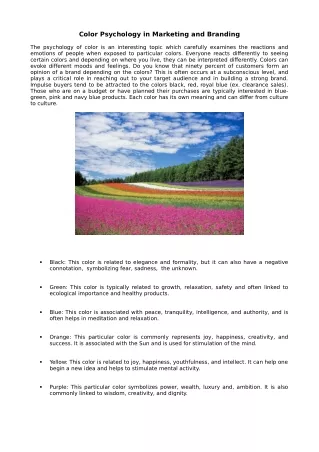
Red: Fire, Blood, Passion and emotion, love, courage (Red Badge of Courage), Lust, crime, murder, rage, Temper (red hair) Red-Letter Days, Caught red-handed, Scarlet Women, Scarlet Letter, Red Light District, STOP! Red is a warning color, it immediately gets our attention, whether on a stop sign, or a ripe apple in a tree, we are conditioned to notice red when it exists. Darker reds are associated with elegance and sophistication RED
Adding white completely changes our read of red, more than any other color, light red is seen as a distinct color on it’s own (pink) associated with little girls, gentility, the feminine, sweetness.
PURPLE Luxurious, Royal, Originally purple pigment was created from mollusks. It’s rarity meant it was limited to royalty and wealthy individuals and that association has lingered. Dusty purples are associated with nostalgia or age. In design, purple is often associated with luxury items. It can be associated with mysticism. In nature, purple rarely exists (perhaps adding to it’s luxury associations), most often it shows up as a flower.
Cheery, sunshine, happiness. In flower design, yellow denotes friendship. Generally, the ‘least favorite’ color chosen. High reflexivity; one of the first colors to be noticed, and one of the first colors babies are able to perceive. Food associations: with citrus, butter, and cheeses, Indian food & spices. Regarded as a special color in some Asian cultures: Buddhist monks wore yellow robes because yellow was associated with the afterlife. Negative associations: Yellow Press, Jaundice, Yellow: coward, old, yellowed paper, Warning color seen in: Snakes, Wasps, Radiation symbols, Yellow+black is instantly eye-catching (a learned color response) Yellow
Fire, warmth, heat, spice (cinnamon, turmeric, curry); cheer; autumn; leave change; harvest color; sunsets Brown oranges suggest comfort and security-homey colors In some cultures, orange suggests fertility, because orange trees are so prolific High-Visibility: Florescent orange vests, life rafts, orange jumpsuits
Browns: natural, earth, wood, Strength, hard work, no-nonsense, unadorned (Puritans) Age, nostalgia, sepia-toned photos, Rich, dark browns can evoke, chocolate, luxury, wealth, taste, Other browns can evoke simplicity, hardiness, Negative associations:Brown-noser, dirt, unclean, brown undertones in colors can make them either less appealing or earthier (depends on the brown).
In design, blue often connotes dependability, classic choices, strength, tranquility, balance, transcendence, motherhood, ‘cool’, serenity Combined with red, patriotism Negative associations: sadness, depression, coldness Associations:True-Blue, sky, water, infinity, serenity, First place blue ribbon, Blue chip (the best), Blue Blood (royality, nobility), Blue Collar (working class), The Blues, balance, transcendence, Blue jeans, cursing a blue streak, blue prose, dependability, Little boy blue, America’s favorite color!
Spring, growth, rejuvenation, ‘going green’, green thumb, camouflage, nature, grass, fertility, freshness, rebirth Negative associations: sickness, envy, jealousy, decay, poison, nausea, mold Pop-culture: environmentalism, aliens (little green men)
NEUTRALS: unspecific, ‘staying neutral’, unimposing, eggshell, natural hues, beige, neutrality, earthiness, sand, Negative associations: bland, boring
Maximum lightness (all light is reflected), white magic, white lies, white flag-truce, white elephant, White House, Associations: coolness, cleanliness, sanitation, hygiene, purity, innocence (wedding dresses) Americans prefer blue or green-cast whites, Mediterraneans prefer yellow or red-cast whites. White walls, white sands, white cube, impersonal, In India, it is a color for funeral, associated with death
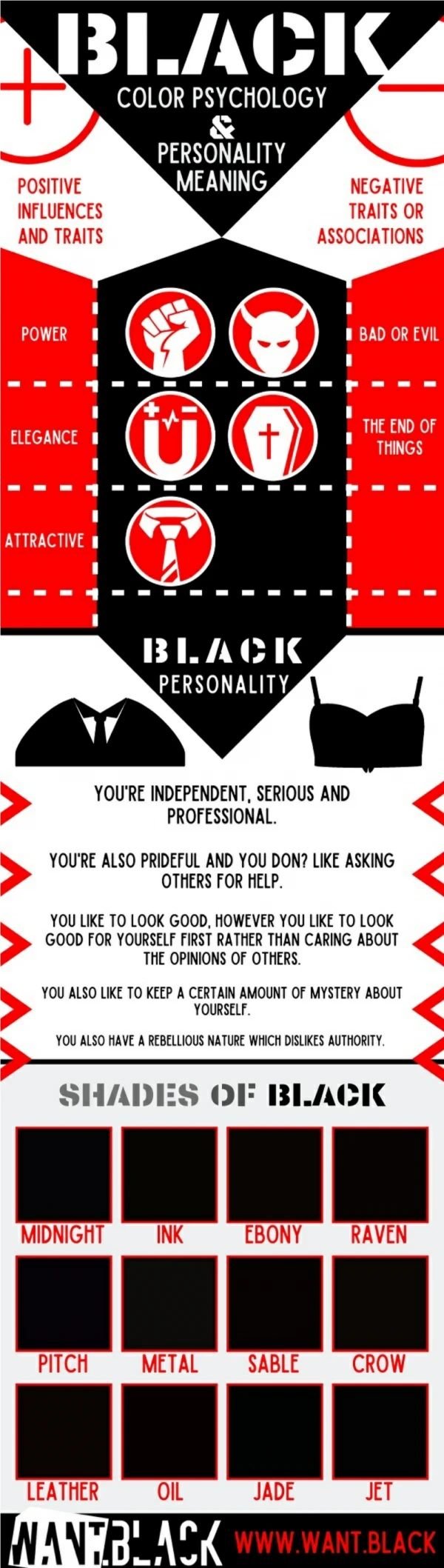
Word associations:blacklist, blackmail, blackball, black market, black sheep, black widow, black tie, black cat (bad luck), In India, a wedding color Combined with red or yellow: a warning color (see snakes, spiders, poison butterflies, radioactive symbols) Positive associations: Elegance, sophistication, refinement Negative associations: Darkness, death, threat, shadows, fear
What does this color combination suggest/why would a designer choose these colors?
What does the red mean in this image, when combined with a pen? ChazMaviyane-Davis
And here, as a hammer head (and bird head)? ChazMaviyane-Davis
And here? Chaz