Download
1 / 5
50 likes | 231 Views
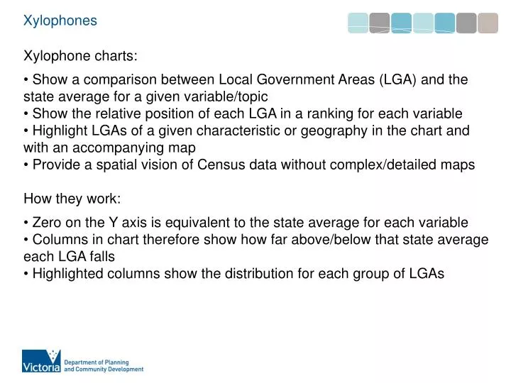
Xylophones. Xylophone charts: Show a comparison between Local Government Areas (LGA) and the state average for a given variable/topic Show the relative position of each LGA in a ranking for each variable

E N D
Xylophones • Xylophone charts: • Show a comparison between Local Government Areas (LGA) and the state average for a given variable/topic • Show the relative position of each LGA in a ranking for each variable • Highlight LGAs of a given characteristic or geography in the chart and with an accompanying map • Provide a spatial vision of Census data without complex/detailed maps • How they work: • Zero on the Y axis is equivalent to the state average for each variable • Columns in chart therefore show how far above/below that state average each LGA falls • Highlighted columns show the distribution for each group of LGAs
Xylophones Map identifies selected grouping of LGAs
Xylophones Map identifies selected grouping of LGAs Zero on Y axis represents state average
Xylophones Map identifies selected grouping of LGAs Zero on Y axis represents state average Highlighted columns show selected LGAs above or below state average