Download
1 / 73
730 likes | 826 Views
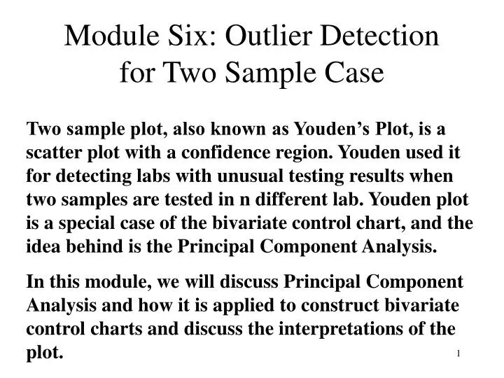
Module Six: Outlier Detection for Two Sample Case.

E N D
Module Six: Outlier Detection for Two Sample Case Two sample plot, also known as Youden’s Plot, is a scatter plot with a confidence region. Youden used it for detecting labs with unusual testing results when two samples are tested in n different lab. Youden plot is a special case of the bivariate control chart, and the idea behind is the Principal Component Analysis. In this module, we will discuss Principal Component Analysis and how it is applied to construct bivariate control charts and discuss the interpretations of the plot.
There are three types of laboratory testing, where two-sample plots can be applied: • A group of labs participate in testing two similar materials using the same method. It is important to identify labs, if any, which perform extremely different from the rest in either one or both materials. A two-sample plot is used to detect the extreme labs. • This is the case studied by Youden (1954), and later extended by Mandel and Lashof (1974).
2. A participated lab tests a variety of material using the same method as the standard lab, and the testing results are compared to the standardized lab to study if any particular test is extremely different from the standard lab. A paired bivariate control chart is used to determine how good the participated lab is when compared with the standard lab. Tracy, Young and Mason (1995) used a similar approach, bivariate control chart for studying paired measurements in quality control. 3. A lab test similar two or more materials using a standard procedure on a regular bases for many days. A bivariate or multivariate control chart is used for process control. In recent decades, multivariate control charts have been developed for process control of two or more quality characteristics simultaneously. Similar situation may occur in laboratory testing process control.
The classical Youden’s Plot for Two-sample cases The following inter-laboratory study about the percent of insoluble residue in cement reported by 29 Laboratories Row %residueA %residueB 1 0.31 0.22 2 0.08 0.12 3 0.24 0.14 4 0.14 0.07 5* 0.52 0.37 6 0.38 0.19 7 0.22 0.14 8* 0.46 0.23 9 0.26 0.05 10 0.28 0.14 11 0.10 0.18 12 0.20 0.09 13 0.26 0.10 14 0.28 0.14 15 0.25 0.13 Row %residueA %residueB 16 0.25 0.11 17 0.26 0.17 18 0.26 0.18 19 0.12 0.05 20 0.29 0.14 21 0.22 0.11 22 0.13 0.10 23* 0.56 0.42 24 0.30 0.30 25 0.24 0.06 26* 0.25 0.35 27 0.24 0.09 28 0.28 0.23 29 0.14 0.10
Using One sample Box-Plot, we have Quick check suggests Lab #5, 8, and 23 are likely outliers. They are excluded in the two-sample plot.
(from NIST website) The vertical line passes through the median of the X-variable. The Horizontal line passed through the median of the Y-variable. The center of the graph is the intersection of the two median lines. This intersection is called the Manhattan Median.
What is the 45o line for? What is the practical meaning of this line? Why and How Youden Plot works? Under the absolute perfect condition, the pair of data should be all equal when testing the same material twice using the same testing procedure. However, it is never the case. In fact, there are two major components of uncertainties: The systematic error and random error. From common experience, systematic error of a given lab should be the same or very close, in theory, when performing the test under the same condition using the same procedure. And that each lab is different from others. This suggests that, if there is no random or unexpected error, under the perfect condition, but allowing lab differences, then, the pair of data should be equal (that x=y) for a given lab, but, may be different for different labs. Translating this situation, the pairs of data are located at the 45o line passing through the Manhattan Median. Therefore, the distance from (x,y) pairs on the 45o line is the component of the systematic error for the given lab. How can we identify the random error component from the plot? In reality, a pair of data points are scattered on the graph. Only very few pairs will be located on the 45o line, and even so, x and y are really the same. Consider a pair of data point which is away from center and are not on the 45o line. The distance from the point (x,y) to the center is the total error: Total error = Systematic error + Random error
(-7, -2) Random Error Component(RaE): the distance from (-2,-7) to (-4.5, -4.5) Systematic Error (SyE) component: the distance from (-4.5, 4.5) to (0,0) The total error =
(x3 , y3) The distance is allowed to be negative here for reflecting the quadrant. The magnitude is positive. How to determine (x3 , y3)? For simplicity, assume center is (0,0). Then we see that x3 = (x2 + y2)/2. That is the coordinate for the systematic component is at ((x2 + y2)/2 , (x2 + y2)/2 ). Hence, systematic error component is the distance to from this point to (0,0): If the center is at (x1 , y1), then the Systematic Error component is
NOTE: p in the formula is the Random Component, in our notation, we use: RaE. If there is no systematic error, the uncertainty should involve only random error component. And therefore, the standard deviation of the random error components is an estimate of the random error variation. 95% coverage region is given by the radius = 2.45(s). The value 2.45 is based on the assumption the (X,Y) follows Bivariate Normal and are independent.
Youden’s Calculation of the standard deviation and the radius • Youden plot is applied to identify labs with unusual high systematic error as well as labs have unusually high random errors. • When a lab has both large total error, the data point will be far away from the center. They are the first group of labs that should be closely investigated. • It may happen that a a material is less sensitive to different environment than the other. When this happens, the data points will tend to be parallel to X- axis or Y-axis, with a large variation due to a material. This can also be quickly identified. • When a lab have an unusually high systematic error, but small random component, it will scattered along the 45o line. And that more data points are in upper right quadrant and lower left quadrant. • When a lab has a large random component, it will be far from the 45o line, that is, will have higher probability to be in the upper-left and lower-right quadrants.
In order to identify these unusual labs, labs with large systematic error, Youden suggested to draw a circle centered at the Manhattan median with the radius being a multiple of the variation due to random error. The variation due to the random errors is the standard deviation of the random errors of labs, which is obtained by: According to Youden (1959), a 95% coverage probability of a circle is given by the circle with radius = 2.448(s) A 99% coverage probability of a circle is given the cirvle with radius = 3.035(s) The relationship between the coverage probability and the multiple b is given in Youden’s original paper in the Journal of Industrial Quality Control, 1959, p. 24-28: Coverage probability = 1-exp(-b2/2)
(-7, -2) An alternative approach to compute the systematic error components, random error components and the corresponding variations. • For a given (x,y) data point, its corresponding coordinate of the systematic component is ( (x+y)/2, (x+y)/2), and the difference between (x,y) and ((x+y)/2, (x+y)/2) along the X-axis is • X – (x+Y)/2 = (x-y)/2 • The difference along the Y-axis = (y-x)/2 • This suggests that the random error for the data point (x,y) is (x-y)/2. • For each lab, • compute the systematic component • [ (x+y)) – (x0+y0)]/2, where (x0 , y0) is the median origin. • Compute the random error component: • (x-y)/2 • Compute variance and s.d. for each component. • sB measures the variation of between-lab systematic errors. • se measures the variation due to random errors. • 4. To construct the circle with 95% coverage probability, the radius = 2.45(se)
Activity: To construct a classical Youden’s Plot for Two-sample cases The following inter-laboratory study about the percent of insoluble residue in cement reported by 29 Laboratories Row %residueA %residueB 1 0.31 0.22 2 0.08 0.12 3 0.24 0.14 4 0.14 0.07 5* 0.52 0.37 6 0.38 0.19 7 0.22 0.14 8* 0.46 0.23 9 0.26 0.05 10 0.28 0.14 11 0.10 0.18 12 0.20 0.09 13 0.26 0.10 14 0.28 0.14 15 0.25 0.13 Row %residueA %residueB 16 0.25 0.11 17 0.26 0.17 18 0.26 0.18 19 0.12 0.05 20 0.29 0.14 21 0.22 0.11 22 0.13 0.10 23* 0.56 0.42 24 0.30 0.30 25 0.24 0.06 26* 0.25 0.35 27 0.24 0.09 28 0.28 0.23 29 0.14 0.10
Variable N Mean Median StDev Material A 25 0.2292 0.2500 0.0731 Material B 25 0.1340 0.1300 0.0597 Variable N N* Mean StDev (A-B)/2 25 4 0.04760 0.03473 (A+B)/2 25 4 0.1816 0.0570 The radius of the circle for the 95% coverage region is .03473 x 2.45 = .085 Hence the circle has the form: (x-.25)2 + (y-.13)2 = (.85)2 Hands-on activities using Mandel and Lashof’s data
Principal Component Analysis -The concept Behind Two-Sample Plots The idea behind the two-sample plot is the principal components and bivariate normal distribution. The following scatter plot illustrate the principal components for bivariate case. (79.81, 92.81)
The scatter plot is from an inter-laboratory study in Mandel & Lashof (1974). The data are tensile strength of rubbers using two different materials, and testing in 16 laboratories. Laboratory Strength-E (X2) Strength-H (X1) 1 94 80 2 103 82 3 94 77 4 99 83 5 97 86 6 91 76 7 91 81 8 102 98 9 98 83 10 91 81 11 93 82 12 82 69 13 93 81 14 82 72 15 83 73 16 92 73
Y1 and Y2 are new coordinates. • Y1 represents the direction where the data values have the largest uncertainty. • Y2 is perpendicular to Y1. • They intersect at the sample averages = (79.81, 92.81) . • To find Y1 and Y2, we need to make transformation from X1 and X2. To simplify the discussion, we move the origin to and redefine the (X1,X2) coordinate as • x1 = X1 - , x2 = X2 - , so that the origin is (0,0). • The relationship is illustrated in the following graph. We would like to present the data of a given lab, p = (x1,x2) in terms of p = (y1,y2). From basic geometry relations, we see: • y1 = (cosq) x1 + (sinq) x2 • y2 = (-sinq) x1 + (cosq) x2 p y1 q x2 y2 The angle q is determined so that the observations along the Y1 axis has the largest variability. But HOW? x1
The transformation from (x1,x2) to (y1,y2) results several nice properties • The variability along y1 is largest. • Y1 and y2 are uncorrelated, that is, orthogonal. • The confidence region based on (y1,y2) is easy to construct, and provide useful interpretations of the two sample plots. • Questions remain unanswered are • How to determine the angle q so that the variability of observations along the y1 axis is maximized? • How to construct the ellipse for confidence region with different levels of confidences? • How to interpret the two-sample plots?
How to determine the y1 and y2 axis so that the variability of observations along the y1 axis is maximized and y2 is orthogonal to y1? Rewrite the linear relation between (y1,y2) and (x1,x2) in matrix notation: y1 = (cosq) x1 + (sinq) x2 y2 = (-sinq) x1 + (cosq) x2 NOTE: X is bivariate , so is Y, and V(X) = , V(Y) = A’V(X)A = l1 and l2are called the eigen values. Which are the solutions of And, V(Y1) = l1 , V(Y2) = l2, Correlation between Y1 and Y2 = 0.
l1 and l2are called the eigen values. Which are the solutions of • And, V(Y1) = l1 , V(Y2) = l2, Correlation between Y1 and Y2 = 0. • The angle q = if , when s1 = s2, q = 45o • Note the angle depends on the correlation between X1 and X2 , as well as, on the variances of X1 and X2, respectively. • When r is close to zero, the angle is also close to zero. If V(X1) and V(X2) are close, then, the scatter plots are scattered like a circle. That is, there is no clear major principal component. • When r is close to zero and V(X1) is much larger than V(X2), then, the angle will be close to zero, and the data points are likely to be parallel to the X-axis. On the other hand, if V(X1) is much smaller than V(X2), the angle will be close to 900, and the data points will be more likely parallel to the Y-axis.
Consider, now, we actually observe the following two sample data: The sample means are given by The sample variance-covariance matrix is given by r is the Pearson’s correlation coefficient, and S2 is the sample variance. S is the sample standard deviation. V(Y) is the solution of The solutions for l are given by NOTE: V(Y1) + V(Y2) = l1+l2 = s12 + s22 = V(X1) + V(X2)
Using the sample data, the angle is estimated by q = Case Example We know use the Tensile strength data to demonstration the computation of principal components and related sample information. For the Tensile Strength Example, X1 is the material H and X2 is the material E. The number of labs, n= 16. Using Minitab, we can obtain the following information:
Variance-Covariances Matrix: H E H46.4292 35.0292 E 35.0292 40.9625 Correlations = .8031 Principal Component Analysis: Tensile Strength-H, Tensile Strength-E Eigen values are: 78.831 and 8.560, the solutions of Linear Coefficients between (Y1, Y2) and (X1,X2) Variable Y1 Y2 H 0.734 -0.679 E 0.679 0.734 These are the coefficients for y1 = (cosq) x1 + (sinq) x2 y2 = (-sinq) x1 + (cosq) x2 The angle q = = arctan[(78.831-46.4292)/35.0292] = 42.770
The sample means from the sample data are Variable N Mean H 16 79.81 E 16 92.81 In terms of (Y1, Y2), the means are Variable N Mean Y1 16 121.61 Y2 16 13.937 Two sample scatter plot is
Confidence Region for two-sample Plots Each of the X1 and X2 can be treated as a univariate variable. In most cases, we consider each variable follows a normal distribution. The rules we introduced for one variable case do assume that each variable follows a normal distribution. We can apply outlier detecting methods for each variable. When we consider two variables simultaneously, [X1, X2] are bivariate, and the distribution for [X1,X2] is taken to be bivariate normal distribution. Because of this extension, we are able to construct ellipses that works similar to empirical rule. We can construct several ellipses so that the probability of having the pair of data inside the ellipse is .95 or .99 and so on. The construction of the ellipse can be simplified when we use the principal components as described above. And the interpretations based on the principal components are very useful.
Bivariate Normal Distribution and it’s application in two-sample plots Because the ellipse region relies on bivariate normal distribution, we briefly give an introduction of the bivariate normal in the following. The bivariate normal distribution of X1 and X2 has the form: f(x1, x2) = (2ps1s2)-1(1-r2)-1/2exp(-Q/2) Where We usually use the notation : is the variance-covariance matrix. is the mean vector.
A ellipse Q = c, c>0 centered at can then be created in the (X1, X2) coordinate. . The shape and the orientation of the ellipse is determined by the values of s12, s22and r, and its size is determined by the choice of the constant c. The choice of the constant c can be determined based on the level of confidence using the bivariate normal distribution. When we collect two samples, the sample data provide sample means and sample variance-covariance matrix. The sample means are given by The sample variance-covariance matrix is given by r is the Pearson’s correlation coefficient, and S2 is the sample variance. S is the sample standard deviation.
When replacing the population parameters by the corresponding sample information, we obtain the Hotelling’s T2: T2 is distributed as Which is a multiple of an F-distribution. The ellipse region is now given by T2 = c* The constant c* is determined using the F-distribution described above. The corresponding 100(1-a)% percentile is from the F distribution with degrees of freedom (2, n-2). For example, when participated labs, n = 16, then a 95% percentile of F(2, n-2) = F(2,14) = 3.74. Therefore, c* = 2(255)/224 x (3.74) = 8.515 A 95% ellipse region can then be constructed using T2 = 8.515
How to construct a 100(1-a)% region in a two-sample plot – the Youden’s Plot? Under the (X1,X2) coordinate, a general form of an ellipse is given by : Under the principal component coordinate and move the center to (0,0), the ellipse has the simple form in terms of (y1, y2): The distance from the center, (0,0) to the ellipse curve along the major principal component is is , and the distance from the center (0,0) to the curve along the minor principal component is
y2 y1 The sum of the distance from foci to curve is constant, and equal to Hence, for any point on the ellipse (y1,y2), when y1 is given, y2 can be computed by When matching the mathematical form with the statistical form of confidence ellipse region: T2 = c*, it is seen that, T2 = c* can be expressed in terms of the general form above. Confidence ellipse region in terms of the principal components has a simple form:
The sum of the distance from foci to curve is constant, and equal to Hence, for any point on the ellipse (y1,y2), when y1 is given, y2 can be computed by And, the original scale in terms of (x1,x2) at the center (0,0) is given by x1 = (cosq)y1 – (sinq)y2 x2 = (sinq)y1 + (conq)y2 Shifting the center from (0,0) back to , we have
= 25.908 = 8.537 = 24.461 We are now ready to construct a 100(1-a)% confidence ellipse region for the Tensile Strength data. In terms of the principal component coordinate (y1, y2) at the center = (0,0). A 95% coverage region has the region covered by the ellipse Which is given by The vertices are (-25.908, 0) and (25.908, 0) The foci are (-24.461, 0) and (24.461, 0) The Vertical axis are intersected at (0, 8.537) and (0, -8.537) The sum of the distances from two foci to the curve is 51.816
To construct the ellipse curve, the point on the curve is given by: The original scale of the ellipse curve on the (X1, X2) is given by Using the original scale of (X1, X2), the 95% coverage region is
The two-sample plot with the 95% coverage probability for the tensile strength data is given by: We notice that one lab is outside of the 95% coverage region. This is Lab 8 with two-sample results (98,102)
Marginal Plots as an supplement for detecting outliers in two-sample case The two-sample plot (Youden’s plot) takes the correlation between two-samples into account and are assumed to follow a bivariate normal distribution. This is a useful plot for detecting outliers. In addition to the two-sample plot, one have introduced box-plot for each sample. A two-dimensional marginal box-plot is a good addition for detecting outliers when we sue two-sample Youden’s plot. Using the Tensilt strength as an example, we use Minitab to construct the marginal box-plot in the following.
The horizontal Box plot is the box-plot for Tensile Strength of Material H. The vertical Box plot id for Material E. It is noticed that there is a clear outlier when testing Material H based on the marginal box plot. Lab 8 is the outlier lab when testing Material H. A similar finding was obtained using Two-sample plot.
How to construct Two-sample Plot using Minitab? • Minitab does not have a procedure on the pull-down menu. However, a Minitab macro program, similar to what we call a subroutine, has been written for two-sample plots. I have added this macro into the Minitab Macro collection. The name of the macro is BCC (stands for Bivariate Control Chart). There are some restrictions when applying this macro. • Preparation of data: • Enter sample One in C1, which will be on the X-axis. • Enter sample Two in C2, which will be on the Y-axis. • Obtain the critical F-value of the F-distribution using any Statistics book or using Minitab: F(a, 2, n-2), where n is the sample size with (1-a) being the coverage probability. For example, a 95% coverage region gives a = .05.
For the Tensile Strength inter-laboratory study, the number of participated labs = n = 16. • For, a 95% coverage region in the Two-sample plot, the critical value is F(.05, 2,14) = 3.74 from an F-table. The two degrees of freedom are ‘2’ for numerator d.f., and n-2 = 14 for the denominator d.f.. • 4. Use Minitab to determine F(.05,2,14): • Go to Calc, choose Probability Distributions, then select ‘F’. • In the F-distribution Dialog box, click on ‘Inverse cumulative probability. • Enter d.f. 2 and 14, respectively. • Click on Input Constant and enter .95. • 5. Make the Session window an active window. Then, go to Editor Menu, and click on ‘Enable Commands’.
6. In the Session window, you should see ‘MTB>’ appears. We will use Minitab commands to input the F(.05, 2,14) and run the BCC Macro. 7. In the Session window, enter the following two commands next to ‘MTB>’ : MTB> let k11 = 3.74 MTB> %BCC The ‘let’ statement defines a minitab constant: k11 = F(.05,2,14) The ‘%’ before the macro name ‘BCC’ is to identify ‘BCC’ as a minitab macro. The results from the %BCC macro are a Two-sample plot with both scatter plot and the 95% ellipse region, and some principal component computations stored in the worksheet.
How to use Minitab to construct Marginal Box plot? • Marginal box plot is available in the Graph Menu. • Go to Graph, choose Marginal Plot. • In the Dialog box, enter Y-variable, and X-variable. • You can choose different types of marginal plots, including Histogram, Dot-lot and Box plot. Choose the one you would like to construct. • Click on the ‘Symbol’ selection, you can define the type of symbols for the scatter plot.
How to use Minitab to conduct a Principal Component Analysis? • In my discussion of constructing principal components, and angle, the relationship between (X1, X2) and the principal components, I have used Minitab to obtain these results for the Tensile Strength example. Here is how Minitab does the analysis. • Go to Stat, choose Multivariate, then select Principal Components. • In the Dialog box, enter variables X1 and X2. Choose the Type of Matrix to be Covariance. • Click on the ‘Graph’ , then select ‘Score plot for first two components’. • Click on the ‘Storage’, you can choose to store the coefficients for computing (y1,y2) using (x1,x2)(that is cosq and sinq),and store the values of (Y1, Y2). For example, store Coefficients in C5 and Store (Y1,Y2) inC6, C7.
How to Interpret Two-sample plots? • In a typical inter-laboratory testing study, the pairs of samples usually are of different, but similar materials are sent out periodically to a number of participating laboratories. All labs run a predetermined number of replicate measurements on each sample for a number of properties. • For each property, the pair of two samples can be plotted as a Youden Plot or more generally, a bivariate control chart. • Generally speaking, the points on the plot fall within an ellipse region, which may be defined as a 95% coverage region or 99%. • The major axis (the major principal components) of the ellipse is approximately 45o. • The length of the principal component ( based on previous discussion) is related to the ‘between laboratory variability’, and the length of the second principal component ( ) to the ‘material-laboratory interaction’.
A General Statistical Model for interpreting the possible source of variability • NOTE: • If the between-lab variability is not homogeneous for two samples, the major principal component of the ellipse may not be 45o. • In addition, the pattern and interpretation of the plot of the plot heavily depends on the model for the experiment and the source of variability in both samples and their inter-relationships. • A general statistical model that includes important sources of variability is necessary in order to provide adequate interpretation of Youden’s two-sample plot under different assumptions of the sources of variability. • Youden emphasizes that the two samples should be similar and reasonably close in the measurement of the property evaluated.However, this may not hold in inter-laboratory studies. A more general situation is to consider the following possibilities.
Material A and B have different population averages, a and b. • Each lab has a systematic effect, denoted by LiA, and LiB, respectively. • The property is measured with an unexplainable random error from each laboratory, denoted by eiA and eiB, respectively. • The observed measurement from each lab , denoted by XiA and XiB can be expressed by the statistical model: • XiA = a + LiA + eiA , i = 1,2, 3, ----, n • XiB = b + LiB + eiB , I = 1,2,3, ---, n • NOTE that the systematic lab effects is assumed dependent only on the population of the material, not on the material itself. In other words, for different material with the same population average, the systematic lab effect remain the same, even though the material may be different. • It is important to realize that the interpretation of Youden plot depends critically on the specific assumptions on LiA, LiB, eiA and eiB. • When data are observed, a and b are estimated by the corresponding sample averages: , and the model is center to (0,0):