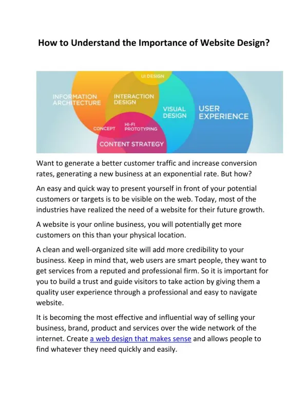
Download
1 / 7

E N D
Responsive Web Design An era of device friendly websites URL: http://www.techtic.com/blog/responsive-web-design-what-why-how/ Techtic Solutions | info@techtic.com | +1201.793.8324 | +44 117 7938324 | +61 2 80909320
What is Responsive Website • Responsive Website Design is one of the most talked about topic of 2013 and continues being one of the best trends in 2014. • Websites are being given this amazing way to resize automatically depending upon the screen size. • Be it any device that you are on, the website will be legible and no more zooming the website. • The website itself will adapt the device resolution and fit any device. Techtic Solutions | info@techtic.com | +1201.793.8324 | +44 117 7938324 | +61 2 80909320
How Does the Device Understand Responsiveness • How does it understand which device is it on and once it understands the device how does it resize automatically? • Understanding this would be really helpful to code or rather transform any normal website into responsive website. • The device understand the viewport based on which it understands the responsiveness of the website. Techtic Solutions | info@techtic.com | +1201.793.8324 | +44 117 7938324 | +61 2 80909320
The Viewport Meta Tag • To convert any website into responsive; enter the viewport meta tag, introduced by Apple, which was then adopted by all the others in the industry. • <meta name=”viewport” content=”width=device-width initial-scale=1”> • content=”width=device-width” makes the website flexible and scale the website to the width of the device you enter. Content=”initial-scale=1” This will allow the display of the layout in the proportion of 1:1 scale. No zooming will be applied. One can also make sure that no further zooming can be applied by making it maximum-scale=1. • In a nutshell the viewport defines the view of the website, scalability and zoom level for any website. This needs to be defined as a first step on the way to transforming any website to responsive. Techtic Solutions | info@techtic.com | +1201.793.8324 | +44 117 7938324 | +61 2 80909320
Media Queries • CSS Media Queries is one of the most important aspect for making the website responsive. Zooming and Viewport has been setup but the website wont work on smart phones unless the CSS for a particular smartphone is defined to make website understand and act as per the CSS. CSS3 can specify when certain CSS rules should be applied on a particular device width. This allows you to apply a special CSS for mobile devices such as smartphones or tablets. CSS Media queries are supported in Internet Explorer (IE) 9+, Firefox 3.5+, Safari 3+, Opera 7+, as well as on most modern smartphones and other screen-based devices. • Here is how it works. The CSS is defined for each viewport and the corresponding stylesheet or rather css rules will apply only when a media query is true. The stylesheet for each viewport’s corresponding media query is also given in the example. Needless to say that the media query must be linked in the page to function properly. Techtic Solutions | info@techtic.com | +1201.793.8324 | +44 117 7938324 | +61 2 80909320
Screen resolution and dimensions Techtic Solutions | info@techtic.com | +1201.793.8324 | +44 117 7938324 | +61 2 80909320
Thank You! • URL: http://www.techtic.com/blog/responsive-web-design-what-why-how/ • Website: www.techtic.com • Email Address: info@techtic.com • Read More Articles: http://www.techtic.com/blog Techtic Solutions | info@techtic.com | +1201.793.8324 | +44 117 7938324 | +61 2 80909320