Download
1 / 16
0 likes | 5 Views
Learn how and why Tailwind select is a great option for making dropdowns for rapid development, consistent design,and responsive design.

E N D
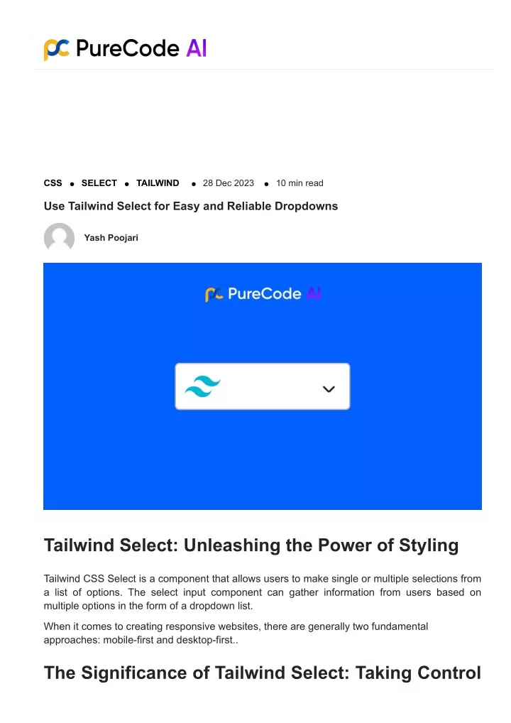
Type to generate custom UI components with AI CSS SELECT TAILWIND 28 Dec 2023 10 min read Use Tailwind Select for Easy and Reliable Dropdowns Yash Poojari Tailwind Select: Unleashing the Power of Styling Tailwind CSS Select is a component that allows users to make single or multiple selections from a list of options. The select input component can gather information from users based on multiple options in the form of a dropdown list. When it comes to creating responsive websites, there are generally two fundamental approaches: mobile-first and desktop-first.. The Significance of Tailwind Select: Taking Control
of Your UI Components A Tailwind CSS select dropdown is a UI component that allows users to select and submit options. It is built using Tailwind CSS, a utility-first CSS framework for creating responsive and customizable web interfaces. This component enables developers to efficiently create interactive forms and collect user information. Review the code snippet provided below for the basic Tailwind Select Dropdown:- <label for="countries" class="block mb-2 text-sm font-medium text-gray-900 dark:text- gray-400">Select an option</label> <select id="countries" class="bg-gray-50 border border-gray-300 text-gray-900 text-sm rounded-lg focus:ring-blue-500 focus:border-blue-500 block w-full p-2.5 dark:bg-gray-700 dark:border-gray-600 dark:placeholder-gray-400 dark:text-white dark:focus:ring-blue-500 dark:focus:border-blue-500"> <option selected>Choose a country</option> <option value="US">United States</option> <option value="CA">Canada</option> <option value="FR">France</option> <option value="DE">Germany</option> </select> Perks of Using Tailwind Select Tailwind CSS Select is a utility-first CSS framework that provides low-level utility classes for building designs directly in your markup. Advantages of using Tailwind for select dropdowns include rapid development, consistent design, responsive design, flexibility, ease of learning, the ability, performance, community, and documentation, build process integration, and the elimination of custom CSS. However, it’s important to note that Tailwind may not be suitable for every project or developer’s workflow. The choice between frameworks depends on the specific needs and preferences of the project and development team. Using this code snippet, you can create an HTML page with Tailwind CSS and Tailwind Select component for option selection in your project. <!DOCTYPE html> <html lang="en"> <head> <meta charset="UTF-8"> <meta name="viewport" content="width=device-width, initial-scale=1.0">
<title>Your Project</title> <link href="https://cdn.jsdelivr.net/npm/tailwindcss@2.2.19/dist/tailwind.min.css" rel="stylesheet"> <link href="path/to/tailwind-select.min.css" rel="stylesheet"> </head> <body class="bg-gray-100"> <div class="container mx-auto p-8"> <h1 class="text-3xl font-bold mb-4">Project Title</h1> <div class="relative inline-flex self-center"> <svg class="text-white bg-purple-700 absolute top-0 right-0 m-2 pointer- events-none p-2 rounded" xmlns="http://www.w3.org/2000/svg" width="40" height="40" viewBox="0 0 38 22" version="1.1"> <title>Options</title> <polygon fill="#fff" points="33 5.38 33 31.38 29 31.38 28.99 9.38 7 9.38 7 5.38"/> </svg> <select class="text-2xl font-bold rounded border-2 border-purple-700 text- gray-600 h-14 w-60 pl-5 pr-10 bg-white hover:border-gray-400 focus:outline-none appearance-none"> <option>A-Z</option> <option>Z-A</option> </select> </div> </div> </body> </html> The code snippet is an HTML template for a project using Tailwind CSS and Tailwind Select. It includes the doctype declaration, <html> tag, character encoding, viewport definition, and title. The Tailwind Select CSS file is linked with a <link> tag. The <body> element has a class for a light gray background. Inside a container element, there is a <h1> heading with styling classes for large font sizes and bold text. In the “Your content goes here” section, you can add your content. Additionally, we provide an example to illustrate how to utilize the Tailwind Select component for image selection. This example includes an <div> element with inline flex, which contains a dropdown (<select>). Each option within the dropdown corresponds to a choice. After this section, add your content as needed.
Enhancing the User Experience Improving user experience involves various aspects, and customizable design and accessibility features are two key elements to consider: Customizable Design Customizable design allows users to personalize the appearance and layout of a digital product according to their preferences. This can include: 1. Theme Options: Users can choose from various color schemes or themes to match their preferences. 2. Layout Customization: Providing options to rearrange or resize elements on the interface, allowing users to create a layout that suits their workflow. 3. Font and Text Customization: Users may have different font size preferences or may prefer certain fonts for better readability. 4. Widget Placement: Allowing users to move widgets or components around on a page for a more personalized experience. 5. Dark/Light Mode: Including options for both dark and light modes can accommodate different user preferences and improve readability in various lighting conditions. Check out this code snippet for reference: <!DOCTYPE html> <html lang="en"> <head> <meta charset="UTF-8"> <meta name="vie Accessibility Features Accessibility features are crucial for ensuring that a product is usable by people of all abilities. Incorporating these features makes the product more inclusive and user-friendly: 1. Screen Reader Compatibility: Ensuring that the interface is compatible with screen readers helps users with visual impairments navigate and understand content. 2. Text-to-Speech Functionality: Allowing users to convert on-screen text into spoken words helps those with visual impairments or learning disabilities. 3. Keyboard Navigation: Providing keyboard shortcuts and ensuring that all functionality is accessible via keyboard navigation helps users who may have difficulty using a mouse. 4. Contrast and Color Choices: Ensuring sufficient contrast between text and background colors aids users with visual impairments and color blindness. 5. Responsive Design: Designing the interface to be responsive to different screen sizes and devices ensures a consistent experience for users with varying needs. 6. Captioning and Transcripts: For multimedia content, providing captions for videos and transcripts for audio content ensures that users with hearing impairments can access the
information. By focusing on customizable design and accessibility features, you can create a more inclusive and user-friendly experience, catering to a broader audience with diverse needs and preferences. Check out this example of code snippet for reference: <!DOCTYPE html> <html lang="en"> <head> <meta charset="UTF-8"> <meta name="viewport" content="width=device-width, initial-scale=1.0"> <title>Accessibility Features Example</title> </head> <body> <h1>Accessibility Features Example</h1> <label for="text-to-speech-input">Text-to-Speech:</label> <input type="text" id="text-to-speech-input" placeholder="Type text here"> <button onclick="convertToSpeech()">Convert to Speech</button> <script> function convertToSpeech() { const input = document.getElementById('text-to-speech-input'); const text = input.value; // Utilize a text-to-speech API or library to convert 'text' into speech alert(`Simulating text-to-speech: ${text}`); } </script> </body> </html> Text Selection Control Utilities Check out these awesome utilities that give you complete control over how users can select text within an element! Class Properties select-none user-select: none; select-text user-select: none; select-all user-select: none;
select-auto user-select: none; Unveiling the Inner Workings of Tailwind Select The inner workings of the Tailwind Select component involve a combination of HTML, CSS, and JavaScript to create a functional and customizable dropdown component. When a user interacts with the select input dropdown component, the following steps take place: 1. HTML Structure: The select component dropdown is created with <select> and <option> elements. The <select> represents the dropdown itself, while the <option> elements define the available choices. 2. CSS Styling: Tailwind CSS offers classes to style the select component dropdown. These classes allow customization of width, height, colors, borders, and more. 3. JavaScript Interactivity: JavaScript handles user interactions with the select dropdown. Event listeners detect when an option is selected or any interaction occurs. 4. Option Selection: When an option is selected, JavaScript captures the value and updates the display of the select dropdown. This can include changing the appearance or displaying the value elsewhere. 5. Data Submission: After selection, the value can be submitted as part of a form or used for further processing. JavaScript can access this data and send it to a server-side script or use it for client-side operations. By combining these technologies, Tailwind Select offers developers a straightforward and flexible approach to implementing select dropdowns with ease and customization possibilities. Creating an Essential Select Dropdown 1) Adding the HTML markup for a select dropdown <!-- index.html --> <!DOCTYPE html> <html lang="en"> <head> <meta charset="UTF-8"> <meta name="viewport" content="width=device-width, initial-scale=1.0"> <title>Tailwind Select Dropdown</title> <link rel="stylesheet" href="styles.css"> </head> <body> <div class="container mx-auto mt-8"> <label for="example-select" class="text-sm font-semibold text-gray-600">Favourite Fruit</label> <select id="example-select" class="block w-full mt-1 p-2 border border-gray-300
rounded-md focus:outline-none focus:ring focus:border-blue-500"> <option value="option1">Apple</option> <option value="option2">Banana</option> <option value="option3">Strawberry</option> </select> </div> </body> </html> 2) Styling the select dropdown using Tailwind CSS classes: /* styles.css */ @import 'tailwindcss/base'; @import 'tailwindcss/components'; @import 'tailwindcss/utilities'; /* Custom styles */ .container { max-width: 600px; } /* Styling the select element */ .select { @apply block w-full mt-1 p-2 border border-gray-300 rounded-md focus:outline-none focus:ring focus:border-blue-500; } In this example, the @apply directive is a feature provided by Tailwind CSS JIT (Just-in-Time mode) that allows you to compose classes directly in your stylesheet. 3) Customizing the appearance of the dropdown arrow: /* styles.css */ /* ... (previous styles) */ /* Styling the select element */ .select { @apply block w-full mt-1 p-2 pl-8 pr-4 border border-gray-300 rounded-md focus:outline-none focus:ring focus:border-blue-500; background: url('arrow-down.svg') no-repeat right 10px center; background-size: 20px; /* Adjust as needed */ } In this example, we utilize the ‘background’ property to establish a personalized arrow-down icon on the right-hand side of the select element.
4) Handling user interactions with the select dropdown: User interactions often require the use of JavaScript to respond to various events, such as when a user selects an option. Let’s take a look at a straightforward example: // scripts.js document.getElementById('example-select').addEventListener('change', function() { const selectedValue = this.value; alert(`Selected option: ${selectedValue}`); }); Make sure to add this script to your HTML file: <!-- index.html --> <!-- ... (head and body tags) --> <script src="scripts.js"></script> </html> This script enhances the select component by adding an event listener. When the user changes the selected option, an alert is triggered. Feel free to customize the code snippets to suit your project requirements and styling preferences. Revitalize Tailwind Select: Unlock the Power of
Custom Options 1) Adding custom options to the select dropdown: <!-- index.html --> <!DOCTYPE html> <html lang="en"> <head> <meta charset="UTF-8"> <meta name="viewport" content="width=device-width, initial-scale=1.0"> <title>Tailwind Select Dropdown</title> <link rel="stylesheet" href="styles.css"> </head> <body> <div class="container mx-auto mt-8"> <label for="example-select" class="text-sm font-semibold text-gray-600">Select an option:</label> <select id="example-select" class="select"> <option value="option1">Option 1</option> <option value="option2">Option 2</option> <option value="option3">Option 3</option> <!-- Additional custom options --> <option value="option4">Option 4</option> <option value="option5">Option 5</option> </select> </div> </body> </html> 2) Styling the options using Tailwind CSS classes: /* styles.css */ /* ... (previous styles) */ /* Styling the select element */ .select { @apply block w-full mt-1 p-2 pl-8 pr-4 border border-gray-300 rounded-md focus:outline-none focus:ring focus:border-blue-500; background: url('arrow-down.svg') no-repeat right 10px center; background-size: 20px; /* Adjust as needed */ } /* Styling the options */ .select option {
@apply bg-white text-gray-800; } /* Hover and focus styles for options */ .select option:hover, .select option:focus { @apply bg-blue-100; } 3) Handling option selection and updating the dropdown value: // scripts.js const selectElement = document.getElementById('example-select'); selectElement.addEventListener('change', function() { const selectedValue = this.value; alert(`Selected option: ${selectedValue}`); }); 4) Implementing dynamic options using data binding: // scripts.js const selectElement = document.getElementById('example-select'); const options = ['Option 1', 'Option 2', 'Option 3', 'Option 4', 'Option 5']; // Clear existing options selectElement.innerHTML = ''; // Populate options dynamically options.forEach((optionText, index) => { const option = document.createElement('option'); option.value = `option${index + 1}`; option.textContent = optionText; selectElement.appendChild(option); }); // Add event listener for option selection selectElement.addEventListener('change', function() { const selectedValue = this.value; alert(`Selected option: ${selectedValue}`); }); In this example, the options are dynamically populated based on the ‘options’ array. This enables effortless modification and addition of options without the need for manual updates to the HTML markup. The event listener for ‘change’ remains unchanged to handle option selection. Customize the code snippets according to your specific use case and styling preferences.
Implementing Tailwind Select Dropdown Multi-select Functionality with 1) Adding support for multiple selections in the dropdown: <!-- index.html --> <!DOCTYPE html> <html lang="en"> <head> <meta charset="UTF-8"> <meta name="viewport" content="width=device-width, initial-scale=1.0"> <title>Tailwind Selection</title> <link rel="stylesheet" href="styles.css"> </head> <body> <div class="container mx-auto mt-8"> <label for="example-select" class="text-sm font-semibold text-gray-600">Select option(s):</label> <select id="example-select" class="select" multiple> <option value="option1">Option 1</option> <option value="option2">Option 2</option> <option value="option3">Option 3</option> <option value="option4">Option 4</option> <option value="option5">Option 5</option> </select> </div> </body> </html> 2) Styling selected options differently: /* styles.css */ /* ... (previous styles) */ .container{ display: flex; justify-content: center; } label{ position: absolute; font-weight: 700; } /* Styling the select element */
.select { @apply block w-full mt-1 p-3 pl-8 pr-4 border border-gray-300 rounded-md focus:outline-none focus:ring focus:border-blue-500; background: url('arrow-down.svg') no-repeat right 10px center; margin-top:25px; background-size: 50px; /* Adjust as needed */ } /* Styling the options */ .select option { @apply bg-white text-gray-800; } /* Hover and focus styles for options */ .select option:hover, .select option:focus { @apply bg-blue-100; } /* Styling selected options differently */ .select option:checked { @apply bg-blue-500 text-white; } 3) Handling multiple option selections and updating the dropdown value: // scripts.js const selectElement = document.getElementById('example-select'); selectElement.addEventListener('change', function() { const selectedOptions = Array.from(this.selectedOptions).map(option => option.value); alert(`Selected options: ${selectedOptions.join(', ')}`); }); 4) Managing selected options state: // scripts.js const selectElement = document.getElementById('example-select'); // Function to update the selected options state function updateSelectedOptions() { const selectedOptions = Array.from(selectElement.selectedOptions).map(option => option.value); document.getElementById('selected-options').textContent = selectedOptions.join(', '); }
// Initial update updateSelectedOptions(); // Add event listener for option selection selectElement.addEventListener('change', function() { updateSelectedOptions(); }); In this example, we utilize an additional element, identified by the id “selected-options”, to showcase the current state of the selected options. The function “updateSelectedOptions” is invoked both initially and whenever there is a change in the selection. Feel free to modify the code snippets according to your specific needs and styling preferences. Summary: Unleashing Select Elements’ Potential with Tailwind CSS Tailwind CSS is a popular utility-first CSS framework that simplifies and streamlines the process of building modern and responsive user interfaces. While as of now, there is no official “Tailwind Select Dropdown” component, the custom select input examples provided earlier showcase how Tailwind CSS can be leveraged to create highly customizable and visually appealing UI components. Encouragement to Explore Tailwind CSS Further: 1. Efficiency and Readability: Tailwind CSS allows developers to build interfaces rapidly by applying classes directly in the markup. This approach can lead to more readable and maintainable code. 2. Customization and Theming: Tailwind CSS offers extensive customization options for developers to create unique and branded designs. Its utility-first approach enables easy theming and adaptation to different design systems. 3. Responsive Design: Tailwind CSS is mobile-first and ideal for responsive web apps. It offers classes for managing layouts and styles on different screen sizes. 4. Growing Ecosystem: The Tailwind CSS ecosystem is always evolving, with a vibrant community contributing resources to enhance developers’ workflow. 5. Documentation and Learning Resources: Tailwind CSS has thorough documentation, accessible to beginners and experienced developers. It includes clear examples,
explanations, and guidance. Final Thoughts on the Importance of Tailwind Select Component in Modern Web Development: Although not an official component, “Tailwind Select” showcases the versatility of Tailwind CSS in designing custom UI components like select dropdowns. Tailwind CSS promotes a utility-first approach to styling and layout, offering a contemporary solution for developers. Key considerations and benefits of using Tailwind CSS in modern web development include: Consistency: Tailwind CSS promotes a consistent design language across the application, ensuring a cohesive user experience. Rapid Prototyping: The utility-first approach enables quick prototyping and iteration, allowing developers to experiment with designs more efficiently. Utility Classes for Everything: Tailwind CSS provides classes for a wide range of styles, eliminating the need to write custom CSS for many common styling tasks. Performance: Tailwind CSS optimizes stylesheets for better performance and smaller file sizes. The Tailwind CSS framework enables developers to create modern and responsive user interfaces, while also allowing for visually stunning designs. The custom-select component examples showcase the versatility and power of Tailwind CSS in web development. Staying updated with best practices is crucial for unlocking the full potential of this framework. PureCode AI is an invaluable asset for mastering Tailwind CSS and other web development technologies. With advanced algorithms and interactive learning modules, PureCode AI provides a comprehensive learning experience. Developers gain a deep understanding of Tailwind CSS through hands-on exercises and real-world examples. PureCode AI equips developers with the skills needed to excel in web development. PureCode AI offers a user-friendly interface, making learning accessible and enjoyable for developers of all skill levels. Unlock your full potential as a web developer by harnessing the power of PureCode AI today. Share this: Yash Poojari More blogs
CSS Why You Need to Use CSS Minification for Web Performance 01 Mar 2024 12 min read CSS Top CSS Shape Generator Tools That Will Make Your Life Easier 26 Feb 2024 12 min read CSS Best CSS Background Generator Tools for Stunning Websites 26 Feb 2024 9 min read
Tailwind Blogs Tailwind Dropdown Tailwind Cards Tailwind Config Tailwind Buttons Tailwind Breakpoints Tailwind Grid MUI Blogs MUI Typgraphy MUI Tooltip MUI Appbar MUI Stack MUI Slider MUI Select Bootstrap Blogs Bootstrap vs MUI