Download
1 / 18
0 likes | 4 Views
Carousels can be visually engaging and useful for presenting multiple pieces of content, here's how to use a tailwind carousel.

E N D
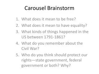
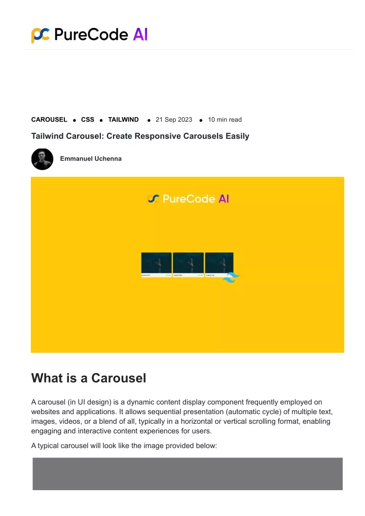
CAROUSEL CSS TAILWIND 21 Sep 2023 10 min read Tailwind Carousel: Create Responsive Carousels Easily Emmanuel Uchenna What is a Carousel A carousel (in UI design) is a dynamic content display component frequently employed on websites and applications. It allows sequential presentation (automatic cycle) of multiple text, images, videos, or a blend of all, typically in a horizontal or vertical scrolling format, enabling engaging and interactive content experiences for users. A typical carousel will look like the image provided below:
Carousel example image Why You Need to Use a Carousel You should consider using a carousel if you want to: Display a series of images, such as product photos, in a limited space in an image gallery. Highlight featured articles, products, or promotions on your website as featured content. Rotate through customer reviews or testimonials. Display recent news articles or updates in a news app or website as news or updates. Show a selection of products or services as a product showcase. Structure of Tailwind Carousel A basic carousel contains the following structure: 1. Rotation: Carousels cycle through content items automatically or with user interaction. This can be done by clicking or tapping on navigation arrows, buttons, or indicators. 2. Multiple Items: Carousels typically display more than one content item at a time, often in a horizontal row, and your users can navigate through these items to see additional content. 3. Indicators: Carousels often include indicators, such as dots or numbers, to show the total number of items and which item is being displayed. 4. Navigation Controls: Users can usually control the carousel’s movement through various navigation controls, like next and previous arrows or swipe gestures on mobile devices. 5. Auto-play: Some carousels automatically advance through the content items at a set interval, while others require manual interaction.
Tailwind CSS logo The HTML structure for Flowbite Tailwind CSS Carousel <div id="default-carousel" class="relative w-full" data-carousel="slide"> <!-- Carousel wrapper --> <div class="relative h-56 overflow-hidden rounded-lg md:h-96"> <!-- Item 1 --> <div class="hidden duration-700 ease-in-out" data-carousel-item> <img src="https://flowbite.com/docs/images/carousel/carousel-1.svg" class="absolute block w-full -translate-x-1/2 -translate-y-1/2 top-1/2 left-1/2" alt="..."> </div> <!-- Item 2 --> <div class="hidden duration-700 ease-in-out" data-carousel-item> <img src="https://flowbite.com/docs/images/carousel/carousel-2.svg" class="absolute block w-full -translate-x-1/2 -translate-y-1/2 top-1/2 left-1/2" alt="..."> </div> <!-- Item 3 --> <div class="hidden duration-700 ease-in-out" data-carousel-item> <img src="https://flowbite.com/docs/images/carousel/carousel-3.svg" class="absolute block w-full -translate-x-1/2 -translate-y-1/2 top-1/2 left-1/2" alt="..."> </div> <!-- Item 4 --> <div class="hidden duration-700 ease-in-out" data-carousel-item> <img src="https://flowbite.com/docs/images/carousel/carousel-4.svg" class="absolute block w-full -translate-x-1/2 -translate-y-1/2 top-1/2 left-1/2" alt="..."> </div> <!-- Item 5 --> <div class="hidden duration-700 ease-in-out" data-carousel-item> <img src="https://flowbite.com/docs/images/carousel/carousel-5.svg" class="absolute block w-full -translate-x-1/2 -translate-y-1/2 top-1/2 left-1/2" alt="..."> </div> </div>
<!-- Slider indicators --> <div class="absolute z-30 flex space-x-3 -translate-x-1/2 bottom-5 left-1/2"> <button type="button" class="w-3 h-3 rounded-full" aria-current="true" aria- label="Slide 1" data-carousel-slide-to="0"></button> <button type="button" class="w-3 h-3 rounded-full" aria-current="false" aria- label="Slide 2" data-carousel-slide-to="1"></button> <button type="button" class="w-3 h-3 rounded-full" aria-current="false" aria- label="Slide 3" data-carousel-slide-to="2"></button> <button type="button" class="w-3 h-3 rounded-full" aria-current="false" aria- label="Slide 4" data-carousel-slide-to="3"></button> <button type="button" class="w-3 h-3 rounded-full" aria-current="false" aria- label="Slide 5" data-carousel-slide-to="4"></button> </div> <!-- Slider controls --> <button type="button" class="absolute top-0 left-0 z-30 flex items-center justify- center h-full px-4 cursor-pointer group focus:outline-none" data-carousel-prev> <span class="inline-flex items-center justify-center w-10 h-10 rounded-full bg- white/30 dark:bg-gray-800/30 group-hover:bg-white/50 dark:group-hover:bg-gray-800/60 group-focus:ring-4 group-focus:ring-white dark:group-focus:ring-gray-800/70 group- focus:outline-none"> <svg class="w-4 h-4 text-white dark:text-gray-800" aria-hidden="true" xmlns="http://www.w3.org/2000/svg" fill="none" viewBox="0 0 6 10"> <path stroke="currentColor" stroke-linecap="round" stroke- linejoin="round" stroke-width="2" d="M5 1 1 5l4 4"/> </svg> <span class="sr-only">Previous</span> </span> </button> <button type="button" class="absolute top-0 right-0 z-30 flex items-center justify- center h-full px-4 cursor-pointer group focus:outline-none" data-carousel-next> <span class="inline-flex items-center justify-center w-10 h-10 rounded-full bg- white/30 dark:bg-gray-800/30 group-hover:bg-white/50 dark:group-hover:bg-gray-800/60 group-focus:ring-4 group-focus:ring-white dark:group-focus:ring-gray-800/70 group- focus:outline-none"> <svg class="w-4 h-4 text-white dark:text-gray-800" aria-hidden="true" xmlns="http://www.w3.org/2000/svg" fill="none" viewBox="0 0 6 10"> <path stroke="currentColor" stroke-linecap="round" stroke- linejoin="round" stroke-width="2" d="m1 9 4-4-4-4"/> </svg> <span class="sr-only">Next</span> </span> </button> </div>
Tailwind CSS Flowbite carousel Creating a Tailwind CSS Image Carousel When it comes to creating image carousels with Tailwind CSS, you might have noticed that the vanilla version does not inherently offer the functionality for carousel sliders. To address this limitation, we can leverage Tailwind CSS component libraries like Tailwind Elements, Flowbite, Tailwind Components, DaisyUI, and others. Purecode.ai offers a repository of more than 10,000 AI-generated custom components for TailwindCSS, MUI, and custom CSS for you to choose from, including carousel component, Gallery, Header, Hero, Input, Loading, Login, Modal, News, Pagination, Pricing, Profile, and many more. Get started today for free. In this section, I will guide you through the process of building a Tailwind CSS carousel slider specifically using Flowbite. Flowbite is an open-source Tailwind CSS component library that harnesses the power of Tailwind utility classes, allowing you to speed up website development by offering an array of pre-made blocks, including a feature-rich carousel component.
Flowbite blocks Understanding How the Carousel Works The Flowbite carousel component uses special HTML attributes to control its behavior. To initialize the carousel component, you need to use the data-carousel={static|slide} data attribute while applying a unique id attribute to the parent element. Here are the two primary options for implementing a carousel slider: data-carousel=”static” prevents the carousel from sliding automatically. data-carousel=”slide” enables the carousel to cycle through items infinitely. Feel free to add as many carousel items as needed. However, ensure that you attach the data- carousel-item data attribute to each item, designating a single item as “active” by assigning the active value to the data attribute. Additionally, it’s essential to set the hidden class as the default state to prevent any flickering. Adding Carousel Controls In this segment, we will focus on enhancing the user experience by adding previous and next navigation buttons to your carousel. We will delve into the usage of Tailwind CSS classes for button styling and positioning, providing code examples accompanied by detailed explanations for seamless integration. For interactive navigation, Flowbite provides an easy way to implement carousel controls. Utilize the data-carousel-prev and data-carousel-next data attributes to listen for click events. These attributes trigger the slide event within the carousel component, enabling navigation in both directions. Moreover, you can personalize the appearance and behavior of the control elements using Tailwind CSS classes to align them with your project’s design. <div id="controls-carousel" class="relative w-full" data-carousel="static"> <!-- Carousel wrapper --> ... <!-- /Carousel wrapper --> <!-- Slider controls --> <button type="button" class="absolute top-0 left-0 z-30 flex items-center justify- center h-full px-4 cursor-pointer group focus:outline-none" data-carousel-prev> <span class="inline-flex items-center justify-center w-10 h-10 rounded-full bg- white/30 dark:bg-gray-800/30 group-hover:bg-white/50 dark:group-hover:bg-gray-800/60 group-focus:ring-4 group-focus:ring-white dark:group-focus:ring-gray-800/70 group- focus:outline-none"> <svg class="w-4 h-4 text-white dark:text-gray-800" aria-hidden="true" xmlns="http://www.w3.org/2000/svg" fill="none" viewBox="0 0 6 10"> <path stroke="currentColor" stroke-linecap="round" stroke-linejoin="round"
stroke-width="2" d="M5 1 1 5l4 4"/> </svg> <span class="sr-only">Previous</span> </span> </button> <button type="button" class="absolute top-0 right-0 z-30 flex items-center justify- center h-full px-4 cursor-pointer group focus:outline-none" data-carousel-next> <span class="inline-flex items-center justify-center w-10 h-10 rounded-full bg- white/30 dark:bg-gray-800/30 group-hover:bg-white/50 dark:group-hover:bg-gray-800/60 group-focus:ring-4 group-focus:ring-white dark:group-focus:ring-gray-800/70 group- focus:outline-none"> <svg class="w-4 h-4 text-white dark:text-gray-800" aria-hidden="true" xmlns="http://www.w3.org/2000/svg" fill="none" viewBox="0 0 6 10"> <path stroke="currentColor" stroke-linecap="round" stroke-linejoin="round" stroke-width="2" d="m1 9 4-4-4-4"/> </svg> <span class="sr-only">Next</span> </span> </button> <!-- /Slider controls --> </div> Flowbite carousel – Slider controls Customizing Carousel Animation Tailwind CSS offers a seamless way to customize the duration and animation style of the carousel component. You can achieve this by leveraging the duration-* and ease-* utility classes provided by Tailwind CSS for transition duration. These classes allow you to fine-tune the animation effects applied to carousel items, ensuring a visually pleasing user experience.
The utility class should be added in the carousel item div wrapper, alongside the data-carousel- item attribute, like so: <div class="hidden duration-200 ease-linear" data-carousel-item> <img src="https://flowbite.com/docs/images/carousel/carousel-1.svg" class="absolute block w-full -translate-x-1/2 -translate-y-1/2 top-1/2 left-1/2" alt="..." /> </div> Here is the complete code implementation. <div id="animation-carousel" class="relative w-full" data-carousel="static"> <!-- Carousel wrapper --> <div class="relative h-56 overflow-hidden rounded-lg md:h-96"> <!-- Item 1 --> <div class="hidden duration-200 ease-linear" data-carousel-item> <img src="https://flowbite.com/docs/images/carousel/carousel-1.svg" class="absolute block w-full -translate-x-1/2 -translate-y-1/2 top-1/2 left-1/2" alt="..."> </div> <!-- Item 2 --> <div class="hidden duration-200 ease-linear" data-carousel-item> <img src="https://flowbite.com/docs/images/carousel/carousel-2.svg" class="absolute block w-full -translate-x-1/2 -translate-y-1/2 top-1/2 left-1/2" alt="..."> </div> <!-- Item 3 --> <div class="hidden duration-200 ease-linear" data-carousel-item="active"> <img src="https://flowbite.com/docs/images/carousel/carousel-3.svg" class="absolute block w-full -translate-x-1/2 -translate-y-1/2 top-1/2 left-1/2" alt="..."> </div> </div> <!-- /Carousel wrapper --> <!-- Slider controls --> ... <!-- Slider controls --> </div> Below is a gif of the implementation of the animation for the carousel with duration-200 ease- linear
Flowbite carousel – carousel animation – duration-700 ease-in-out Below is a gif of the animation implementation for the carousel with duration-700 ease-in-out utility classes. Flowbite carousel – carousel animation – duration-200 ease-linear Carousel Indicators To enhance user navigation and provide clear visual cues, you can incorporate carousel indicators (carousel slider). To display these indicators, include the data-carousel-slide-to= {position} attribute within your indicator elements. The value assigned to this attribute should correspond to the position of the slider element, allowing users to easily identify their current location within the carousel. Use this Tailwind CSS carousel slider component from Flowbite to create a collection of images that can be navigated between using the control buttons and indicators. Below is an example of the implementation of carousel indicators: <!-- Slider indicators --> <div class="absolute z-30 flex space-x-3 -translate-x-1/2 bottom-5 left-1/2"> <button type="button" class="w-3 h-3 rounded-full" aria-current="true" aria- label="Slide 1" data-carousel-slide-to="0"></button> <button type="button" class="w-3 h-3 rounded-full" aria-current="false" aria- label="Slide 2" data-carousel-slide-to="1"></button> <button type="button" class="w-3 h-3 rounded-full" aria-current="false" aria- label="Slide 3" data-carousel-slide-to="2"></button>
<button type="button" class="w-3 h-3 rounded-full" aria-current="false" aria- label="Slide 4" data-carousel-slide-to="3"></button> <button type="button" class="w-3 h-3 rounded-full" aria-current="false" aria- label="Slide 5" data-carousel-slide-to="4"></button> </div> <!-- Slider indicators --> Flowbite carousel – Slider indicators Accessibility Considerations When developing web components like carousels, it is essential to prioritize accessibility to ensure that all users, including those with disabilities, can access and navigate your content seamlessly. One crucial accessibility feature to consider is screen reader support. In Tailwind CSS, we have a handy utility class called sr-only that aids in achieving this accessibility goal. Using the sr-only Utility Class The sr-only utility class in Tailwind CSS is designed to visually hide an element while keeping it accessible to screen readers. This class is particularly valuable when you have elements like icons or text that are essential for understanding and interacting with a component but may not need to be displayed visibly on the screen. Let’s take a look at a practical example of how to use the sr-only class in the context of carousel controls: ... <!-- Slider controls --> <button type="button" class="absolute top-0 left-0 z-30 flex items-center justify-center h-full px-4 cursor-pointer group focus:outline-none" data-carousel-prev> <span class="inline-flex items-center justify-center w-10 h-10 rounded-full bg-
white/30 dark:bg-gray-800/30 group-hover:bg-white/50 dark:group-hover:bg-gray-800/60 group-focus:ring-4 group-focus:ring-white dark:group-focus:ring-gray-800/70 group- focus:outline-none"> <svg class="w-4 h-4 text-white dark:text-gray-800" aria-hidden="true" xmlns="http://www.w3.org/2000/svg" fill="none" viewBox="0 0 6 10"> <path stroke="currentColor" stroke-linecap="round" stroke-linejoin="round" stroke-width="2" d="M5 1 1 5l4 4"/> </svg> <span class="sr-only">Previous</span> </span> </button> <button type="button" class="absolute top-0 right-0 z-30 flex items-center justify- center h-full px-4 cursor-pointer group focus:outline-none" data-carousel-next> <span class="inline-flex items-center justify-center w-10 h-10 rounded-full bg- white/30 dark:bg-gray-800/30 group-hover:bg-white/50 dark:group-hover:bg-gray-800/60 group-focus:ring-4 group-focus:ring-white dark:group-focus:ring-gray-800/70 group- focus:outline-none"> <svg class="w-4 h-4 text-white dark:text-gray-800" aria-hidden="true" xmlns="http://www.w3.org/2000/svg" fill="none" viewBox="0 0 6 10"> <path stroke="currentColor" stroke-linecap="round" stroke-linejoin="round" stroke-width="2" d="m1 9 4-4-4-4"/> </svg> <span class="sr-only">Next</span> </span> </button> <!-- /Slider controls --> ... In this example, we are using a “Previous” and a “Next” button for carousel navigation. The button includes an arrow icon for visual users, but screen readers will access the descriptive text “Previous” and “Next” through the sr-only class. This ensures that all users, regardless of their assistive technology, can understand the purpose of the button. Promoting Inclusive User Experiences By incorporating accessibility features like the sr-only class into your Tailwind CSS carousel controls, you contribute to a more inclusive web. This ensures that individuals with disabilities, such as those who rely on screen readers, can fully engage with your content and enjoy a seamless user experience. Accessibility is not just a best practice; it’s a fundamental aspect of responsible web development that benefits everyone. JavaScript Behavior with Flowbite Carousel Tailwind CSS carousels created using the Flowbite Tailwind component library offer not only dynamic visual appeal but also JavaScript-driven behavior for more advanced customization. Flowbite offers callback functions for evenlisteners for the carousel functionality. In this section, we will delve into the JavaScript behavior of Flowbite carousels, allowing you to have
greater control over your carousel’s appearance and functionality. Leveraging the Carousel Flowbite Class The Carousel class from Flowbite allows you to create a JavaScript object that provides extensive customization options. This object can be utilized to apply custom styles, alter the active slide item, and set callback functions directly from your JavaScript code. To explore the possibilities offered by the Carousel class, let’s take a look at the key aspects of its JavaScript behavior: Object Parameters When working with the Carousel object, you can pass essential parameters to configure the Carousel items and define various options. Object Parameters Customizing Options Utilize the provided options within the Carousel object to tailor the carousel’s default position, the interval between slides, indicator styles, and callback functions.
Customizing Options Interactive Methods To interact programmatically with the Carousel object and manipulate its behavior, you can employ several useful methods: Interactive Methods Practical Example Let’s put this knowledge into action with a practical example. Suppose you have a set of carousel items and a configuration object like the one below: const items = [ { position: 0, el: document.getElementById('carousel-item-1') }, { position: 1, el: document.getElementById('carousel-item-2') }, // ... more items ]; const options = { defaultPosition: 1, interval: 3000, indicators: { // ... indicator customization }, onNext: () => { console.log('Next slider item is displayed'); },
onPrev: () => { console.log('Previous slider item is displayed'); }, onChange: () => { console.log('A new slider item has been shown'); } }; You can then create a new carousel object and customize it using these parameters: import { Carousel } from 'flowbite'; const carousel = new Carousel(items, options); Now, you can interact with the carousel using the following public methods: next(): Move to the next (right) slide. prev(): Navigate to the previous (left) slide. slideTo(position): Jump to a specific slide based on its position. cycle(): Start or resume automated cycling of the carousel. pause(): Halt the automated sliding, pausing the cycle. By leveraging JavaScript behavior with Flowbite’s carousel component, you can achieve precise control and interactivity, enhancing the overall user experience of your Tailwind CSS carousels. Learn more on the official Flowbite documentation. Wrapping Up In this article, I started by introducing you to what carousels are in terms of UI design, I walked you through creating carousels using the Tailwind CSS component library – Flowbite, and we also considered some accessibility concerns. While carousels can be visually engaging and useful for presenting multiple pieces of content, they also have some potential drawbacks. They can sometimes lead to banner blindness (users ignoring them) and may not always be accessible to all users, especially if not implemented properly. Also, your users may miss important content if it rotates too quickly or if they do not interact with it. Therefore, it is important to use carousels thoughtfully and consider alternative ways to present content when appropriate. Further Learnings Create carousels with DaisyUI Tailwind CSS component Learn how to create carousels with Bootstrap
Videos on Tailwind CSS Carousel We have a collection of 10,000+ AI-generated custom components for you to choose from for your next web project. Check out Purecode.ai for custom CSS, HTML, and more. ? Share this:
Emmanuel Uchenna More blogs CSS Why You Need to Use CSS Minification for Web Performance 01 Mar 2024 12 min read CSS Top CSS Shape Generator Tools That Will Make Your Life Easier 26 Feb 2024 12 min read
CSS Best CSS Background Generator Tools for Stunning Websites 26 Feb 2024 9 min read Tailwind Blogs Tailwind Dropdown Tailwind Cards Tailwind Config Tailwind Buttons Tailwind Breakpoints Tailwind Grid MUI Blogs MUI Typgraphy MUI Tooltip MUI Appbar MUI Stack MUI Slider MUI Select Bootstrap Blogs Bootstrap vs MUI