Download
1 / 21
0 likes | 10 Views
In this article, you will learn about the MUI drawer navigation and how to create a drawer with ergonomic access to destinations in a site.

E N D
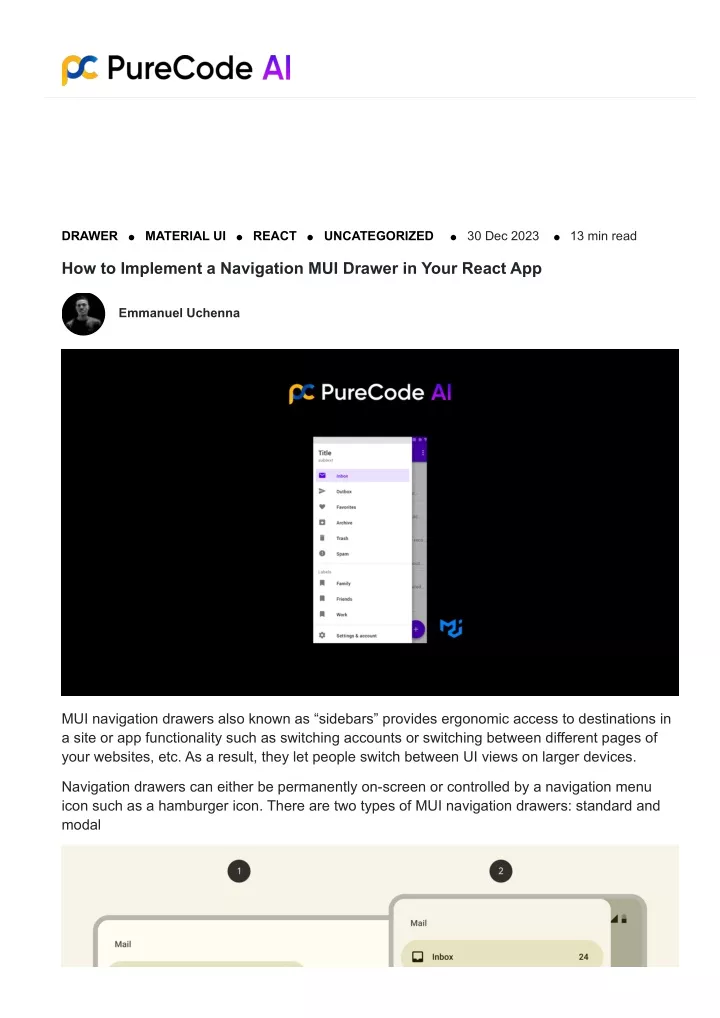
DRAWER MATERIAL UI REACT UNCATEGORIZED 30 Dec 2023 13 min read How to Implement a Navigation MUI Drawer in Your React App Emmanuel Uchenna MUI navigation drawers also known as “sidebars” provides ergonomic access to destinations in a site or app functionality such as switching accounts or switching between different pages of your websites, etc. As a result, they let people switch between UI views on larger devices. Navigation drawers can either be permanently on-screen or controlled by a navigation menu icon such as a hamburger icon. There are two types of MUI navigation drawers: standard and modal
1 Standard navigation drawer 2 Modal navigation drawer In this article, you will learn about the MUI drawer navigation and how to create a drawer in Material-UI React. So skip the hard part of writing codes from scratch by letting our AI agent generate your components for your web application and be 5x effective and productive. What is Material-UI? Before diving into the Drawer component, let us briefly discuss Material-UI. Material-UI (MUI) is a popular React UI framework that provides a set of pre-designed components following the Material Design guidelines. It simplifies the process of building aesthetically pleasing and responsive user interfaces. It also provides you with pre-built robust, customizable, and accessible React components that can be used to build your design system and develop your web applications faster. MUI was started in 2014 by Hai Nguyen and since then, it has experienced significant growth, boasting 89k+ stars on GitHub, 1.5M+ weekly downloads, with a small bundle size of 93.7kB (Minified+ Gzipped). The chart below from NPM trends shows a comparison of the number of downloads of Material UI over the last year.
MUI provides one component called Drawer that you can use to create a Drawer in Material-UI. If you use MUI for your project, consider using Purecode.ai Marketplace to access over 10000+ AI-generated ready-made templates and components to speed up your development process. Implementing Material UI Drawer Component Now you understand what Material UI library is, its significance, and why it is a preferred choice for most developers. Let us learn how to install React and the MUI library. Prerequisite Before creating a Material-UI Drawer, you need to have the following: NPM is installed on your machine. Basic knowledge of JavaScript and React. If you need help getting started with React, check out the video tutorial below. Setting up a React App In your terminal, enter the following command to create a new React application: npx create-react-app my-app && cd my-app
Once your app is set up, run the application by entering either of these commands in your terminal: yarn start Or using npm: npm start Your server should launch in your browser at http://localhost:3000/. How to Install Material UI To get set up with MUI we can install it as an NPM package or use Yarn. npm install @material-ui/core or yarn add @material-ui/core Once the MUI library is successfully installed, you are all set to start using the Material UI components in your React application. Understanding the Drawer Component The Drawer component is used to create a navigation drawer. The Drawer component can be imported as below: import { Drawer } from "@material-ui/core";
Drawer Types MUI Provides you with the following types of drawers: Temporary drawer: This drawer can toggle open or closed and closed by default. The drawer opens temporarily above all other content until any section is selected. Responsive drawer: This drawer is responsive. Persistent drawer: In this navigation, the drawer can toggle open or closed. It is on the same surface elevation as the content and is closed by default and opens by selecting the menu icon and stays open until it is closed. Mini variant drawer: In this drawer navigation, the persistent navigation drawer changes its width. Permanent drawer: They are always visible and aligned to the left edge with the same elevation as the content or background and cannot be closed. Creating a Temporary Drawer A temporary drawer is a slide-out navigation menu that opens and closes in response to user actions. By default, the temporary drawer is closed, and hidden off-screen. It opens or “draws” out temporarily above any main content when triggered, usually by a menu icon. The temporary drawer floats above the main UI, not obstructing it. Your users can browse the navigation links in the drawer while still viewing the underlying content. Once a navigation link is selected, the drawer will automatically close. To create a temporary drawer in Material-UI React, set the ‘open’ prop of the Drawer component to a state variable that toggles between true and false. For example, set ‘open’ to ‘isDrawerOpen‘ state. When the menu icon is clicked, set ‘isDrawerOpen‘ to true to open the Drawer. It can be closed by clicking outside of it, pressing the ESC key, or when a link is selected by setting ‘isDrawerOpen‘ to false. The Drawer appears temporarily until closed again programmatically or by the user. The temporary drawer pattern allows fluid navigation without taking up permanent screen space. Users can easily open the drawer to navigate and then close it to focus on content. To create a temporary drawer, start by importing the following components: Drawer, ListItem, ListItemIcon, ListItemText, Button, etc: Code Example for MUI Temporary Drawer // Code snippet for creating a basic drawer import Box from '@mui/material/Box'; import SwipeableDrawer from '@mui/material/SwipeableDrawer'; import Button from '@mui/material/Button'; import List from '@mui/material/List'; import Divider from '@mui/material/Divider'; import ListItem from '@mui/material/ListItem';
import ListItemButton from '@mui/material/ListItemButton'; import ListItemIcon from '@mui/material/ListItemIcon'; import ListItemText from '@mui/material/ListItemText'; import InboxIcon from '@mui/icons-material/MoveToInbox'; import MailIcon from '@mui/icons-material/Mail'; // (other imports) function App() { // (component logic) } Next, paste the following code to create a basic temporary drawer: import * as React from 'react'; import Box from '@mui/material/Box'; import SwipeableDrawer from '@mui/material/SwipeableDrawer'; import Button from '@mui/material/Button'; import List from '@mui/material/List'; import Divider from '@mui/material/Divider'; import ListItem from '@mui/material/ListItem'; import ListItemButton from '@mui/material/ListItemButton'; import ListItemIcon from '@mui/material/ListItemIcon'; import ListItemText from '@mui/material/ListItemText'; import InboxIcon from '@mui/icons-material/MoveToInbox'; import MailIcon from '@mui/icons-material/Mail'; export default function TemporaryDrawer() { const [state, setState] = React.useState({ top: false, left: false, bottom: false, right: false, }); const toggleDrawer = (anchor, open) => (event) => { if ( event && event.type === 'keydown' && (event.key === 'Tab' || event.key === 'Shift') ) { return; } setState({ ...state, [anchor]: open }); }; const list = (anchor) => ( <Box
sx={{ width: anchor === 'top' || anchor === 'bottom' ? 'auto' : 250 }} role="presentation" onClick={toggleDrawer(anchor, false)} onKeyDown={toggleDrawer(anchor, false)} > <List> {['Inbox', 'Starred', 'Send email', 'Drafts'].map((text, index) => ( <ListItem key={text} disablePadding> <ListItemButton> <ListItemIcon> {index % 2 === 0 ? <InboxIcon /> : <MailIcon />} </ListItemIcon> <ListItemText primary={text} /> </ListItemButton> </ListItem> ))} </List> <Divider /> <List> {['All mail', 'Trash', 'Spam'].map((text, index) => ( <ListItem key={text} disablePadding> <ListItemButton> <ListItemIcon> {index % 2 === 0 ? <InboxIcon /> : <MailIcon />} </ListItemIcon> <ListItemText primary={text} /> </ListItemButton> </ListItem> ))} </List> </Box> ); return ( <div> {['left', 'right', 'top', 'bottom'].map((anchor) => ( <React.Fragment key={anchor}> <Button onClick={toggleDrawer(anchor, true)}>{anchor}</Button> <SwipeableDrawer anchor={anchor} open={state[anchor]} onClose={toggleDrawer(anchor, false)} onOpen={toggleDrawer(anchor, true)} > {list(anchor)} </SwipeableDrawer> </React.Fragment> ))}
</div> ); } Handling Drawer State The open prop is a boolean that controls the visibility of the Material-UI Drawer component. To manage the state, use a variable like isDrawerOpen and set it to true or false to open and close the drawer. The onClose and onClick handler functions can toggle isDrawerOpen to change the open prop, such as when the menu icon is clicked to open the drawer or when a link is selected to close it. Properly controlling the open prop by updating the state in response to user events like onClose allows the Drawer to transition between open and closed states fluidly. Creating a Permanent Drawer The Material UI Drawer component allows you to create permanent navigation drawers that
remains visible at all times. This is achieved by setting the variant prop to “permanent“. A permanent drawer is fixed to the left edge of the screen and sits at the same elevation or height as the rest of the content. Unlike other drawer variants, a permanent drawer cannot be closed or hidden. For desktop interfaces, a permanent navigation drawer is the recommended default implementation. It provides consistent and convenient access to navigation options. Users can always see the menu choices available in the drawer without having to trigger any show/hide behavior. The permanent drawer works well for desktop layouts as it doesn’t take up too much horizontal space. The drawer can house the main navigation while the remaining width is dedicated to content. Setting up permanent navigation drawers with MUI is straightforward. You simply render the <Drawer> component with variant=”permanent” and omit the open prop that controls show/hide behavior. The drawer will remain fixed on the screen at all times. This creates an intuitive navigation pattern for desktop interfaces. Users have access to menu options at a glance without losing screen real estate. The permanently visible drawer avoids hiding navigation choices that may confuse. Basic code example for a Permanent Drawer // Code snippet for creating a permanent drawer <Drawer variant="permanent" open={open} anchor={"left"} onClose={() => setOpen(false)}> {getList()} </Drawer> Code Example for MUI Permanent Drawer import * as React from 'react'; import Box from '@mui/material/Box'; import Drawer from '@mui/material/Drawer'; import CssBaseline from '@mui/material/CssBaseline'; import AppBar from '@mui/material/AppBar'; import Toolbar from '@mui/material/Toolbar'; import List from '@mui/material/List'; import Typography from '@mui/material/Typography'; import Divider from '@mui/material/Divider'; import ListItem from '@mui/material/ListItem'; import ListItemButton from '@mui/material/ListItemButton'; import ListItemIcon from '@mui/material/ListItemIcon'; import ListItemText from '@mui/material/ListItemText'; import InboxIcon from '@mui/icons-material/MoveToInbox'; import MailIcon from '@mui/icons-material/Mail'; const drawerWidth = 240;
export default function PermanentDrawerLeft() { return ( <Box sx={{ display: 'flex' }}> <CssBaseline /> <AppBar position="fixed" sx={{ width: `calc(100% - ${drawerWidth}px)`, ml: `${drawerWidth}px` }} > <Toolbar> <Typography variant="h6" noWrap component="div"> Permanent drawer </Typography> </Toolbar> </AppBar> <Drawer sx={{ width: drawerWidth, flexShrink: 0, '& .MuiDrawer-paper': { width: drawerWidth, boxSizing: 'border-box', }, }} variant="permanent" anchor="left" > <Toolbar /> <Divider /> <List> {['Inbox', 'Starred', 'Send email', 'Drafts'].map((text, index) => ( <ListItem key={text} disablePadding> <ListItemButton> <ListItemIcon> {index % 2 === 0 ? <InboxIcon /> : <MailIcon />} </ListItemIcon> <ListItemText primary={text} /> </ListItemButton> </ListItem> ))} </List> <Divider /> <List> {['All mail', 'Trash', 'Spam'].map((text, index) => ( <ListItem key={text} disablePadding> <ListItemButton> <ListItemIcon> {index % 2 === 0 ? <InboxIcon /> : <MailIcon />} </ListItemIcon>
<ListItemText primary={text} /> </ListItemButton> </ListItem> ))} </List> </Drawer> <Box component="main" sx={{ flexGrow: 1, bgcolor: 'background.default', p: 3 }} > <Toolbar /> <Typography paragraph> Lorem ipsum dolor sit amet, consectetur adipiscing elit, sed do eiusmod tempor incididunt ut labore et dolore magna aliqua. Rhoncus dolor purus non enim praesent elementum facilisis leo vel. Risus at ultrices mi tempus imperdiet. Semper risus in hendrerit gravida rutrum quisque non tellus. Convallis convallis tellus id interdum velit laoreet id donec ultrices. Odio morbi quis commodo odio aenean sed adipiscing. Amet nisl suscipit adipiscing bibendum est ultricies integer quis. Cursus euismod quis viverra nibh cras. Metus vulputate eu scelerisque felis imperdiet proin fermentum leo. Mauris commodo quis imperdiet massa tincidunt. Cras tincidunt lobortis feugiat vivamus at augue. At augue eget arcu dictum varius duis at consectetur lorem. Velit sed ullamcorper morbi tincidunt. Lorem donec massa sapien faucibus et molestie ac. </Typography> <Typography paragraph> Consequat mauris nunc congue nisi vitae suscipit. Fringilla est ullamcorper eget nulla facilisi etiam dignissim diam. Pulvinar elementum integer enim neque volutpat ac tincidunt. Ornare suspendisse sed nisi lacus sed viverra tellus. Purus sit amet volutpat consequat mauris. Elementum eu facilisis sed odio morbi. Euismod lacinia at quis risus sed vulputate odio. Morbi tincidunt ornare massa eget egestas purus viverra accumsan in. In hendrerit gravida rutrum quisque non tellus orci ac. Pellentesque nec nam aliquam sem et tortor. Habitant morbi tristique senectus et. Adipiscing elit duis tristique sollicitudin nibh sit. Ornare aenean euismod elementum nisi quis eleifend. Commodo viverra maecenas accumsan lacus vel facilisis. Nulla posuere sollicitudin aliquam ultrices sagittis orci a. </Typography> </Box> </Box> ); }
Creating a Persistent Drawer Persistent navigation drawers can toggle open or closed. The drawer sits on the same surface elevation as the content. It is closed by default opens by selecting the menu icon, and stays open until closed by the user. The state of the drawer is remembered from action to action and session to session. When the drawer is outside of the page grid and opens, the drawer forces other content to change size and adapt to the smaller viewport. Persistent navigation drawers are acceptable for all sizes larger than mobile. They are not recommended for apps with multiple levels of hierarchy that require using an up arrow for navigation. import * as React from 'react'; import { styled, useTheme } from '@mui/material/styles'; import Box from '@mui/material/Box'; import Drawer from '@mui/material/Drawer'; import CssBaseline from '@mui/material/CssBaseline'; import MuiAppBar from '@mui/material/AppBar'; import Toolbar from '@mui/material/Toolbar'; import List from '@mui/material/List'; import Typography from '@mui/material/Typography'; import Divider from '@mui/material/Divider'; import IconButton from '@mui/material/IconButton';
import MenuIcon from '@mui/icons-material/Menu'; import ChevronLeftIcon from '@mui/icons-material/ChevronLeft'; import ChevronRightIcon from '@mui/icons-material/ChevronRight'; import ListItem from '@mui/material/ListItem'; import ListItemButton from '@mui/material/ListItemButton'; import ListItemIcon from '@mui/material/ListItemIcon'; import ListItemText from '@mui/material/ListItemText'; import InboxIcon from '@mui/icons-material/MoveToInbox'; import MailIcon from '@mui/icons-material/Mail'; const drawerWidth = 240; const Main = styled('main', { shouldForwardProp: (prop) => prop !== 'open' })( ({ theme, open }) => ({ flexGrow: 1, padding: theme.spacing(3), transition: theme.transitions.create('margin', { easing: theme.transitions.easing.sharp, duration: theme.transitions.duration.leavingScreen, }), marginLeft: `-${drawerWidth}px`, ...(open && { transition: theme.transitions.create('margin', { easing: theme.transitions.easing.easeOut, duration: theme.transitions.duration.enteringScreen, }), marginLeft: 0, }), }), ); const AppBar = styled(MuiAppBar, { shouldForwardProp: (prop) => prop !== 'open', })(({ theme, open }) => ({ transition: theme.transitions.create(['margin', 'width'], { easing: theme.transitions.easing.sharp, duration: theme.transitions.duration.leavingScreen, }), ...(open && { width: `calc(100% - ${drawerWidth}px)`, marginLeft: `${drawerWidth}px`, transition: theme.transitions.create(['margin', 'width'], { easing: theme.transitions.easing.easeOut, duration: theme.transitions.duration.enteringScreen, }), }), }));
const DrawerHeader = styled('div')(({ theme }) => ({ display: 'flex', alignItems: 'center', padding: theme.spacing(0, 1), // necessary for content to be below the app bar ...theme.mixins.toolbar, justifyContent: 'flex-end', })); export default function PersistentDrawerLeft() { const theme = useTheme(); const [open, setOpen] = React.useState(false); const handleDrawerOpen = () => { setOpen(true); }; const handleDrawerClose = () => { setOpen(false); }; return ( <Box sx={{ display: 'flex' }}> <CssBaseline /> <AppBar position="fixed" open={open}> <Toolbar> <IconButton color="inherit" aria-label="open drawer" onClick={handleDrawerOpen} edge="start" sx={{ mr: 2, ...(open && { display: 'none' }) }} > <MenuIcon /> </IconButton> <Typography variant="h6" noWrap component="div"> Persistent drawer </Typography> </Toolbar> </AppBar> <Drawer sx={{ width: drawerWidth, flexShrink: 0, '& .MuiDrawer-paper': { width: drawerWidth, boxSizing: 'border-box', },
}} variant="persistent" anchor="left" open={open} > <DrawerHeader> <IconButton onClick={handleDrawerClose}> {theme.direction === 'ltr' ? <ChevronLeftIcon /> : <ChevronRightIcon />} </IconButton> </DrawerHeader> <Divider /> <List> {['Inbox', 'Starred', 'Send email', 'Drafts'].map((text, index) => ( <ListItem key={text} disablePadding> <ListItemButton> <ListItemIcon> {index % 2 === 0 ? <InboxIcon /> : <MailIcon />} </ListItemIcon> <ListItemText primary={text} /> </ListItemButton> </ListItem> ))} </List> <Divider /> <List> {['All mail', 'Trash', 'Spam'].map((text, index) => ( <ListItem key={text} disablePadding> <ListItemButton> <ListItemIcon> {index % 2 === 0 ? <InboxIcon /> : <MailIcon />} </ListItemIcon> <ListItemText primary={text} /> </ListItemButton> </ListItem> ))} </List> </Drawer> <Main open={open}> <DrawerHeader /> <Typography paragraph> Lorem ipsum dolor sit amet, consectetur adipiscing elit, sed do eiusmod tempor incididunt ut labore et dolore magna aliqua. Rhoncus dolor purus non enim praesent elementum facilisis leo vel. Risus at ultrices mi tempus imperdiet. Semper risus in hendrerit gravida rutrum quisque non tellus. Convallis convallis tellus id interdum velit laoreet id donec ultrices. Odio morbi quis commodo odio aenean sed adipiscing. Amet nisl suscipit adipiscing bibendum est ultricies integer quis. Cursus euismod quis viverra nibh cras. Metus vulputate eu scelerisque felis imperdiet proin fermentum
leo. Mauris commodo quis imperdiet massa tincidunt. Cras tincidunt lobortis feugiat vivamus at augue. At augue eget arcu dictum varius duis at consectetur lorem. Velit sed ullamcorper morbi tincidunt. Lorem donec massa sapien faucibus et molestie ac. </Typography> <Typography paragraph> Consequat mauris nunc congue nisi vitae suscipit. Fringilla est ullamcorper eget nulla facilisi etiam dignissim diam. Pulvinar elementum integer enim neque volutpat ac tincidunt. Ornare suspendisse sed nisi lacus sed viverra tellus. Purus sit amet volutpat consequat mauris. Elementum eu facilisis sed odio morbi. Euismod lacinia at quis risus sed vulputate odio. Morbi tincidunt ornare massa eget egestas purus viverra accumsan in. In hendrerit gravida rutrum quisque non tellus orci ac. Pellentesque nec nam aliquam sem et tortor. Habitant morbi tristique senectus et. Adipiscing elit duis tristique sollicitudin nibh sit. Ornare aenean euismod elementum nisi quis eleifend. Commodo viverra maecenas accumsan lacus vel facilisis. Nulla posuere sollicitudin aliquam ultrices sagittis orci a. </Typography> </Main> </Box> ); } Adding a Divider The Material-UI framework includes a convenient Divider component that can be used to visually separate sections of content within navigation drawers. Adding dividers between groups of menu items in your drawer is a simple way to organize the options into logical categories. To add a divider, first import the Divider from Material-UI. Then render the <Divider /> component between the different sections of your drawer content. For example: <Drawer> <List> {/* Section 1 drawer items */} </List> <Divider /> <List> {/* Section 2 drawer items */} </List> </Drawer> The Divider will span the full available width of the drawer and render a thin horizontal line
between the menu sections. This provides a clean visual separation to delineate the different categories of navigation options. Using dividers improves the organization and scalability of the menu items in the drawer. So in summary, the Material-UI Divider is an easy way to group and organize the content in your navigation drawers for a better user experience. The divider gives a visual distinction between categories of links or menu options. Code Example for Adding a Divider // Code snippet for adding a divider in the drawer <Drawer variant="permanent" open={open} anchor={"left"} onClose={() => setOpen(false)}> {getList()} <Divider /> {getList()} </Drawer> Tabular Comparison of Different Navigation Drawer Implementation Options with MUI Drawer Drawer Type Permanent Persistent Temporary Hidden by default, toggled open/closed Hidden by default, toggled open/closed Visibility Always visible Position Pinned to side Slides out over content Slides out over content Default for desktop sites Use Case For UIs with limited space Quick access on mobile Fast, always rendered Performance Slower show/hide Slower show/hide variant Prop "persistent" (default) "permanent" "temporary" Controls open/closed state open Prop Omitted Controls open/closed state
Drawer Type Permanent Persistent Temporary onClose Prop Omitted Closes drawer Closes drawer This table compares the three main drawer variant options: Permanent – Always visible, pinned drawer for desktop Persistent – Hidden by default, slides out, toggled open/close Temporary – Hidden by default, slides out, toggled open/close The key differences lie in visibility, position, use cases, and performance. Permanent drawers are the fastest since they are always rendered. Persistent and temporary drawers have open/close behavior. The above table also maps the variant options to the corresponding props that enable each implementation. This provides a quick reference for configuring each type of drawer. What You Have Learned In this article, you have gained a solid understanding of implementing navigation drawers in your React application using the Material-UI Drawer component. Starting with the basics, you have learned how to import essential components, such as ListItem and ListItemIcon, and use them to create a simple yet effective navigation drawer. The guide walks you through the process of handling the drawer’s state, introducing the ‘open‘ boolean variable and illustrating the role of event functions in managing the drawer’s visibility. You have also delved into creating a permanent drawer, exploring the ‘variant’ prop with a focus on the ‘permanent‘ value. The guide provides clear examples to help you differentiate between default and permanent drawer variants, empowering you to choose the most suitable option for your application’s navigation needs. Also, you have learned how to enhance the drawer’s visual appeal by incorporating dividers between items using the Material-UI Divider component. The provided code snippets and explanations offer a hands-on approach, ensuring you grasp the concepts and can seamlessly integrate navigation drawers into your React projects. If you wish to learn more about MUI Drawer, check out this video below:
Further Readings If you enjoyed reading this article, consider checking out other great pieces about Material UI from our blog. How to Start Using the MUI Accordion Component How to Style And Customize MUI DatePicker Top 7 Material UI Alternatives for Unlimited Development The Ultimate Material Icons Cheat Sheet: A Quick-Reference How To Build A MUI Stepper That Enhances Functionality How to Easily Install MUI in 2023: The Basics Share this: Emmanuel Uchenna More blogs React
How to Build Dynamic Charts with React Chartjs Components 05 Mar 2024 13 min read React How to Implement Drag and Drop in React with React DnD 01 Mar 2024 13 min read React How to Use Google Maps API With the Google-map-react Library 01 Mar 2024 11 min read Tailwind Blogs Tailwind Dropdown Tailwind Cards Tailwind Config Tailwind Buttons Tailwind Breakpoints
Tailwind Grid MUI Blogs MUI Typgraphy MUI Tooltip MUI Appbar MUI Stack MUI Slider MUI Select Bootstrap Blogs Bootstrap vs MUI