Download
1 / 20
0 likes | 5 Views
Discover the techniques of using CSS to disable buttons with examples, emphasizing the useful ':disabled' pseudo-class and styling methods.

E N D
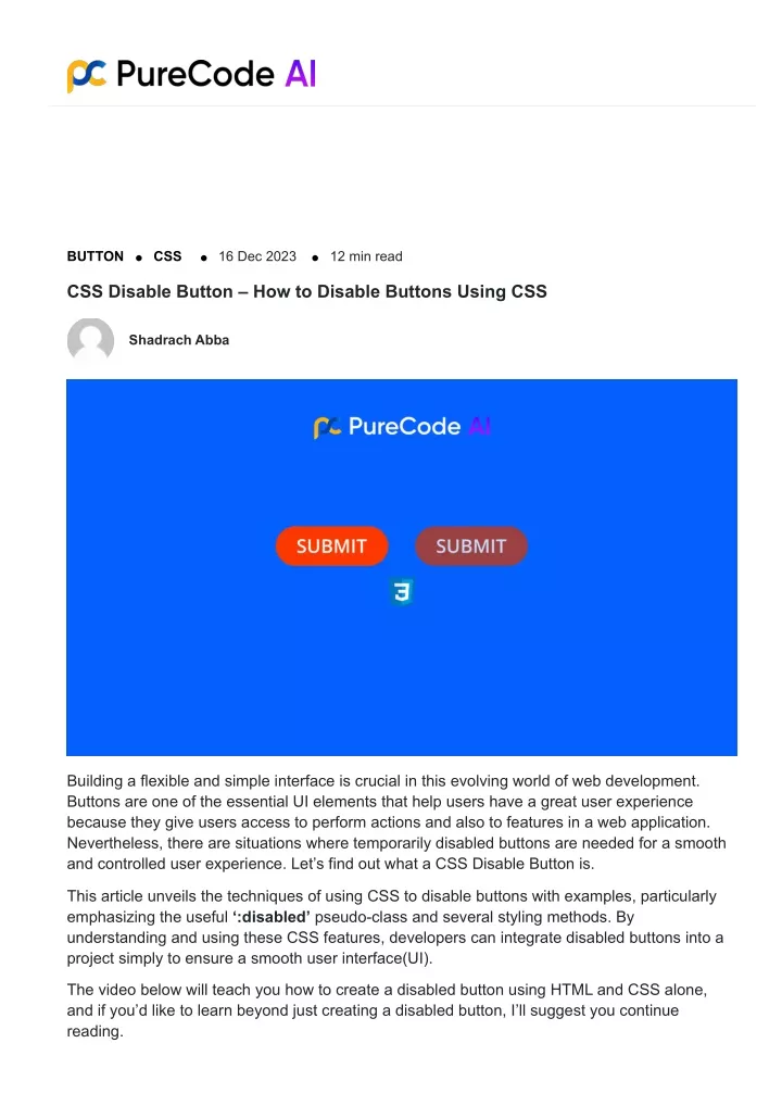
BUTTON CSS 16 Dec 2023 12 min read CSS Disable Button – How to Disable Buttons Using CSS Shadrach Abba Building a flexible and simple interface is crucial in this evolving world of web development. Buttons are one of the essential UI elements that help users have a great user experience because they give users access to perform actions and also to features in a web application. Nevertheless, there are situations where temporarily disabled buttons are needed for a smooth and controlled user experience. Let’s find out what a CSS Disable Button is. This article unveils the techniques of using CSS to disable buttons with examples, particularly emphasizing the useful ‘:disabled’ pseudo-class and several styling methods. By understanding and using these CSS features, developers can integrate disabled buttons into a project simply to ensure a smooth user interface(UI). The video below will teach you how to create a disabled button using HTML and CSS alone, and if you’d like to learn beyond just creating a disabled button, I’ll suggest you continue reading.
Before we go ahead into the topic, we must understand what a pseudo-class is, a pseudo-class is a keyword that is added to a selector to specify the particular state of the element(s) being selected. You can style elements based on their state or position using pseudo-classes. PS: Engineers waste time building and styling components when working on a project, writing repetitive markup adds time to the project and is a mundane, boring task for engineers. PureCode.ai uses AI to generate a large selection of custom, styled UI components for different projects and component types. What is a Button? Now that we’re familiar with the CSS pseudo-class, let’s also take a look at buttons. Buttons are fundamental UI elements designed to be clicked to carry out a particular action. Buttons can have multiple functions and different forms depending on the situation. A button can be used for various purposes to enhance users experience and engagement in a web application, but here are a few functions of a button: It can be used to submit forms after users have filled the form text fields with their information. Buttons can be used to change the functionality or visibility of specific elements on pages On an E-commerce website, buttons can be used to allow users to add products to their
shopping carts. Users can log in or create an account with buttons, which speed up the user’s authentication process. A button on a website can be used for a multitude of purposes. To learn more about the functionalities of buttons, let’s take a closer look at the overview of button states. An Overview of the Different Button States in CSS Understanding the different types of button states would help gain a deep understanding of the topic, so what is a button state? A button state is the current state of a button, indicating whether is available for interaction, active, or inactive. Buttons use various states to provide visual indications to users, thereby improving the overall user experience. Buttons can be in different states when it comes to web development, each with a specific function that improves users’ experience and provides immediate feedback. A button’s various states provide information about its functionality or current state, which enhances users’ experience generally. Here is an outline of a few common button states: Default State Disabled Button State Hover State
Active State Toggle State Now, let’s delve deeper into these few common button states. Default State The default state is the initial appearance of the button when it is not interacted with. It is usually in a neutral state, indicating that the button is ready for usage. The default state should be visually different from other UI elements. Here is an example of a default button. <style> button { background-color: #007bff; color: #fff; padding: 10px 20px; border: none; cursor: pointer; } </style> <button>Default Button</button> Disabled Button State One important part of developing a website is creating the disabled state of a button, which indicates both physically and functionally that a button is not available to be used at the moment.
When an associated function is not available at the moment, this state is frequently used to stop users from clicking or tapping a button. Here is an example of a disabled button in HTML code button:disabled { background-color: #ccc; color: #666; font-size:20px; } <button disabled>Disabled Button</button> in this example above, the button is initially disabled using the `disabled` attribute then it is given a background color, font size, and color with CSS. Hover Button State This is a hover effect added to a button that occurs when users hover their cursor, typically without clicking or tapping the button. the state helps users to know that a button is interactable. Here is an example of a button with the hover state effect in HTML and CSS code <html lang="en"> <head> <meta charset="UTF-8"> <meta name="viewport" content="width=device-width, initial-scale=1.0"> <title>Test</title> <style> button{ background-color:blue;
border-color:red; } button:hover{ background-color:red; } </style> </head> <body> <button>Submit</button> </body> </html> In this code snippet above, we have a button labeled `Submit` which has an initial background color of blue and a border color of red. A hover effect in the style tag (<style>) was added to the button to change the background color of the button to red whenever a mouse pointer hovers over the button. This image below is the output of the code above: Active State When users click a button, it enters the active state. This state provides strong visual indications, showing that a button has been pressed and the user’s action has been processed. The active state generally includes changes in color, depth, or animation to emphasize the button’s active status. Here is an example of a button with the active state effect in HTML and CSS code
<style> button:active { background-color: #004080; color: white; } </style> <button>Active</button> Toggle State Toggle buttons that switch between two or more states use additional states to represent their current selection. For example, a toggle button may have a checked state to indicate the selected option and an unchecked state to indicate the unselected option. To distinguish between the various options, toggle states can involve changes in color, border, or icons. To create a button that has a toggle state, Let’s start with the HTML structure. We have a basic HTML document with a heading and a label containing an input checkbox and a span element. This structure forms the foundation of our toggle switch: <!DOCTYPE html> <html> <head> <meta name="viewport" content="width=device-width, initial-scale=1"> <style> <!-- Your CSS Code Goes Here --> </style> </head>
<body> <h2>Toggle Switch</h2> <label class="switch"> <input type="checkbox"> <span class="slider round"></span> </label> </body> </html> Now, let’s dive into the CSS code that brings our toggle switch to life. The CSS code is responsible for styling and animating the switch. Here’s a breakdown of the key CSS styles: .switch { position: relative; display: inline-block; width: 60px; height: 34px; } .switch input { opacity: 0; width: 0; height: 0; } .slider { position: absolute; cursor: pointer; top: 0;
left: 0; right: 0; bottom: 0; background-color: #ccc; transition: .4s; <!-- Smooth transition effect --> } .slider:before { position: absolute; content: ""; height: 26px; width: 26px; left: 4px; bottom: 4px; background-color: white; transition: .4s; <!-- Smooth transition effect for the knob --> } input:checked + .slider { background-color: #2196F3; <!-- Background color when the switch is ON --> } input:focus + .slider { box-shadow: 0 0 1px #2196F3; <!-- Add a subtle shadow on focus --> } input:checked + .slider:before { transform: translateX(26px); <!-- Move the knob to the right when the switch is ON --> } /* Rounded sliders */ .slider.round { border-radius: 34px; } .slider.round:before { border-radius: 50%; <!-- Make the knob round for a polished look --> }
These code examples demonstrate how to create buttons with different states. You can change the styles and behavior of the buttons to suit your needs. Now let’s find out what a disabled button is. What is a Disabled Button? Disabled buttons are buttons that can not be interacted with by users. Disabled buttons usually look faded and this helps users detect the disabled buttons easily just like is shown in the image below. In the image above, the disabled button is on the left side, while the normal/enabled button is on the right side. Here are some examples of how disabled buttons are used: Forms: Disabled buttons are often used to prevent users from submitting incomplete or invalid data when working with forms. For example, a submit button might be disabled until all of the required fields are filled in. Wizards: Disabled buttons are often used in wizards to guide users through a multi-step
process. For example, the next button might be disabled until users have completed the current step. Error pages: Disabled buttons are often used on error pages to prevent users from performing actions that would make the error worse. For example, a submit button might be disabled on an error page to prevent users from submitting the same invalid data again. How to Create a Button Creating a button is a fundamental task in web development, as buttons serve as essential interactive elements that allow users to perform actions and navigate through web pages. The process of creating a button involves defining its HTML structure and applying CSS styles to customize its appearance and behavior. In HTML, the <button> tag is used to create buttons in a web application. The first step in creating this is to define the structure using HTML <!DOCTYPE html> <html lang="en"> <head> <meta charset="UTF-8"> <meta name="viewport" content="width=device-width, initial-scale=1.0"> <title>Test</title> </head> <body> <button>Submit</button> </body> </html> This simple HTML code shows a basic button labelled “Click me”. But right now, the button is not styled. Let’s give the button some styles with CSS(Cascading Style Sheet). The image below is the output of the code above:
Adding Styles to a Button Enhancing a button’s visibility on a website improves its design quality and makes the interface more engaging and easy for users to understand. When adding styles to buttons, you can use CSS to modify its look and make sure it match the website’s overall design and branding. Utilizing the previous HTML code we will go through the fundamental methods for adding styles to a button in this section, including how to add border, text color, and size. <style> button { background-color: #3498db; /* Set the background color */ color: #ffffff; /* Set the text color */ padding: 10px 20px; /* create space around the text */ border: none; border-radius: 5px; /* Add rounded corners for a modern look */ cursor: pointer; } </style> <button>Submit</button> The image below is the output of the code above: Now, you can style a button with CSS. let’s disable a button using CSS.
How to Disable a Button in CSS A button can be rendered disabled by adding the HTML `disabled` attribute to it. A button that is disabled cannot be clicked and cannot be used for any purpose. The easiest way to make sure a button is disabled is to add the `disabled` attribute to the <button> tag in HTML. This will make the button unclickable and gray out its text and background color. To achieve this, follow these steps: 1. Using the disabled Attribute in HTML: The simplest approach is to add the disabled attribute directly in the button tag in HTML. This will render the button inactive, preventing users from interacting with it.<button disabled>Disabled</button> The output of the above HTML code for the disabled button is shown in the image below. 2. Using CSS Selectors to Target Disabled Buttons: You can also utilize CSS selectors to style and disable buttons selectively. The `:disabled` pseudo-class selector targets the disabled state of an element, allowing you to modify its appearance and behavior. button:disabled { background-color: #ccc; color: #666; cursor: not-allowed; } This CSS code applies the specified styles to all disabled buttons, making them appear grayed out and unclickable. The “cursor: not-allowed”. Other factors to consider include when disabling a button in CSS: Visual Cues: Ensure that buttons have clear visual cues to distinguish them from active buttons. This can be achieved through color changes, opacity adjustments, or subtle iconography. Feedback: Provide clear feedback to users when they attempt to interact with a button disabled. This can be done through tooltips, error messages, or changes in cursor behavior. Accessibility: Utilize the ARIA attribute to provide semantic information about the disabled state for assistive technologies like screen reader
Here is an example of ARIA Attribute Usage <button role="button" aria-label="Submit Form" aria-disabled="false">Click</button> How to Remove Hover Effects from Disabled Buttons Suppose you want to remove the hover effect on a disabled button. In that case, you can utilize the CSS selector to target and override the default hover styles associated with the button. Here is a step-by-step guide to achieving this: 1. Identify the Button element: The first step in removing hover effects from disabled buttons is to identify the button element. This entails utilizing the proper CSS selectors to target the button and comprehending its HTML structure.In HTML, the <button> tag is commonly used to represent a button element. This tag includes any characteristics that specify the button’s appearance or behavior in addition to the text or content that appears on it. <button>Button Text</button> To identify disabled buttons, you need to look for <button> tags with the disabled attribute. This attribute indicates that the button is not interactive and should not be clickable. <button disabled>Disabled Button</button> 2. Utilize the CSS Selector(:disabled): After locating the button element, you can target it precisely with CSS selectors. For disabled buttons, the :disabled pseudo-class selector is particularly useful. button:disabled { } 3. Remove the Hover Effects: Remove the hover effect that you want to remove within the CSS selector. button:disabled { background-color: #ccc; /* Set default disabled background color * This code snippet disables hover interactions, sets the disabled background and text colors to default, and changes the cursor to the default on hover, effectively removing the hover effects. Let’s how a disabled button would look when viewed on the browser:
Enhancing User Experience with CSS Disable Button In this section, we’ll look at how to make a visually appealing and user-friendly CSS disable button. This button is intended to inform users that a specific action is disabled. Let’s define different styles and CSS classes for our buttons. CSS Button Disabling Styles Table: https://www.notion.so/b8ca66254622430f90b32cff86cdbaf3? pvs=4#f73d1def8e1b42309f6d976cbb9e518e To achieve a disabled look, apply the following CSS styles to the ‘btn-disabled’ class: .btn-disabled { background-color: #ccc; color: #999; cursor: not-allowed; /* Add any additional styles for the disabled state */ opacity: 0.7; /* Example: Reducing opacity for a faded appearance */ } Purpose of Disabled buttons. In web development, disabled buttons serve as a way to communicate to users that a specific action or interaction is not permitted or available at this time. When a button is disabled, users are unable to click on it to perform any related actions; it is usually visually recognizable from an enabled button. Disabled buttons serve several purposes in UI design: Preventing Wrong Actions: Disabled buttons act as gatekeepers, preventing users from performing actions that are not currently allowed. This helps users, especially when they are finishing a task or filling out forms, avoid mistakes and frustration. A form’s disabled submit button, for example, prevents the users from submitting incomplete data by indicating that one or more required fields are missing. Improve User Experience: Disabled buttons generally improve user’s experience by minimizing mistakes, and assisting users in completing tasks quickly. They make it easier for
users to communicate with the system confidently and efficiently which improves user satisfaction and productivity. Improving Accessibility: To ensure that people with disabilities, especially those who rely on screen readers, can interact with the system efficiently, disabled buttons are essential. By giving users context and avoiding frustration, screen readers can make it apparent when a button is disabled. UI designers can make interfaces that are more flexible, error-free, and simple by carefully using disabled buttons PureCode.ai can cater for your code development process. It will save you valuable time and effort on a project by providing customized, and ready-to-use components which will allow you to prioritize more important and thought-intensive tasks to speed up the development of your user interface. Further Thoughts on Disabling Buttons in CSS While CSS is primarily a styling language and doesn’t provide native functionality for disabling buttons, it’s possible to create visual representations of disabled buttons using CSS. When considering the concept of “disabling” buttons using CSS, it’s essential to understand that this is a purely visual treatment, and the button remains interactive unless disabled through HTML attributes or JavaScript. Here are some further thoughts and considerations when working with disabled buttons in CSS: Visual Guidance: Consistency: Keep the disabled buttons on your website or application looking the same. Maintaining consistency improves the user’s comprehension and makes the state of interaction evident. Accessibility: Semantic HTML: Use the HTML “disabled” attribute to disable buttons truly. Giving assistive technologies semantic meaning ensures users with disabilities receive accurate information about the button’s state. <button disabled>Disabled Button</button> Pointer Event: `pointer-events` Property: To control whether an element can be the target of user actions, use CSS’s `pointer-events` property. The element becomes non-interactive when it is set to none. Although this can simulate a disabled state visually, it doesn’t stop interactions, so it’s usually used in conjunction with actual disabling via JavaScript or HTML attributes. button:disabled { pointer-events: none; }
Styling for Concentration: Focus Styles: Make sure that your styling makes it obvious what the focus is, particularly for visitors who are using keyboards or other assistive devices to navigate your website. This style contributes to accessibility preservation. button:focus { outline: 2px solid #3498db; } User Experience (UX): Comment and Expectation: Keep user experience in mind. Disabled buttons should provide feedback on why they are disabled, guiding users on what steps to take next. Remember, the goal is to create a positive and intuitive user experience. While CSS can contribute to the visual aspect of a disabled button, using HTML attributes (like disabled) and JavaScript for true interactivity control is crucial, especially when considering accessibility and a robust UI. For your reference, you can also check out the below YouTube video to learn more about the disabled selector in CSS: Share this: Shadrach Abba
More blogs CSS Why You Need to Use CSS Minification for Web Performance 01 Mar 2024 12 min read CSS Top CSS Shape Generator Tools That Will Make Your Life Easier 26 Feb 2024 12 min read CSS
Best CSS Background Generator Tools for Stunning Websites 26 Feb 2024 9 min read Tailwind Blogs Tailwind Dropdown Tailwind Cards Tailwind Config Tailwind Buttons Tailwind Breakpoints Tailwind Grid MUI Blogs MUI Typgraphy MUI Tooltip MUI Appbar MUI Stack MUI Slider MUI Select Bootstrap Blogs Bootstrap vs MUI