Download
1 / 23
0 likes | 3 Views
Learn how to make an intuitive and helpful navbar that provides information with MUI AppBar that enhances the user experience greatly.

E N D
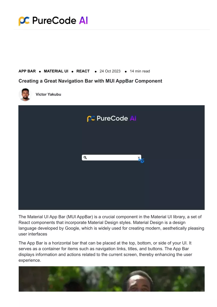
APP BAR MATERIAL UI REACT 24 Oct 2023 14 min read Creating a Great Navigation Bar with MUI AppBar Component Victor Yakubu The Material UI App Bar (MUI AppBar) is a crucial component in the Material UI library, a set of React components that incorporate Material Design styles. Material Design is a design language developed by Google, which is widely used for creating modern, aesthetically pleasing user interfaces The App Bar is a horizontal bar that can be placed at the top, bottom, or side of your UI. It serves as a container for items such as navigation links, titles, and buttons. The App Bar displays information and actions related to the current screen, thereby enhancing the user experience.
Exploring Different Types of AppBar 1. Basic App Bar: The Basic App Bar serves as a fundamental starting point for integrating a simple yet effective navigation system into your application. With its minimalistic design, it allows for easy customization while maintaining a clean and elegant appearance. 2. App Bar with Menu: The App Bar with Menu variant extends the functionality of the basic AppBar by incorporating a dropdown menu, enabling users to access additional navigation options conveniently. This type is particularly useful for applications with an extensive set of features and sections. 3. App Bar with Search Field: For applications that require quick and efficient data retrieval, the App Bar with Search Field provides a valuable solution. This variant integrates a search field directly into the navigation bar, allowing users to perform searches without navigating to a dedicated search page. 4. MUI Responsive App Bar with Drawer: This variant includes a drawer, which is a navigational component that slides in from the side. The drawer typically includes a list of navigation options and is especially useful for mobile or smaller screens where space is limited 5. Customized App Bar: The Customized App Bar variant caters to developers seeking a highly tailored navigation system that aligns precisely with the application’s unique design and branding requirements. With its extensive customization options, this type of AppBar empowers developers to create a distinctive and visually appealing navigation experience. The Material UI AppBar can be used in building intuitive and visually appealing contextual action bar or navigation bars for web applications. With its diverse range of types and customization options, the AppBar enables developers to create a seamless and engaging user experience, fostering a positive interaction with the application’s features and content. Real-world examples of the use of App Bar
https://dribbble.com/shots/22396890-Expert-Tips-App-Settings-UI-Design-Made-Easyhttps://dribbble.com/shots/22396890-Expert-Tips-App-Settings-UI-Design-Made-Easy 1. E-commerce Platforms: An E-commerce website App Bar displays information about the company logo, navigation menus, search functionality, and essential user account options, ensuring seamless and intuitive browsing for customers. 2. Content Management Systems (CMS): Content management systems utilize the AppBar to offer quick access to essential editing tools, navigation options, and user settings, enabling content creators and administrators to manage the platform efficiently. 3. Social Media Platforms: Social media platforms leverage the AppBar to provide users with easy access to their profiles, notifications, messaging options, and various other features, contributing to a user-friendly and streamlined social networking experience. 4. Corporate Websites and Dashboards: Corporate websites and dashboards often incorporate the AppBar to showcase the company’s branding, primary navigation links, and user account management options, facilitating seamless interaction with the company’s digital ecosystem. 5. Educational Platforms: Educational platforms utilize the AppBar to provide students, educators, and administrators with quick access to course materials, personal profiles, messaging tools, and other essential features, contributing to an organized and efficient learning environment. 6. Media Streaming Services: Media streaming services make use of the AppBar to facilitate smooth navigation between different content categories, user profiles, search functionalities, and personalized recommendations, enhancing the overall user experience and
engagement. In all these cases, the AppBar plays a crucial role in providing users with a consistent and accessible interface, enabling them to navigate through different sections of the application effortlessly while maintaining a visually appealing and intuitive user experience. You can get free designs of MUI AppBar components and over 10,000+ AI-generated custom components to speed up development with MUI. Avoid the repetitive design grind. Choose unique, customized solutions with Purecode. Creating Basic Material UI App Bar: Step-by-Step Creating a navigation bar with the MUI AppBar Component is a straightforward process. Before you can start, you need to install MUI in your project. MUI is a popular React UI library that provides a set of pre-designed components following the Material Design guidelines. Here’s how to install MUI: 1. Create a new React project if you don’t already have one. You can create a new project using Create React App by running the following command in your terminal: npx create-react-app foldername 1. Navigate into your new project folder with the following command: cd foldername 1. Install the MUI modules using the following commands: npm install @mui/material npm install @mui/icons-material Now that MUI is installed, let’s move on to creating a Basic App Bar. The Basic App Bar is a simple bar that can contain elements like text, buttons, or icons. It’s the most common type of App Bar and serves as the foundation for other variants. Here’s an example of a Basic App Bar: import AppBar from '@mui/material/AppBar'; import Toolbar from '@mui/material/Toolbar'; import Typography from '@mui/material/Typography'; import Button from '@mui/material/Button'; import MenuIcon from '@mui/icons-material/Menu'; import { IconButton } from '@mui/material'; function BasicAppBar() { return ( <AppBar position="static"> <Toolbar> <IconButton size="large" edge="start" color="inherit"
aria-label="menu" sx={{ mr: 2 }} > <MenuIcon /> </IconButton> <Typography variant="h6" component="div"> Basic App Bar </Typography> <Button color="inherit">Login</Button> </Toolbar> </AppBar> ); } export default BasicAppBar; Creating a appbar in it’s default position In this example, we first import the necessary components from the MUI library. Then, we create a functional component called BasicAppBar. Inside this component, we return the AppBar component from MUI. The position=”static” prop means that the App Bar doesn’t move when you scroll. Inside the AppBar component, we use the Toolbar component. The Toolbar component is a container for other components like Typography, Button, or IconButton. In this case, we’re only including a Typography component to display the text “Basic App Bar”. The variant=”h6″ prop sets the style of the text, and the component=”div” prop means that the Typography component will render a <div> element in the DOM. Building an App Bar with Menu using Material UI Creating an App Bar with a menu using Material UI provides an intuitive way for users to navigate through different areas of your application. This concept is particularly useful in applications where you need to provide multiple navigation options but want to keep the interface clean and uncluttered mui.com. Here’s how you can create an App Bar with a menu: 1. First, import the necessary components from the MUI library: import {useState} from 'react'; import AppBar from '@mui/material/AppBar'; import Toolbar from '@mui/material/Toolbar'; import IconButton from '@mui/material/IconButton'; import Typography from '@mui/material/Typography'; import MenuIcon from '@mui/icons-material/Menu'; import MenuItem from '@mui/material/MenuItem'; import Menu from '@mui/material/Menu';
2. Create a state variable to hold the anchor element for the menu: const [anchorEl, setAnchorEl] = useState(null); 3. Create a function to handle the opening of the menu const handleMenu = (event) => { setAnchorEl(event.currentTarget); }; 4. Create a function to handle the closing of the menu: const handleClose = () => { setAnchorEl(null); }; 5. Inside your component’s return statement, create the App Bar with a menu: return ( <div> <AppBar position="static"> <Toolbar> <IconButton edge="start" color="inherit" aria-label="menu" onClick={handleMenu}> <MenuIcon /> </IconButton> <Typography variant="h6"> App </Typography> <Menu anchorEl={anchorEl} open={Boolean(anchorEl)} onClose={handleClose} > <MenuItem onClick={handleClose}>Option 1</MenuItem> <MenuItem onClick={handleClose}>Option 2</MenuItem> </Menu> </Toolbar> </AppBar> </div> ); In this example, we first create an AppBar with a Toolbar. Inside the Toolbar, we add an IconButton that will trigger the opening of the menu when clicked. We also include a Typography component to display the title of the app. Next, we create a Menu component. The anchorEl prop is used to set the element that the menu is positioned relative to, and the open prop determines whether the menu is open. The onClose prop is used to handle the closing of the menu. Finally, we add MenuItem components to the Menu. Each MenuItem includes an onClick prop to close the menu when the item is clicked. And that’s it! You now have an App Bar with a menu. The complete code would look like this:
import React from 'react'; import AppBar from '@mui/material/AppBar'; import Toolbar from '@mui/material/Toolbar'; import IconButton from '@mui/material/IconButton'; import Typography from '@mui/material/Typography'; import MenuIcon from '@mui/icons-material/Menu'; import MenuItem from '@mui/material/MenuItem'; import Menu from '@mui/material/Menu'; export default function AppBarMenu() { const [anchorEl, setAnchorEl] = React.useState(null); const handleMenu = (event) => { setAnchorEl(event.currentTarget); }; const handleClose = () => { setAnchorEl(null); }; return ( <div> <AppBar position="static"> <Toolbar> <IconButton edge="start" color="inherit" aria-label="menu" onClick= {handleMenu}> <MenuIcon /> </IconButton> <Typography variant="h6"> App </Typography> <Menu anchorEl={anchorEl} open={Boolean(anchorEl)} onClose={handleClose} > <MenuItem onClick={handleClose}>Option 1</MenuItem> <MenuItem onClick={handleClose}>Option 2</MenuItem> </Menu> </Toolbar> </AppBar> </div> ); }
How to Implement an MUI AppBar with a Search Field An App Bar with a search field is a versatile tool that enhances user experience by providing easy access to search functionality directly from the App Bar. This allows users to quickly find the information they’re looking for without having to navigate to a separate search page. Here’s how you can create an App Bar with a search field using Material UI: 1. First, import the necessary components from the MUI library: import AppBar from '@mui/material/AppBar'; import Toolbar from '@mui/material/Toolbar'; import IconButton from '@mui/material/IconButton'; import Typography from '@mui/material/Typography'; import InputBase from '@mui/material/InputBase'; import MenuIcon from '@mui/icons-material/Menu'; import SearchIcon from '@mui/icons-material/Search'; 2. Inside your component’s return statement, create the MUI AppBar with a search field: return ( <div> <AppBar position="static"> <Toolbar> <IconButton edge="start" color="inherit" aria-label="menu"> <MenuIcon /> </IconButton> <Typography variant="h6" style={{ flexGrow: 1 }}> App </Typography> <div> <SearchIcon /> <InputBase placeholder="Search…" inputProps={{ 'aria-label': 'search' }} /> </div> </Toolbar> </AppBar> </div> ); In this example, we first create an AppBar with a Toolbar. Inside the Toolbar, we add an IconButton for the menu, a Typography component for the app title, and a div for the search field. Inside the div, we include a SearchIcon and an InputBase component. The InputBase
component is a basic text input field. The placeholder prop sets the placeholder text for the input field, and the inputProps prop is used to pass additional props to the input element. And that’s it! You now have an App Bar with a search field. The complete code would look like this: import React from 'react'; import AppBar from '@mui/material/AppBar'; import Toolbar from '@mui/material/Toolbar'; import IconButton from '@mui/material/IconButton'; import Typography from '@mui/material/Typography'; import InputBase from '@mui/material/InputBase'; import MenuIcon from '@mui/icons-material/Menu'; import SearchIcon from '@mui/icons-material/Search'; export default function AppBarSearch() { return ( <div> <AppBar position="static"> <Toolbar> <IconButton edge="start" color="inherit" aria-label="menu"> <MenuIcon /> </IconButton> <Typography variant="h6" style={{ flexGrow: 1 }}> App </Typography> <div> <SearchIcon /> <InputBase placeholder="Search…" inputProps={{ 'aria-label': 'search' }} /> </div> </Toolbar> </AppBar> </div> ); } Creating a Responsive Material UI App Bar with Drawer A Responsive MUI App Bar with a Drawer in Material UI is a navigation component that adjusts to different screen sizes. On larger screens, the drawer remains visible, while on smaller screens, it can be hidden and activated by clicking a menu icon. This makes the app user- friendly across different device sizes.
Here’s how you can create a Responsive App Bar with a Drawer using Material UI: 1. First, import the necessary components from the MUI library: import {useState} from 'react'; import AppBar from '@mui/material/AppBar'; import Toolbar from '@mui/material/Toolbar'; import IconButton from '@mui/material/IconButton'; import Typography from '@mui/material/Typography'; import MenuIcon from '@mui/icons-material/Menu'; import Drawer from '@mui/material/Drawer'; import ListItem from '@mui/material/ListItem'; import ListItemText from '@mui/material/ListItemText'; import List from '@mui/material/List'; 2. Create a state variable to handle the opening and closing of the drawer: const [open, setOpen] = useState(false); 3. Create functions to handle the opening and closing of the drawer: const handleDrawerOpen = () => { setOpen(true); }; const handleDrawerClose = () => { setOpen(false); }; 4. Inside your component’s return statement, create the App Bar and the Drawer: return ( <div> <AppBar position="static"> <Toolbar> <IconButton edge="start" color="inherit" aria-label="menu" onClick= {handleDrawerOpen}> <MenuIcon /> </IconButton> <Typography variant="h6"> App </Typography> </Toolbar> </AppBar> <Drawer open={open} onClose={handleDrawerClose}> <List> <ListItem button onClick={handleDrawerClose}> <ListItemText primary="Option 1" /> </ListItem> <ListItem button onClick={handleDrawerClose}> <ListItemText primary="Option 2" />
</ListItem> </List> </Drawer> </div> ); In this example, we first create an AppBar with a Toolbar. Inside the Toolbar, we add an IconButton to open the drawer and a Typography component for the app title. Next, we create a Drawer component. The open prop determines whether the drawer is open, and the onClose prop handles the closing of the drawer. Finally, we add ListItem components to the Drawer. Each ListItem includes an onClick prop to close the drawer when the item is clicked. Fixed Placement in Material UI App Bar: A Deep Dive In Material UI, the App Bar’s position prop determines how the App Bar is placed in your application. When you set the app bar position fixed, the App Bar will remain in the same position even when the page is scrolled. This can be particularly useful for providing constant access to navigation links, actions, or any other important information you might want to include in your App Bar. Here’s how you can implement a fixed placement App Bar using Material UI: 1. First, import the necessary components from the MUI library: import React from 'react'; import AppBar from '@mui/material/AppBar'; import Toolbar from '@mui/material/Toolbar'; import IconButton from '@mui/material/IconButton'; import Typography from '@mui/material/Typography'; import MenuIcon from '@mui/icons-material/Menu'; 2. Inside your component’s return statement, create the app bar position fixed: return ( <div> <AppBar position="fixed"> <Toolbar> <IconButton edge="start" color="inherit" aria-label="menu"> <MenuIcon /> </IconButton> <Typography variant="h6">
Fixed App Bar </Typography> </Toolbar> </AppBar> <Toolbar /> </div> ); In this example, we first create an AppBar with a Toolbar. Inside the Toolbar, we add an IconButton for the menu and a Typography component for the app title. The position=”fixed” prop ensures that the App Bar stays in the same place even when the page is scrolled. One important thing to note, when you use an app bar position fixed, the content below the App Bar will start from the very top of the page, behind the App Bar. To prevent this, you can add an empty Toolbar component below the App Bar. The empty toolbar component will add the necessary spacing to ensure the content starts below the App Bar. And that’s it! You now have a fixed App Bar.
Scrolling and Material UI App Bar: An In-Depth Analysis The interaction of scrolling with the App Bar can greatly enhance the user experience of your application. Material UI’s useScrollTrigger hook allows you to respond to user scroll actions, such as hiding the App Bar when the user scrolls down and showing it again when the user scrolls up. This can be particularly useful for providing more space for reading or viewing content. Here’s how you can implement a scroll action using the useScrollTrigger() hook: 1. First, import the necessary components from the MUI library: import React from 'react'; import AppBar from '@mui/material/AppBar'; import Toolbar from '@mui/material/Toolbar'; import IconButton from '@mui/material/IconButton'; import Typography from '@mui/material/Typography'; import MenuIcon from '@mui/icons-material/Menu'; import Slide from '@mui/material/Slide'; import useScrollTrigger from '@mui/material/useScrollTrigger'; 2. Create a new component that will hide App Bar when scrolling down: function HideOnScroll(props) { const trigger = useScrollTrigger(); return ( <Slide appear={false} direction="down" in={!trigger}> {props.children} </Slide> ); } In this component, we use the useScrollTrigger() hook to create a trigger that changes its value when a scroll action is detected. We then use the Slide component to hide App Bar when scrolling down (in={!trigger}) and show it again when scrolling up. 1. Inside your main component’s return statement, use the HideOnScroll component to wrap the App Bar: return ( <div> <HideOnScroll> <AppBar> <Toolbar> <IconButton edge="start" color="inherit" aria-label="menu"> <MenuIcon /> </IconButton> <Typography variant="h6"> Scroll App Bar
</Typography> </Toolbar> </AppBar> </HideOnScroll> </div> ); Now, when you scroll down, the App Bar will hide, and when you scroll up, it will show again. Hide, Elevate, and Back to Top App Bar The App Bar in Material UI can interact with scrolling in several interesting ways, including hiding when the user scrolls down and reappearing when they scroll up, elevating (raising its z- index and adding a shadow) when the user scrolls, and providing a back-to-top app bar button when the user has scrolled down significantly. These features can help maximize screen real estate and improve the user experience. Here’s how you can implement these features:
1. First, import the box component and any other necessary components from the MUI library: import React from 'react' import AppBar from '@mui/material/AppBar'; import Toolbar from '@mui/material/Toolbar'; import IconButton from '@mui/material/IconButton'; import Typography from '@mui/material/Typography'; import MenuIcon from '@mui/icons-material/Menu'; import useScrollTrigger from '@mui/material/useScrollTrigger'; import Slide from '@mui/material/Slide'; import Fab from '@mui/material/Fab'; import KeyboardArrowUpIcon from '@mui/icons-material/KeyboardArrowUp'; import Zoom from '@mui/material/Zoom'; import Box from '@mui/material/Box'; import Container from '@mui/material/Container'; 2. Create a HideOnScroll component that hides the App Bar when scrolling down: function HideOnScroll(props) { const trigger = useScrollTrigger(); return ( <Slide appear={false} direction="down" in={!trigger}> {props.children} </Slide> ); } 2. Create a ScrollTop component that provides a back-to-top app bar button when the user has scrolled down: function ScrollTop(props) { const trigger = useScrollTrigger({ target: props.window ? window() : undefined, disableHysteresis: true, threshold: 100, }); const handleClick = (event) => { const anchor = (event.target.ownerDocument || document).querySelector( '#back-to-top-anchor' ); if (anchor) { anchor.scrollIntoView({ behavior: 'smooth', block: 'center' }); } }; return ( <Zoom in={trigger}> <div
onClick={handleClick} role="presentation" style={{ position: 'fixed', bottom: 16, right: 16 }} > {props.children} </div> </Zoom> ); } 3. Create an ElevationScroll component that elevates the App Bar when scrolling: function ElevationScroll(props) { const trigger = useScrollTrigger({ disableHysteresis: true, threshold: 0, }); return React.cloneElement(props.children, { elevation: trigger ? 4 : 0, }); } In this component, we use the useScrollTrigger() hook to create a trigger that changes its value when a scroll action is detected. We then clone the App Bar and add an elevation prop to it. The elevation prop sets the z-index of the App Bar and adds a shadow to it. When the page is at the top (trigger is false), the elevation is 0. When the user scrolls (trigger is true), the elevation is 4. Inside your main component’s return statement, use the ElevationScroll component to wrap the HideOnScroll component: return ( <div> <ElevationScroll> <HideOnScroll> <AppBar> <Toolbar> <IconButton edge="start" color="inherit" aria-label="menu"> <MenuIcon /> </IconButton> <Typography variant="h6"> Scroll App Bar </Typography> </Toolbar> </AppBar> </HideOnScroll> </ElevationScroll> <Toolbar id="back-to-top-anchor" /> <ScrollTop>
<Fab color="secondary" size="small" aria-label="scroll back to top"> <KeyboardArrowUpIcon /> </Fab> </ScrollTop> <Container> <Box sx={{ my: 2 }}> {[...new Array(12)] .map( () => `Cras mattis consectetur purus sit amet fermentum. Cras justo odio, dapibus ac facilisis in, egestas eget quam. Morbi leo risus, porta ac consectetur ac, vestibulum at eros. Praesent commodo cursus magna, screen titles vel scelerisque nisl consectetur et.` ) .join('n')} </Box> </Container> </div> ); In this example, the Toolbar with an id of back-to-top-anchor is used as the anchor for the back-to-top button. The ScrollTop component wraps a Fab (Floating Action Button) that serves as the back-to-top button. Now, when you scroll down, the App Bar will hide and elevate, and a back-to-top button will appear. When you scroll up, the App Bar will show again.
Enable Color on Dark When implementing the AppBar component in Material-UI for a dark mode interface, you might need to override the color prop to ensure optimal visibility and aesthetic appeal. By enabling the color on dark mode, you can customize the appearance of the App Bar, ensuring it remains visually consistent and accessible in darker color schemes. Code Example Showing how to set the enableColorOnDark prop to true Use the following code example to enable color prop on dark for the AppBar component in your
React application using Material-UI: import AppBar from '@mui/material/AppBar'; import Toolbar from '@mui/material/Toolbar'; import Typography from '@mui/material/Typography'; import Box from '@mui/material/Box'; import Container from '@mui/material/Container'; import { ThemeProvider, createTheme } from '@mui/material/styles'; const theme = createTheme({ palette: { mode: 'dark', primary: { main: '#2196f3', }, }, }); function App() { return ( <div> <ThemeProvider theme={theme}> <div> <AppBar position="static" enableColorOnDark> <Toolbar> <Typography variant="h6" component="div" sx={{ flexGrow: 1 }}> Your App Name </Typography> </Toolbar> </AppBar> </div> </ThemeProvider> </div> ); } export default App; In this code snippet, we utilize the createTheme function from Material-UI to create a theme suitable for a dark mode interface. By setting the enableColorOnDark prop to true, we ensure that the App Bar maintains appropriate visibility and contrast, enhancing the user experience in dark mode. By following these steps, you can easily override the color prop for the MUI AppBar in dark mode, providing users with a visually appealing and accessible navigation experience within your application. If you use MUI for your project, consider using Purecode.ai Marketplace to access over 10000+
AI-generated ready-made templates and components to speed up your development process. Final Thoughts on the MUI App Bar Component In this article, we have discussed various aspects of the Material UI App Bar component. We have covered how to create an MUI AppBar with a menu, a search field, and a drawer, how to make an MUI responsive App Bar, how to hide App Bar on scroll, and how to enable color on dark mode. The Material UI AppBar component finds extensive use in a wide range of web development projects. Its applications span across various industries and sectors, including e-commerce platforms, content management systems, social media networks, corporate websites, educational platforms, and media streaming services. The App Bar displays information to users, providing them with seamless navigation and access to essential features, contributing to an enhanced user experience. Additional Resources To deepen your understanding and explore advanced techniques for utilizing the MUI AppBar component, consider referring to the following resources:
Share this: Victor Yakubu More blogs React How to Build Dynamic Charts with React Chartjs Components 05 Mar 2024 13 min read
React How to Implement Drag and Drop in React with React DnD 01 Mar 2024 13 min read React How to Use Google Maps API With the Google-map-react Library 01 Mar 2024 11 min read Tailwind Blogs Tailwind Dropdown Tailwind Cards Tailwind Config Tailwind Buttons Tailwind Breakpoints Tailwind Grid MUI Blogs MUI Typgraphy MUI Tooltip MUI Appbar MUI Stack
MUI Slider MUI Select Bootstrap Blogs Bootstrap vs MUI