Download
1 / 30
300 likes | 609 Views
Choosing Typefaces for Logos and Logotypes. Graphics 2. http://www.ex.ac.uk/cmit. Typefaces and Logotypes. Introduction. describing typefaces and fonts basic guidelines for using type choosing type for logotypes; some examples of famous brands. Choosing and using a Typeface.

E N D
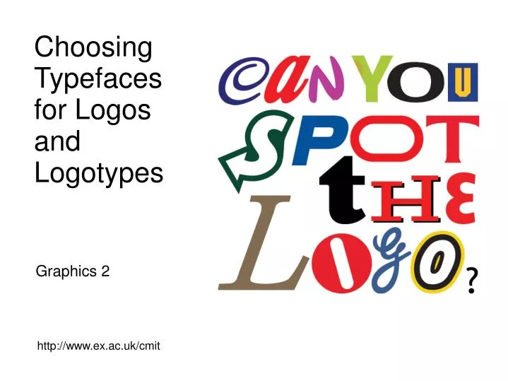
Choosing Typefaces for Logos and Logotypes Graphics 2 http://www.ex.ac.uk/cmit
Typefaces and Logotypes Introduction describing typefaces and fonts basic guidelines for using type choosing type for logotypes; some examples of famous brands
Choosing and using a Typeface 'Typography' is the craft of designing and drawing typefaces 'Typesetting' is the process of designing the layout of text using typefaces much of the language of type has evolved over the last 500 years; eg 'font' from the French 'fonte' meaning 'something that has been melted' (ie like 'fondue') typography is a vast subject - we are barely scratching the surface...
Typeface features A ‘typeface’ is the design of the letters, numbers and characters and is precisely defined by shape and proportion, eg Helvetica A ‘typeface family’ includes different weights, orientation, etc, eg Verdana italic, Arial black, (Helvetica has nearly 20 different variations) A ‘font’ is a specific instance of a typeface. Eg Times New Roman 12pt The actual size of a font when reproduced is measured in ‘points’. (72 points in an inch) although this is a relative rather than absolute dimension... Each character is called a ‘glyph’ - some typefaces have hundreds of special glyphs such as mathematical symbols.
Typeface features 'contextual forms' are special glyphs designed to improve the appearance of the text - ligatures, kerning pairs, etc - important for large tracts of text
Typeface features typefaces can be described as 'serif' or 'sans serif'; 'serifs' are the little embellishments at the ends of lines; Times, Palatino Garamond 'sans' from the French 'without' describes typefaces without embellishments; Helvetica, Arial
Typeface features typefaces can also be divided into categories based on other similarities; Oldstyle - always have serifs, and are based on the appearance of a scribe's pen there is a diagonal stress to the line weight, the serifs are sloped
Typeface features Modern - serifs are fine and horizontal, stress is vertical, the thin/thick transition is severe; Slab serif - sometimes called 'Clarendon' typefaces - thickened horizontals for greater impact;
Typeface features Sans serif - developed early twentieth century, minor or no thick/thin transition and of course no serifs;
Typeface features Script - enormous variety, but all designed to look similar to pen-drawn lettering
Typeface features Decorative - again a vast choice, these typefaces need to be used with care but in the right place can be very effective;
Basic guidelines for Typefaces use the bare minimum of different typefaces and different sizes when you use two typefaces, make them very different to each other use one serif and one sans serif if you use two serif typefaces, make sure they are from different categories use identical type styles to pick out elements that are related for example, make all section-headings the same, and all sub-headings the same when you want bold or italic try not to use a roman font and then apply a bold or italic effect; use the proper font members of a typeface family have been carefully drawn to work together. A 'bold effect’, for example, just thickens each line without taking into account relative spaces and contextual glyphs
Choosing Typefaces for Logotypes psychological studies provide evidence about the nature of cognitive processes that underlie text recognition eg meaning and appearance of text can cause conflict - Stroop Effect studies suggest customers have strong preferences for 'appropriate' choice of typeface subjects tend to agree with each other when asked to rate 'appropriateness' we seem to recognise the 'voice' of a typeface an 'appropriate' typeface seems to be one that fulfils our expectations...
Choosing Typefaces for Logotypes some of our expectations come from the features of the typeface; weight - the proportion of ink to white-space orientation - the slope of the letters letter spacing - the relative width of the letters and the space between them we form associations with the look of the typeface and the brand... bold solid lettering suggests strength, reliability delicate fine lettering suggests quality, style, elegance
Choosing Typefaces for Logotypes typefaces can evoke emotional responses that designers hope will reflect well on the brand for example, a typeface that resembles a signature forms an association of trust - - that someone believes in the product enough to 'put their name to it' we might even find an unconscious association with upper and lower case letters upper case letters do not vary in height and lack delicate features of lower case... voice holds more authority, but is perhaps less fun - not a good thing if your product is entertainment...
Choosing Typefaces for Logos much of our expectation comes from experience we've grown used to seeing certain typefaces in certain contexts over the years these two aspects have reinforced each other eg perfume brands chose script typefaces, so script became associated with perfume… however fashions change, brands have diversified and the trend seems to be towards block letters like Chanel No 5 and AVON
Choosing Typefaces for Logos brands that were designed early on had little to draw on historically… logos using the same basic design common subsequently their brand equity was borrowed by developing companies particularly those that wanted to establish themselves in new markets, like electronics...
Choosing Typefaces for Logotypes and new brands can carve out their own image in the public consciousness given enough advertising effort Reckitt Benckiser Group make 40% of their profit from brands that are less than three years old 'Cillit Bang' became a household name within a few months thanks to its advertising campaign established brands may feel they have become so well known that their shapes and colours have made the name superfluous...
Advantages and Disadvantages of Logotypes words are recognised less quickly than pictures; studies from psychology indicate that it takes slightly less time to a) recognise a picture compared to the word describing the same picture b) pick out a specific picture from amongst others compared to the word from amongst others establishing brand recognition takes time and marketing expense everyone recognises Ford, but what if you wanted to launch a new car with the brand name Smith? brand names often provide no cues as to product or service...
Advantages and Disadvantages of Logotypes a logotype communicates your brand name directly; we've seen that language has the power to override cognitive processes when customers view a logotype, language processing areas of the mind will become involved, strengthening recognition of the brand name problems can be mitigated to some extent by adding graphical elements to the logotype use of colour text and colour backgrounds, especially with spacing elements, transforms the text...
Colour and Affect - Emotional Cues colours are known to effect us at a psychological level; we refer to emotion, mood, arousal, feeling etc as 'affect' studies suggest that room decoration, for example, can have a significant influence on those who enter can colour be used as a graphical element to influence customer behaviour?
Colour and Affect - Emotional Cues little conclusive empirical research on colour preferences in branding; colour is highly subjective to the individual lots of cultural overtones - eg green can have religious significance, but currently in the West we associate green with liberal politics / anti-capitalist / social and environmental responsibility... aim to meet expectations, or justify why you've chosen not to follow the crowd... ...
Colour and Affect - Emotional Cues associations may be just simple, obvious, easy to identify; green for mint / fresh air red to play on the brand name ‘mars’ the Blockbuster reversed-out printed ticket or just intended to be playful; fun, add to the voice in ways which suggest enjoyment...
further information The Elements of Typographic Style, Robert Bringurst about £15 from Amazon excellent resource, far more information than needed for this module, but a good one if you want to take graphics further…
further information Logo, Michael Evamy about £14 from Amazon a catalogue of logos, includes lots of examples of logotypes…
further information Planet Typography – http://www.planet-typography.com/ Type Culture – http://www.typeculture.com/academic_resource/articles_essays/ “Thirteen ways of looking at a typeface”, Michael Bierut – http://www.designobserver.com/archives/entry.html?id=25212
Answers to the logo quiz C Cadbury’s A CocA colA N DisNey Y ebaY O sOny U blockbUster S Subway P Pepsi O Oracle T Tesco T Tic Tac H yaHoo E Esso L Louis Vuitton O canOn G GE (General Electric) O legO http://www.flickr.com/photos/inthepicturedesign/2075885412/