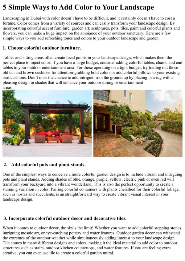
Download
1 / 10
100 likes | 110 Views
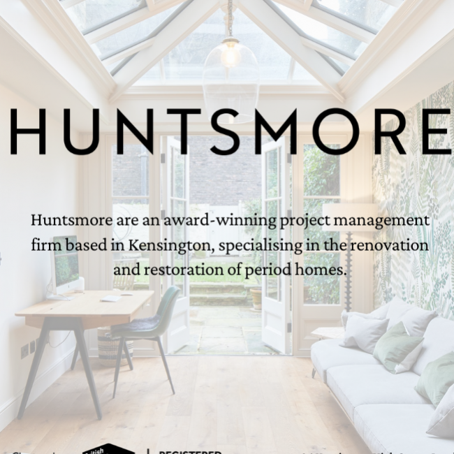
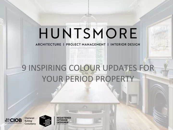
Discover our lookbook of gorgeous heritage colour ideas for classic and contemporary schemes thatu2019ll bring your period property to lifeu2026<br><br>

E N D
DIVE INTO THE BLUES Arguably the most influential design statement of the Victorian era was their use of rich, dramatic colours that set a decadent backdrop for statement ornaments and bold patterns. While deep blues – such as the colour used in this Victorian terrace renovation – nod to the past, especially when teamed with brass fittings, it can take on a more modern look when mixed with contemporary cabinets, lighter wood tones, fun lighting and modern artwork. Timber flooring laid in a herringbone pattern will create a timelessly elegant base for any room in the house, adding warmth and pattern in equal measure.
ADD A DRAMATIC COLOUR COMBO It’s not just the colour you use in your period property, but the way in which you use it. The living room walls in this Victorian conversion were painted floor-to-ceiling in this natural blue shade – including the alcoves, shelving and cabinetry – giving it a modern feel and also letting the marble feature fireplace take centre stage. Why choose one rich colour when you can choose two? Here a contrasting accent colour, a rich emerald green, calls attention to the velvet sofa upholstery and giving the overall scheme the extra wow-factor.
BREAK THE MOULD The rich tone of teal has all the restful qualities of green and blue in one beautiful hue, making it a popular colour for both period properties and more contemporary homes. In this Grade II listed property in Kensington, decorative wall panels add subtle interest to the walls and the green/blue paint tone adds drama all the way up to the picture rail. By keeping the space above the picture rail (and the ceiling) white in contrast, it allows the beautiful cornicing of the ceiling to stand out. Hardwood oak floors add warmth to the palette.
LEAD WITH LEAD If dark moody hues are not your thing, update your period property interior with neutral colour shades. This fully bespoke, Shaker-style kitchen is finished with a soothing grey paint colour that was inspired by a former residence of composer George Frederick Handel and harks back to a popular colour for Georgian homes; perfectly suited to this red brick Art Nouveau property. A glass pendant light and range add an industrial-style feel, while antique picture frames celebrate the property’s history.
CREATE A LIVING WALL The botanical trend continues to be popular in British homes, with a wide range of wallpaper prints available – from palms to trees to grasses – that capture nature’s enduring beauty and bring walls to life. A bold, leafy green wallpaper brings this grade II listed townhouse extension to life. It adds colour in an otherwise neutral space (complemented by a couple of accent cushions); plays on the indoor-outdoor feel of the scheme; and is not a bad backdrop for the home office video call, either.
CREATE A LIVING WALL It might be a smaller space in the home, but when it comes to colour a powder room is the perfect place to pack a punch. Nothing dramatizes a powder room like a dark, rich colour. Moody greens, blues or blackberries, for example, are a sophisticated way to bring a bold pop of color into a small space. Here, an inky, charcoal blue is teamed with stainless steel for a period feel. Or if you want something with a bit more pep, the retro tone in this powder room proves that a little pink goes a long way.
PLAY WITH PERIOD WALLPAPER PATTERNS The Victorians had a passion for French design. With its elaborate and ornate patterns (such as toile and damask), confident adornments and rich colours, all-things French had swept across Great Britain since the French revolution as a symbol of luxury and elegance. In this mews house bedroom, a damask patterned wallpaper in a striking and exotic colour palette takes centre stage to create a feature wall reminiscent of Georgian decadence. Pulling out the main colours for the red wardrobe, blue headboard and green lamp creates a coordinated look and modern twist.
CHOOSE SOOTHING NEUTRAL PAINT TONES Neutrals get a bad rap and tend to merit a more evocative word than their name suggests. Used to describe a palette that’s been at the top of the colour charts for decades, these earthy, gentle colours (from warm leather browns to stone greys and whites) are easy to live with, elegant and undemanding. Plus, as this elegant living room in Wandsworth proves, neutral shades can be the perfect way to highlight beautiful period-style interior woodwork such as the cornicing and fireplace.
LOOKING FOR A PROJECT MANAGER? Be inspired by more of Huntsmore’s latest projects in our photo gallery. Plus, if you’re looking to start your own unique project, we invite you to book a complimentary consultation with one of our experienced design experts who will advise you on how to turn your ideas into reality. 96 Kensington High Street, London, W8 4SG www.huntsmore.com hello@huntsmore.com +44 (0) 20 7484 5745