Download
1 / 3
30 likes | 38 Views
A good website design and development can take your business ahead in the market; however, choose a reliable company that offers affordable rates. Eccentric Business Intelligence is an online web design company that provides personalized services for every business. To know more information, track our blogs.

E N D
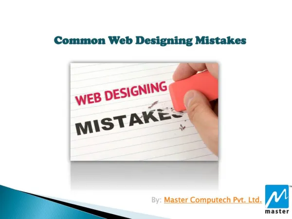
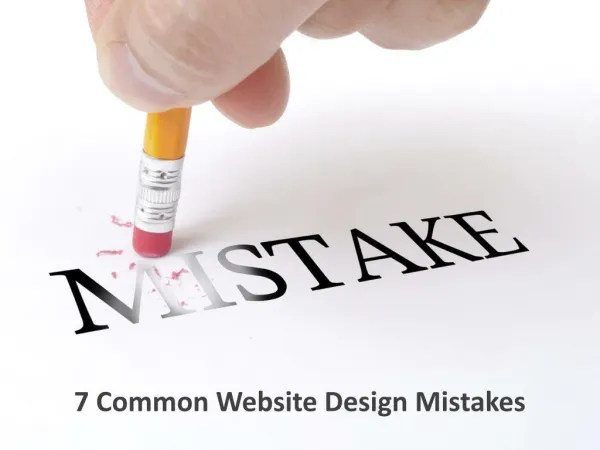
7 COMMON MISTAKES WHEN DESIGNING A WEBPAGE One web design mistake and your business can lose hundreds of prospective customers. The users leave websites that could be more user-friendly and easier to navigate within a few seconds. Your business can offer a great piece of products/services, but a bad website development can degrade your brand's credibility. Hiding Navigation Tabs The menu bar of the website must be visible on the desktop version and the mobile version of the website. It would help if you didn't hide it in the hamburger menu. It doesn't look clean for the website, but it is best for SEO, and visitors can navigate it properly. Choosing Unclear Fonts Hand-drawn scripts, cursive fonts, and difficult-to-read symbols can create chaos on your website. It will decrease cognitive fluency if your graphic design is not supportive and the fonts need to be more apparent. It leads to increase cognitive load and decreased understanding. WWW.ECCENTRICBI.COM
Incorrect Placement of CTA CTA is an integral part of any website. If it is placed wrongly on your business website, it will not help transform the leads. So, CTA must be placed smartly on the web page to prompt user action. Ensure that the website designers optimize the CTA in terms of color, text, and positioning. No Contrast between Text and Background Color The contrast between the text and the background is quite powerful. If the text is written in a light gray color, it might look great but can cause many problems for the readers. That will let the people leave your site even if you offer good products/services. Poor Use of Whitespace The large block of spaces between the text may intimidate and take the eyes off many readers. Incorporating too many text blocks may also make your site look chaotic. Designers must give special attention to the blocks of texts and the whitespaces. It must be updated, even the content with readable space between the text blocks. WWW.ECCENTRICBI.COM
Do Not Use the Same Images Stock images have been used on many websites. If you are using the same images as your competitors, it will provide you with less traction. So, dig deeper and find truly relatable pictures for your brand. You can even post realistic photos to attract a large number of audiences. Ignoring Metadata Every web page must have a title and meta description to attract users, and it is perfect for SEO too. It validates the searcher on what they will find on the particular web pages of the websites. Neither the searchers will leave the page if it's just a clutter of thoughts. Are you looking for the right website design and development? You can reach out to a reputed and professional website design agency Eccentric Business Intelligence. They render customized services for each business irrespective of their size. WWW.ECCENTRICBI.COM