1 / 68
720 likes | 2.09k Views
Do you think you need a fleet of presentation designers to make your latest PowerPoint look good? Sometimes yes, but not always. Here are three design hacks you can use to convince your colleagues that your presentation has been to the experts.

E N D
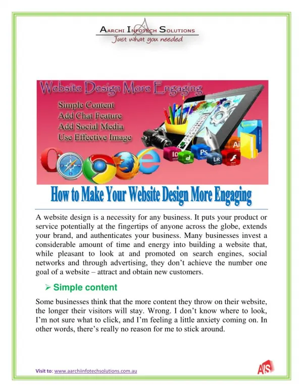
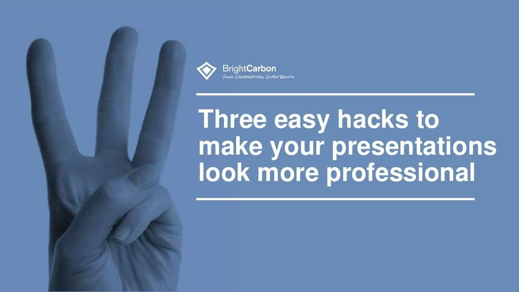
3 Design Hacks to Make Your Presentations Look More Professional Three easy hacks to make your presentations look more professional
Here is your message.It’s super important Here is your message.
And they’ll get disappointed when they realise it’s not fish and chips*
metaphorically speaking of course And they’ll get disappointed when they realise it’s not fish and chips*
You don’t need to be a designer to make beautiful slides
Here are three easy hacks to make your presentations look more professional
But before we begin, let’s have a look at the ugly duckling
Gross isn’t it? White Background Bullet Points And shock of all horrors
Make sure you use creative commons images, or buy them from a stock image site.
Advanced Go to artistic effects, choose blur Add a Fade animation after previous
Make each point its own text box, and have them fly in after previous or on a click
Have your text fill the box – reduced the size! Don’t
Don’t We innovate We care We include you We support you 24/7 We have expertise We’re award winners
Don’t We innovate We care We include you We support you 24/7 We have expertise We’re award winners forget to line them all up
Advanced Right click your box and choose Shape Fill Drag the transparency Slider to 25%
It makes your presentation look like a child’s IT project
Instead, get yourself a set of icons. Stock image website are great for this – it’s definitely an investment
Icons provide an easy-to-understand visual language for your audience
We innovate We care We include you We support you 24/7 We have expertise We’re award winners Once you have your icons pop them in a box the same height as your points Copy the formatting of your points to your new boxes (ctrl+shift+c to copy and ctrl+shift+v to paste)
Group the objects and add a zoom animation with previous and in the animation pane drag them to the corresponding text box