Download
1 / 26
260 likes | 750 Views
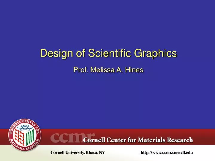
Design of Scientific Graphics Prof. Melissa A. Hines ~3.25" max typ. 2 mm min. typ. Two key criteria: Max graphic width & min font height Design of Scientific Graphics for Publication Prepare all graphics at full scale (see journal rules).

E N D
Design of Scientific Graphics Prof. Melissa A. Hines
~3.25" max typ. 2 mm min. typ. Two key criteria: Max graphic width & min font height Design of Scientific Graphics for Publication Prepare all graphics at full scale (see journal rules). Note that journals often compress graphics w/o asking.
Design of Scientific Graphics for Publication General rules: • Use “bland” san serif font (typ: Helvetica) throughoutRegular weight, not bold • Major elements in graph (e.g., axes): 1 pt minMinimum linewidth of any feature: 0.5 pt • Check journal rules on color before starting • Some letters journals limit number of graphics Choose designs that make your graphs self-explanatory. Don’t use captions as a crutch!
Typography Gotchas for Scientific Graphics • Italicize all variables in text and in graphicsx-axis not x-axis, f not f ( but µm, K, °C, etc. are not italicized) • Use the appropriate length dashes - (hyphen): Use to hyphenate words– (en dash): minus sign — (em dash): Use for punctuating sentences • Use the correct symbol for multiplication not x, ( 10–3 m) not (x 10–3 m)
Legal Gotchas for Scientific Graphics • Publisher owns all images in a published paper (but not underlying data). • Cannot reuse figures from one paper to another without attribution and publisher's written consent. • Trick: Modifying original figure makes it "new" Note: You do not need permission to use someone else's data (taken from a published source).
Vs. Is the Golden Ratio Golden? 1.618 1 Choose the aspect ratio that flatters your data, not some dead Greek philosopher.
To Box or Not To Box? Vs. Pro: Minimal design Pro: Easier to judge scale on RHS of graph
General Rule: Axes should span data range unless removing zero creates false impressions. Should Zero Be Included? Vs.
Replotted data suggest a functional relationship Play with different ways of plotting your data. Graphics Affect Perception of Data Published graph suggests a correlation
Vs. Small Signals and Baseline Issues Baseline must be shown on both sides of peaks.
Appropriate Use of the Top or Right Axis Use second axis to show data in different units.
Less Appropriate Use of the Top or Right Axis • Plotting different types of data on opposite axes is outdated. • In choosing software, preparation of stacked graphs (e.g., same bottom axis) is important.
Use Labels to Remove Dependence on Captions Column and row headers explain different parts of graph w/o captions. Individual labels on sub-images only necessary for reference in text. (Do not include in presentations!) Note all images have same scale bar.
Use Shading to Convey Temporal Information Shading is particularly useful in indicating changes in experimental conditions.
Use Shading to Distinguish Curves The histograms (data) are shaded for emphasis and to help the reader perceive their shape. The limiting curves (exp & Gaussian) are left unfilled for reference.
Use Shading to Distinguish Curves The shaded curve represents historical data; the black line is the new data. This emphasizes that the two spectra have: – different peaks – different linewidths
Solution: Add "depth" by outlining new data in white. (Trick: Double plot new data in fat white under thin red.) Improving Contrast of Overlapping Lines Problem: New data (black) doesn't stand out from old data (red shading)
Focusing Attention on Specific Regions Differential absorption spectrum Common Solution: Plot regions of interest, leaving breaks in axes for "boring" areas. Caution: Scale should remain constant across all regions!
Focusing Attention on Specific Regions Another Solution: Use insets to plot regions of interest.
Legends should reinforce data where possible If possible, put legend in the same order as items on the graph. Jumbled order will confuse the reader.
Solution: Allow curves to overlap, but also plot residual (difference between two curves) Comparing Similar Data with Residuals Problem: Nearly identical curves cannot be distinguished when plotted on same graph. Offset?
Curve Fitting and Residuals A structured residual is indicative ofinappropriate modeling function.
What about pie charts? Pie charts have no place in science. Well-documented problems with accurate perception of relative areas.
Minimum Needs for Scientific Graphing Package • Support for equally spaced & x-y data • Ability to easily transform data (e.g., multiply, divide, FFT) • Curve fitting to user-defined functions & user-defined regions of data. Global fits to multiple data sets. • Control over all parts of graph (e.g., ticks, axes, labels) • Multiple, arbitrarily positioned and scaled axes (e.g., stacked graphs, insets) • Robust data import & graphics export • Fully documented analysis & functions w/ references • Active & responsive user network for help
Your Assignment: Help DOE Communicate! This graph has no discernable message! Make a new publication-quality graph that emphasizes: – Contributions to US energy landscape by energy type vs year – Percentage of renewable energy vs year
Your Tool: Igor Pro You can install Igor Pro on your personal computer or a lab computer for use in completing the assignment. You cannot use the program for research or personal use without buying a license.