Download
1 / 20
200 likes | 204 Views
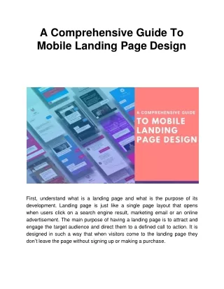
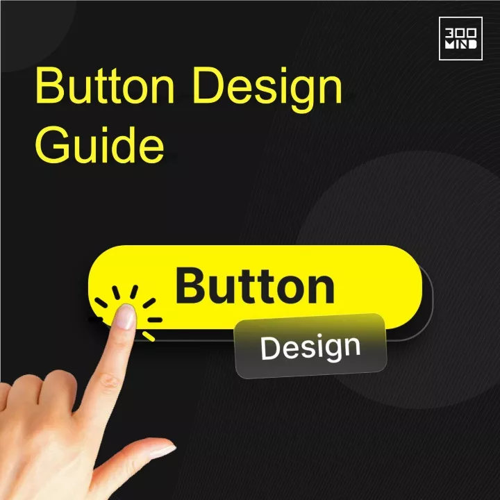
A button is a key UI component that has a crucial impact on how you design interactions. Here is everything you need to know regarding button design in UI/UX.u00a0<br>https://300mind.studio/blog/button-design/<br>

E N D
What is Button in Design? In essence, buttons are interactive elements that help the user understand what activities are feasible to execute through clicking on one.
Types of Button 1. Call to Action Users are typically prompted by call to action buttons to perform important actions like “sign up,” “register,” or “add to cart”.
2. Primary Button Primary buttons can be utilized when a user wants to proceed “next” or “Proceed to check out”.
3. Secondary Button Secondary buttons, such as “Go Back” or “Cancel,” provide an alternate route to the principal action and are placed adjacent to major buttons.
4. Ghost Button Ghost buttons lack a fill, consisting solely of an outline. They are generally used to denote a secondary or even tertiary activity.
5. Toggle Button A user can switch a setting between two states using toggle buttons or when a user has the option to switch an element on and off, such as the “Favorite” button.
6. Floating Action Button Floating action buttons float above the screen and frequently stay there throughout various interfaces.
7. Humburger Button This is the button that hides the sites/apps menu. Once you click on it, the menu drops down and expands, revealing other buttons.
8. Plus Button The ‘plus’ button is mostly used to let the user know that he can add additional content to the system like a post, contact etc.
9. Expendable Button This button is mostly used as a facilitator to enhance interaction flows by overloading the screen with unnecessary information.
10. Expendable Button The play button is characterized by its attractive hover effect where the icon on it changes from the play symbol to the pause symbol.
Things to Consider When Designing Button 1. Button Design: Rounded vs Square Depending on the impression you want to give the user, rounded is more pleasant, sharp is more serious.
2. When to Make Use of The Icon Icon buttons allow more flexibility in placement due to their reduction in size. You’ll observe that FABs all frequently employ this design.
3. Spacing and Padding for Bottom The ideal button spacing, as a general rule, falls between 12 and 48 pixels. Recent research indicated a distance of 6.35 mm, or 24 pixels.
4. Feedback and Button States To help users comprehend the effects of their actions, button states are used. Some states are ‘active/inactive’, ‘hover on/off’ and ‘pressed’.
5. Size and Position of Button Placement and size makes sure that the buttons you’re designing are simple to see and use. More attention is paid to larger buttons than smaller ones.
6. Microcopy on Buttons “Microcopy” is the text that appears inside a button and describes the action or result that will happen if the button clicks it.
7. Choosing Right Color Strategy Designers can influence buttons to trigger particular behaviors through color. The brightest speck of color we see immediately catches our attention.
Leverage Our UX Design Expertise to Bring Your Product Ideas to Life. Sales@300minds.com www.300mind.studio