Download
1 / 11
0 likes | 4 Views
In this helpful guide, we'll show you how to transform your home into a peaceful oasis by choosing the perfect color palette for your interior design. From understanding the psychology of colors to practical considerations like lighting and room size, we'll cover everything you need to know to create a space that promotes relaxation and tranquillity. With tips on harmonizing color combinations, implementing your chosen palette, and maintaining the peaceful ambiance over time, you'll be well-equipped to create a home that feels like a sanctuary.

E N D
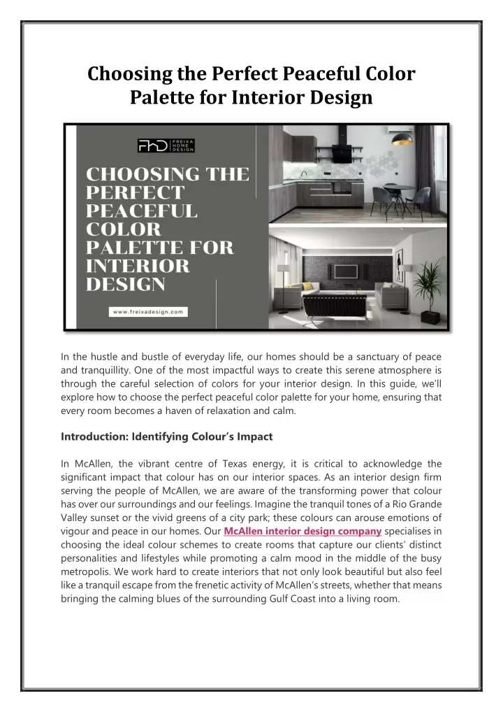
Choosing the Perfect Peaceful Color Palette for Interior Design In the hustle and bustle of everyday life, our homes should be a sanctuary of peace and tranquillity. One of the most impactful ways to create this serene atmosphere is through the careful selection of colors for your interior design. In this guide, we’ll explore how to choose the perfect peaceful color palette for your home, ensuring that every room becomes a haven of relaxation and calm. Introduction: Identifying Colour’s Impact In McAllen, the vibrant centre of Texas energy, it is critical to acknowledge the significant impact that colour has on our interior spaces. As an interior design firm serving the people of McAllen, we are aware of the transforming power that colour has over our surroundings and our feelings. Imagine the tranquil tones of a Rio Grande Valley sunset or the vivid greens of a city park; these colours can arouse emotions of vigour and peace in our homes. Our McAllen interior design company specialises in choosing the ideal colour schemes to create rooms that capture our clients’ distinct personalities and lifestyles while promoting a calm mood in the middle of the busy metropolis. We work hard to create interiors that not only look beautiful but also feel like a tranquil escape from the frenetic activity of McAllen’s streets, whether that means bringing the calming blues of the surrounding Gulf Coast into a living room.
Exploring Peaceful Color Options We are essentially exploring multiple colours that can contribute to a peaceful and comfortable atmosphere in our home. You know how some colours may make you feel joyful while others might give you anxiety? The colours that contribute to a calm mood in your house are the ones we’re talking about here. 1. Soft Neutrals: Creating a Timeless Foundation Soft neutrals are like the calming whispers of a gentle breeze, offering a sense of tranquility and comfort to any space they grace. These timeless hues, such as creamy whites, subtle grays, and warm beiges, provide a versatile backdrop that complements a wide range of decor styles and color schemes. With their understated elegance, soft neutrals create an atmosphere of serenity and sophistication, making them ideal for creating a cozy bedroom retreat, a welcoming living room oasis, or a serene dining area. Whether used as the main color scheme or as accents to bolder hues, soft neutrals have the remarkable ability to open up a space, making it feel larger and more inviting. By embracing the subtle beauty of soft neutrals, you can transform your home into a sanctuary of peace and tranquility, where every moment is infused with a sense of calm and relaxation.
2. Serene Blues: Bringing Calmness to Your Space When it comes to creating a peaceful atmosphere in your home, few colors can rival the tranquillity of serene blues. Blues are often associated with the calming qualities of the sky and sea, evoking feelings of relaxation and serenity. By incorporating shades of blue into your interior design, you can bring a sense of calmness and tranquillity to any room. Whether you choose soft pastel blues for a subtle touch of elegance or deeper navy blues for a more dramatic effect, this versatile color family has the power to transform your space into a serene sanctuary. From bedrooms and bathrooms to living areas and kitchens, serene blues can create a soothing backdrop for everyday life, helping to alleviate stress and promote a sense of well-being. Soothing and versatile, serene blues are the perfect choice for anyone looking to create a peaceful retreat within their home. 3. Soothing Greens: Bringing the Essence of Nature Indoors
Incorporating soothing greens into your interior design scheme can have a profound impact on the overall ambiance of your home. Firstly, greens are inherently linked to nature, evoking feelings of tranquility and calmness. By bringing the soothing hues of nature indoors, you can create a space that feels like a peaceful retreat from the outside world. Green is also known to have a relaxing effect on the mind and body, making it an excellent choice for spaces where you want to unwind and de-stress. In addition to promoting relaxation, greens can also create a sense of balance and harmony in a room, making it feel more cohesive and inviting. From soft sage greens to vibrant emeralds, there is a wide range of shades to choose from, allowing you to tailor the color to suit your personal taste and style. Greens also pair beautifully with a variety of other colors, from earthy browns to crisp whites, giving you plenty of options for creating a cohesive color palette. 4. Gentle Pastels for Tranquil Spaces Gentle pastels, encompassing soft hues like delicate pinks, soothing lavenders, and subtle blues, evoke tranquility and serenity, ideal for creating peaceful home environments. Versatile and elegant, they suit any room, from bedrooms to reading nooks, adding warmth without overwhelming. With their versatility in pairing with other colors, gentle pastels can create timeless looks or add depth with contrasts. Enhancing natural light, they make rooms feel brighter and more spacious, perfect for smaller spaces. Ultimately, gentle pastels help craft serene atmospheres where one can unwind and recharge, whether through blush pink bedroom walls or subtle lavender accents in the living room, turning homes into tranquil havens from everyday stress.
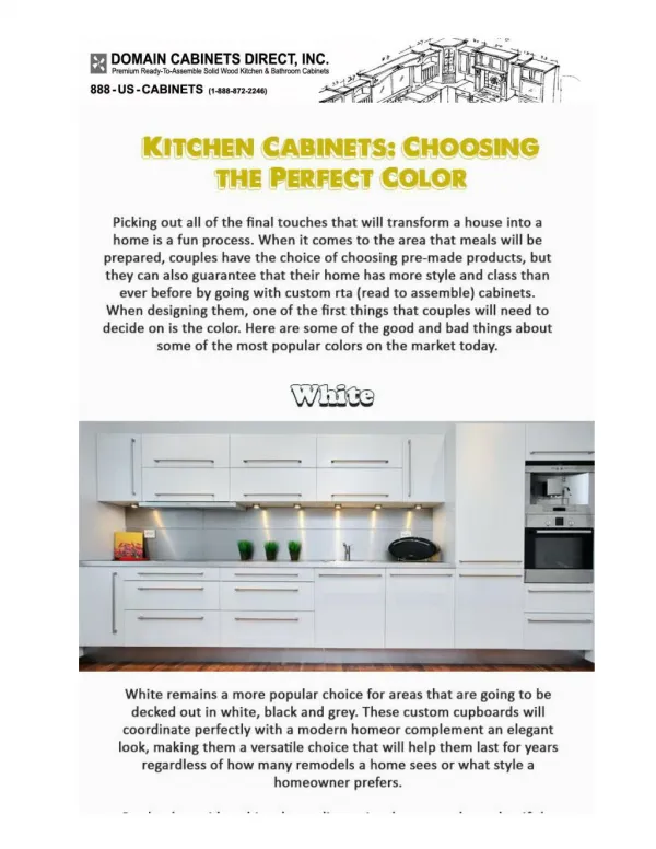
5. Tranquil Whites: Creating Cleanliness and Simplicity When it comes to creating a sense of tranquillity in your home, few colors are as effective as tranquil whites. Serene Simplicity: White is often associated with purity and cleanliness, making it an excellent choice for promoting a sense of calm and order in any room. Expansive Elegance: In addition to creating a clean and fresh look, white can also make a space feel larger and more open by reflecting light and brightening the room. Versatile Versatility: One of the great things about white is its versatility— it pairs well with virtually any other color, allowing you to easily change up your decor without having to repaint. Whether used as the main color or as an accent, tranquil whites can help create a serene and peaceful atmosphere in your home that promotes relaxation and well-being. 6. Exploring Earthy Tones: Bringing Nature Indoors
Earthy tones encompass a range of colors inspired by the natural world, such as warm browns, soft beiges, and muted greens. These hues evoke a sense of grounding and connection to the earth, bringing a touch of nature indoors. Warm browns mimic the rich tones of soil and wood, creating a cosy and inviting atmosphere in any room. Soft beiges evoke the warmth of sandy beaches and desert landscapes, adding a subtle elegance to your decor. Muted greens capture the serenity of lush forests and rolling hills, infusing your space with a sense of tranquillity and harmony. Whether used as the main color scheme or as accents to complement other shades, earthy tones can transform your home into a sanctuary of natural beauty and comfort. Harmonizing Color Combinations Choosing the right colors for your home is more than just picking out your favourite shades. It’s about creating a cohesive and harmonious palette that enhances the overall ambiance of the space. When it comes to harmonizing color combinations, there are several strategies you can use to ensure that your chosen colors work well together and create a sense of balance and unity. 1. Analogous Colors: Creating Harmony Through Similarity One way to harmonize color combinations is by selecting analogous colors. These are colors that are adjacent to each other on the color wheel, such as blue and green or red and orange. Because they share similar undertones, analogous colors naturally complement each other and create a sense of harmony and cohesion in a room. When using analogous colors, consider varying the shades and tones to add depth and interest to the space while maintaining the overall sense of unity. 2. Complementary Colors: Balancing Contrast with Harmony Another strategy for harmonizing color combinations is to use complementary colors. These are colors that are opposite each other on the color wheel, such as blue and orange or purple and yellow. While complementary colors create contrast and visual interest, they can also be used to create harmony when balanced correctly. When using complementary colors, consider using one color as the dominant hue and the other as an accent to prevent the colors from competing for attention. 3. Monochromatic Schemes: Simplifying with Shades and Tones For a more subtle approach to harmonizing color combinations, consider using a monochromatic color scheme. This involves using varying shades and tones of the same color throughout the room. By sticking to one color family, you can create a sense of unity and simplicity while still adding depth and interest to the space. When
using a monochromatic scheme, consider incorporating different textures and materials to prevent the room from feeling flat or monotone. 4. Triadic Colors: Finding Balance in Diversity Finally, triadic colors offer a balanced approach to harmonizing color combinations. This involves selecting three colors that are evenly spaced around the color wheel, such as red, yellow, and blue. By using three diverse colors, you can create a vibrant and dynamic palette while still maintaining a sense of balance and harmony. When using triadic colors, consider using one color as the dominant hue and the other two as accents to prevent the colors from overwhelming the space. Incorporating these strategies for harmonizing color combinations can help you create a cohesive and visually pleasing palette that enhances the overall ambiance of your home. Whether you prefer subtle neutrals or bold statement colors, there’s a harmonious combination out there waiting to transform your space. Practical Considerations for Choosing Peaceful Colors When it comes to selecting colors for your home, there are some practical factors to keep in mind to ensure that your chosen palette not only looks great but also creates a peaceful atmosphere. 1. Lighting Conditions The lighting in a room can significantly affect how colors appear. Natural light from windows can make colors look brighter and more vibrant, while artificial lighting can sometimes cast a yellow or cool tone, altering the colour’sappearance. It’s essential to consider the direction and intensity of light in each room when choosing colors. To get a true sense of how a color will look, it’s a good idea to test paint samples in different lighting conditions throughout the day. 2. Room Size and Layout The size and layout of a room can also impact how colors are perceived. Dark colors tend to make a room feel smaller and more intimate, while lighter colors can create a sense of openness and space. In smaller rooms, it’s generally best to stick to lighter shades to avoid feeling cramped. Conversely, larger rooms can handle darker colors without feeling overwhelming. Additionally, the layout of furniture and other decor items can affect how colors interact with each other, so it’s essential to consider the overall design of the space when choosing colors. 3. Functionality and Purpose
Different rooms in your home serve different purposes, and the colors you choose should reflect this. For example, bedrooms should promote relaxation and sleep, so soothing colors like soft blues or pale greens are often a good choice. In contrast, home offices may benefit from energizing hues like warm yellows or soft oranges to boost productivity. Consider how you use each room and choose colors that support its function and purpose. 4. Existing Decor and Furnishings Finally, it’s essential to consider the existing decor and furnishings in your home when choosing colors. Think about the colors of your furniture, curtains, rugs, and other accessories and how they will work with your chosen palette. You want your colors to complement and enhance your existing decor rather than clash with it. If you’re unsure, consider bringing swatches of your chosen colors with you when shopping for new decor items to ensure everything coordinates harmoniously. By taking these practical considerations into account, you can choose a peaceful color palette for your home that not only looks beautiful but also creates a soothing and harmonious environment for you and your family to enjoy. Implementing Peaceful Color Palettes Once you’ve chosen the perfect peaceful color palette for your home, it’s time to bring those colors to life and transform your space into a tranquil oasis. Implementing your chosen color scheme involves several steps, each aimed at ensuring that your home reflects the sense of calm and serenity you desire. 1. Sampling Colors: Before you commit to painting your entire room in a particular color, it’s essential to test it out first. Purchase small paint samples or swatches of your chosen colors and apply them to different areas of the room. Observe how the colors look in various lighting conditions throughout the day. This will help you ensure that the colors you’ve selected truly create the atmosphere you desire. 2. Painting Techniques: Once you’ve settled on your colors, it’s time to break out the paintbrushes and rollers. Consider different painting techniques to add depth and interest to your walls. You might opt for a solid color throughout the room, or you could experiment with color blocking, ombre effects, or textured finishes. Each technique offers a unique way to showcase your chosen colors and enhance the overall ambiance of the space. 3. Incorporating Color Through Accessories and Textiles: Painting your walls is just one way to incorporate your chosen colors into your home. Consider adding pops of color through accessories and textiles such as throw pillows, area rugs, curtains, and artwork. These accents allow you to introduce additional hues and textures while tying
the room together and creating a cohesive look. Be sure to choose accessories that complement your chosen color palette and enhance the peaceful atmosphere of the space. 4. Professional Help vs. DIY Approaches: Deciding whether to tackle your painting project yourself or hire a professional depends on several factors, including your budget, time constraints, and level of expertise. If you’re comfortable with painting and have the time to dedicate to the project, DIY may be a cost-effective option. However, if you lack the skills or simply prefer to leave it to the experts, hiring a professional painter can ensure a high-quality finish and save you time and effort in the long run. Consider your options carefully and choose the approach that best suits your needs and preferences. Summary: Key Takeaways 1. Understanding the Psychology of Color: Colors have a big impact on how we feel in a space. By choosing calming colors like soft neutrals, serene blues, soothing greens, gentle pastels, tranquil whites, and earthy tones, you can create a peaceful atmosphere in your home. 2. Considering Practical Factors: When choosing colors, think about things like lighting, room size, and existing decor. Lighting can change how colors look, so test them out in different lighting conditions. Dark colors can make small rooms feel even smaller, while light colors can open up a space. And make sure your new colors match with your furniture and decorations. 3. Bringing Your Colors to Life: Once you’ve chosen your colors, it’s time to paint! Test out your colors with swatches and samples before committing. Try different painting techniques to add depth and interest to your walls. And don’t forget about accessories like throw pillows and curtains to tie everything together. 4. Maintaining Peaceful Vibes: After your home is painted, it’s important to keep it looking fresh. Follow the manufacturer’s guidelines for cleaning your walls. And if you ever want to change your colors, don’t be afraid to experiment! Paint is easy to change, so have fun with it. 5. Creating Your Sanctuary: Ultimately, choosing a peaceful color palette for your home is all about creating a space that feels like a sanctuary. By understanding how colors affect our mood, considering practical factors like lighting and room layout, and bringing your colors to life with paint and accessories, you can create a home that promotes relaxation and well-being for you and your family.
Conclusion Choosing a peaceful color palette for your home is a transformative journey that goes beyond mere aesthetics. It’s about creating an environment that nurtures your well- being and enhances your quality of life. By understanding the psychology of color, considering practical factors such as lighting and room layout, and bringing your chosen colors to life through paint and accessories, you can craft a space that truly feels like a sanctuary. Whether you’re looking to create a serene retreat in your bedroom, a tranquil oasis in your living room, or a zen-inspired workspace in your home office, the power of color is at your fingertips. And if you ever need assistance along the way, don’t hesitate to reach out to a reputableinterior design company for expert guidance and support. With the right colors and thoughtful design choices, your home can become a haven of peace and tranquillity, where every room tells a story of comfort, harmony, and beauty. Even your bathroom interior decoration can be transformed into a serene spa-like retreat, completing the peaceful ambiance of your entire home. FAQs on Choosing Peaceful Color Palettes for Your Home Q1. How do I know which color palette is right for my space? Ans: Consider the mood you want to create in each room. Soft neutrals, serene blues, soothing greens, and other calming colors can help promote relaxation and tranquility. Think about how you want to feel in each room and choose colors that reflect that mood. Q2. Can I combine multiple peaceful colors in one room? Ans: Absolutely! Combining different peaceful colors can add depth and interest to a room while still maintaining a sense of tranquility. Just be sure to balance the colors and hues to create a cohesive and harmonious palette that promotes relaxation. Q3.What if I change my mind about the color palette later on? Ans:Don’t worry! Paint is easily changeable, so if you find that your chosen color palette no longer suits your taste or style, you can always repaint. Experimenting with different colors is part of the fun of interior design, so don’t be afraid to try new things until you find the perfect combination for your space. Q4. Are there any colors to avoid for creating a peaceful atmosphere? Ans: While every color has its place, some vibrant or overly stimulating colors may not be conducive to a peaceful environment. Colors like bright reds or yellows can be energizing and may not promote relaxation in the same way that softer, more subdued
hues do. It’s essential to consider the overall mood you want to create in your home and choose colors accordingly. Contact Us – (956) 426-4640 Email– acarbajal@freixadesign.com Visit Website - https://freixadesign.com/ Our Location – 4900 W Expressway 83, Suite 221, McAllen, TX 78503